
design principlesgeometric
Geometric Logo Design That Builds Trust Fast
Geometric logo design builds instant credibility for your brand. Learn how clean shapes and modern p...
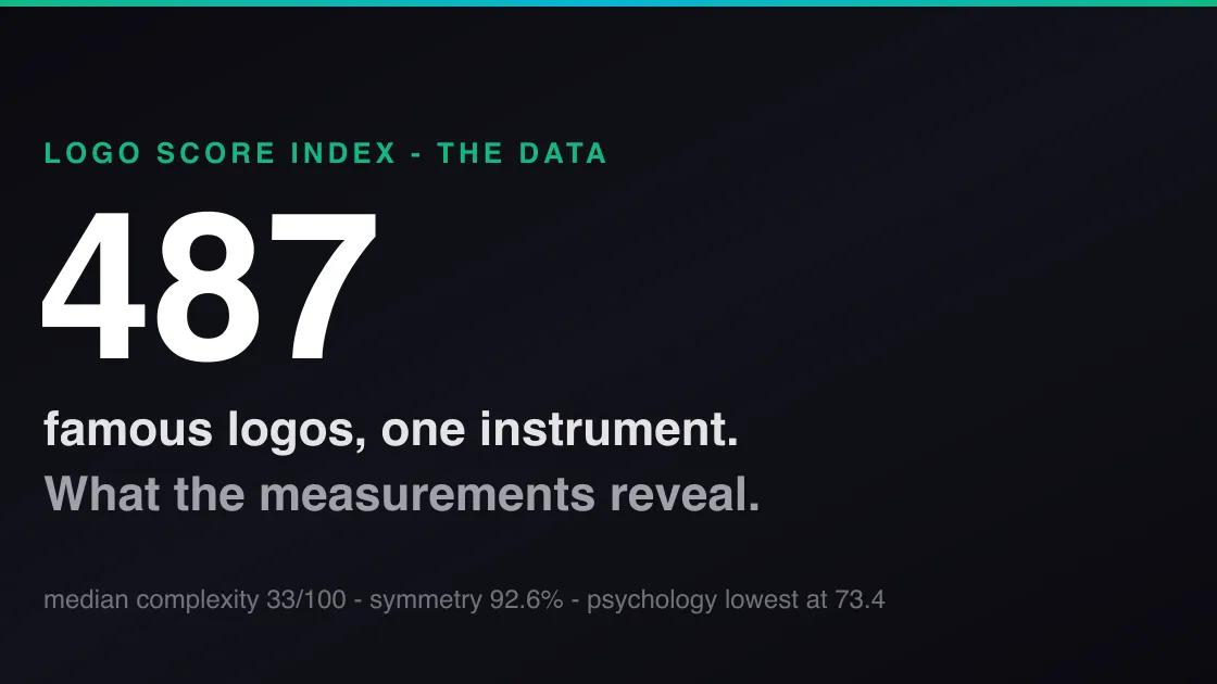
We ran 487 of the world's most famous logos through our full analysis pipeline. The data shows what they share, where even icons score low, and what it means for your logo.
We ran 487 of the world's most famous logos through our full analysis pipeline. The data shows what they share, where even icons score low, and what it means for your logo.
Design advice about logos is usually opinion stacked on opinion: keep it simple, make it timeless, mind your typography. We wanted numbers instead. So we took 487 of the world's most recognizable logos -- Gucci, Nike, Apple, Google, Michelin, Stanford, Lego, and 480 more -- and ran every one through the same analysis pipeline any Logo Analyzer user gets: 30+ real computer-vision measurements first, then 550+ research-informed scores built on top of them.
The full ranked results are public in our Logo Score Index, where every brand has its own analysis page. This post is about what the dataset says in aggregate -- the patterns that emerge when you measure nearly five hundred of the most successful marks on Earth with one consistent instrument.
A quick honesty note before the findings, because it matters to how you read them. Two kinds of numbers appear below. Some are direct measurements -- symmetry, visual complexity, colorblind legibility -- computed deterministically from pixels; run them twice and you get the same answer. Others are scores from our pipeline, where an AI interprets the measurements through published research frameworks. Those are one instrument's assessment, not laboratory ground truth. We think the instrument is a good one, and it is the same one for all 487 logos, which is exactly what makes comparison meaningful.
Here is what we found.
The "keep it simple" advice survives contact with the data. Across all 487 logos, the median visual-complexity measurement is 33 out of 100 (mean 37.4). These are direct pixel measurements -- edge density, color-region counts, entropy -- not opinions. The most recognizable visual identities on the planet cluster firmly in the bottom third of the complexity scale.
There is also a relationship between simplicity and overall score in our data: complexity and overall score correlate at r = −0.30 across the dataset. Simpler famous logos tend to score higher in our pipeline. We state that carefully -- it is a correlation inside one scoring system, not a law of nature -- but it points the same direction as decades of recognition research: marks with fewer elements are processed faster and remembered better. (For the neuroscience of why, see how your brain processes logos in milliseconds.)
The practical reading: if your logo is more complex than roughly two-thirds of the most famous logos ever made, you should have a very specific reason why.
The average famous logo measures 92.6% overall symmetry in our computer-vision analysis -- a blend of horizontal and vertical balance computed directly from the image. That number surprised us with how high it is. Even wordmarks, which cannot be literally mirror-symmetric, tend to sit in visually balanced containers with even optical weight.
Symmetry is one of the oldest findings in visual perception: balanced forms are processed more fluently and rated more pleasant. The famous-logo corpus behaves exactly as the literature predicts. If your mark feels subtly "off" and you cannot say why, an asymmetric weight distribution is one of the first things worth checking.
This is the finding we did not expect. When we average the eight category scores across all 487 logos, the ranking looks like this:
| Category | Average score |
|---|---|
| Typography | 89.8 |
| Design | 88.9 |
| Trust | 87.4 |
| Cognitive | 86.8 |
| Cultural | 84.5 |
| Market | 76.2 |
| Color | 75.6 |
| Psychology | 73.4 |
Technically, famous logos are superb: typography, design craft, and trust signals all average near 90. (Most categories are scored for all 487 logos; typography and cognitive are scored where applicable, for 441 and 459 respectively.) The lowest-scoring dimension across the entire corpus is psychology -- the category covering emotional impact, memorability of meaning, and subconscious appeal -- at 73.4.
One interpretation: fame does the emotional work for these brands, so the mark itself rarely has to. The Nike swoosh (psychology: 91) and Walt Disney's signature (89) are the exceptions that carry emotion in the drawing itself. Most famous marks are closer to beautifully engineered neutrality -- and for a young brand without fame to lean on, that is precisely the gap worth designing for. Emotional resonance is the dimension where a new logo can genuinely compete with the giants, because the giants are not winning it on the artwork alone.
The single strongest category across the corpus is typography at 89.8 average -- and at the top it is nearly perfect: HBO scores 98, Tiffany and Calvin Klein 97. These are wordmarks refined over decades, kerned and weighted until nothing is accidental.
The spread is real, though: the corpus bottoms out in the 40s (Le Monde, CouchSurfing), and those same logos sit at the bottom of the overall ranking too. In this dataset, weak typography and weak overall performance travel together. If your logo contains letters, they are not a detail -- they are most of the grade.
Here is a pattern worth copying outright: of the 458 famous logos with a colorblind-legibility measurement, not one scored below 70 out of 100. Zero. The most successful visual identities in the world are, as a population, legible to colorblind viewers -- roughly 8% of men.
That is unlikely to be a coincidence. Marks that survive decades of reproduction across print, screens, embroidery, and signage tend to be the ones that never depended on a fragile color distinction in the first place. (Color choice has plenty of other consequences too -- see the psychology of color in logo design.) When we analyze user logos, colorblind legibility is one of the most common places where otherwise strong marks lose points. The famous corpus shows the standard is absolutely reachable.
Averaging by industry -- counting only sectors with at least ten logos in the set, because two data points do not make an industry -- fashion leads at 87 (32 logos) and retail trails at 79 (12 logos), with automotive (83), technology (82), and entertainment (82) in between. An 8-point spread by sector is large. It means "is this a good logo?" is partly the wrong question; "is this a good logo for its category?" is the one the data supports. Our analysis benchmarks against your industry for exactly that reason.
Reading the corpus as a checklist:
Every number in this post comes from the same public dataset you can browse yourself: the Logo Score Index, 487 logos, each with its full analysis. And if you want to know where your own mark stands on the same 550+ metrics -- complexity, symmetry, typography, colorblind legibility, and the psychology gap included -- score your logo free. It takes about four minutes.
Method and disclosure: all 487 logos were analyzed with the same pipeline available to Logo Analyzer users -- computer-vision measurements computed first, then research-informed AI scoring anchored to those measurements. Direct measurements (complexity, symmetry, colorblind legibility) are deterministic and reproducible; category and overall scores are our pipeline's assessment and can vary slightly between runs. Logo Analyzer is independent and not affiliated with or endorsed by any brand named here; all trademarks and logos belong to their respective owners. Scores are not an official ranking, an endorsement, or a measure of brand or commercial success.
Geometric logo design builds instant credibility for your brand. Learn how clean shapes and modern p...
Discover how negative space branding creates memorable logos that stand out. Learn design techniques...

Learn how startup logo design evolves with your growing business. Create scalable, memorable brandin...
Get a free scientific analysis with 550+ metrics across perception and design.
Try Free Analysis