Logo Score Index · #486 of 487
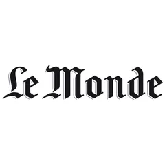
Le Monde Logo Analysis
Le Monde's authoritative logo builds trust but its traditional design clashes with the entertainment industry, risking market irrelevance.
Entertainment · 16 points below the Entertainment average of 82 (83 logos)
The verdict
This logo projects strong authority and professional credibility, leveraging a unique, traditional aesthetic that commands respect. However, its serious and historical design is fundamentally misaligned with the dynamic entertainment industry, creating a significant barrier to market positioning and emotional connection with the target audience. A strategic re-evaluation of the visual identity is crucial to bridge this gap and unlock the brand's full potential.
Score breakdown
How the Le Monde logo scores across the analysis categories.
- Design78
- Psychology60
- Trust71
- Cognitive73
- Market66
- Typography45
- Color77
- Cultural51
Strengths and weak spots
What works
The logo's primary strengths lie in its strong sense of tradition, authority, and uniqueness. The distinctive Blackletter typeface ensures high differentiation and memorability, conveying a premium and established perception. It projects high professional credibility and trust, suggesting a reliable and serious entity.
Where it could improve
Significant areas for improvement include its poor fit for the entertainment industry, which creates a major contextual mismatch. The complex typography can lead to moderate cognitive load and challenges with scalability and adaptability across various digital platforms. It also lacks emotional warmth and broad cultural inclusivity, potentially limiting its global appeal and emotional connection with a diverse audience.
If this were your logo, we'd suggest
- Re-evaluate Brand Identity for Entertainment Industry
- Simplify Typography for Digital Scalability
- Introduce Elements for Emotional Connection
- Explore a More Contemporary Color Palette
What the analysis found
Positioning
The logo's traditional Blackletter font and serious aesthetic position the brand as an established, authoritative entity, akin to a historical newspaper. This creates a severe mismatch with the entertainment industry, where brands typically aim for modern, engaging, and often playful positioning. The current design actively hinders the brand from effectively communicating its entertainment offerings and connecting with its target demographic.
Trust
The classic, formal typography and monochromatic palette inherently convey a high degree of trust and professional credibility. The design suggests a brand that is reliable, well-established, and serious about its content. This strong foundation of trust is a significant asset, though its impact is diminished by the contextual mismatch with the entertainment sector.
Recognition
The logo benefits from very high differentiation due to its unique Blackletter typeface, making it highly memorable and easily recognizable among competitors. While the intricate details might slightly increase cognitive load for initial processing, its distinctiveness ensures strong memory encoding and attention capture, contributing positively to brand recall.
Emotion
The logo primarily evokes emotions of seriousness, respect, and intellectualism, aligning with a 'Sage' archetype. However, it lacks emotional warmth, excitement, or playfulness, which are often critical for engaging audiences in the entertainment industry. This emotional disconnect can limit deeper audience engagement and hinder the formation of strong emotional bonds with the brand.
Design
Visually, the logo demonstrates high harmony and symmetry, with a clear figure-ground balance and good Gestalt compliance for closure. The design is elegant and projects a premium perception. However, the intricate Blackletter font presents significant challenges for scalability and adaptability across various digital and small-format applications, potentially compromising its visual integrity and readability.
Brand personality
The logo's brand personality is overwhelmingly dominated by 'Sophistication' (90), reflecting its elegant Blackletter typeface, monochromatic palette, and formal presentation. It exudes an upper-class, charming, and refined aura. 'Competence' (85) is also very strong, conveyed by the traditional, authoritative font that suggests reliability and intelligence. In contrast, 'Sincerity' (20) is low, as the logo feels formal rather than down-to-earth or wholesome. 'Excitement' (25) is also low, as the traditional design lacks daring or imaginative qualities. 'Ruggedness' (15) is minimal, as the logo is far from outdoorsy or tough.
The logo strongly aligns with 'The Sage' archetype, embodying wisdom, intelligence, and authority. The traditional Blackletter font, monochromatic palette, and formal presentation convey a sense of established knowledge, truth-seeking, and intellectual rigor. It suggests a brand that values understanding, insight, and a deep, historical perspective, aiming to enlighten its audience. This aligns well with a news organization but creates a significant disconnect if the brand operates in the entertainment industry, where 'The Jester' or 'The Lover' might be more appropriate.
Color and typography
The black and white color scheme primarily evokes feelings of seriousness, formality, and sophistication. Black conveys power, authority, and elegance, while white suggests purity, clarity, and simplicity. This combination creates a strong, no-nonsense emotional impact, signaling a brand that is established and trustworthy. However, it lacks warmth, excitement, or joy, which are often desired emotional responses in the entertainment industry.
The Blackletter font conveys a personality of tradition, authority, and seriousness, which would be a strong match for a historical newspaper or a formal institution. However, for a brand in the 'entertainment industry,' this font personality is a significant mismatch. Entertainment brands typically require fonts that convey excitement, playfulness, modernity, or approachability. The current font's personality is largely antithetical to these desired traits, leading to a low match score.
Explore the full Le Monde scorecard
Every metric behind the 66/100 — attention prediction, color harmony, typography and more, in the interactive report.
More from the index


Independent analysis. Logo Analyzer is not affiliated with or endorsed by Le Monde; all trademarks and logos belong to their respective owners. Scores and commentary reflect one AI model's assessment of the logo's design and are not an official ranking, endorsement, or measure of brand or commercial success.