
design principlesgeometric
Geometric Logo Design That Builds Trust Fast
Geometric logo design builds instant credibility for your brand. Learn how clean shapes and modern p...
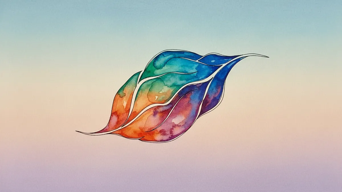
Learn how startup logo design evolves with your growing business. Create scalable, memorable branding that builds customer trust and drives growth.
Learn how startup logo design evolves with your growing business. Create scalable, memorable branding that builds customer trust and drives growth.
A startup logo that can't scale is a logo you'll pay to redesign within 18 months. I've watched it happen to dozens of early-stage companies: they rush through brand identity, pick something that looks fine on a pitch deck, then scramble when it falls apart on a mobile app icon or product packaging. Startup logo design isn't about making something pretty for launch day. It's about building a visual identity flexible enough to grow with your business, even when you have no idea what your business will look like in three years.
The biggest killer of startup logos isn't bad taste. It's short-term thinking. Founders treat their logo as a checkbox, something to get done before the investor meeting or the landing page goes live. The result? A mark that works in exactly one context and nowhere else.
Research from the MIT Sloan Management Review found that visual brand consistency across touchpoints increases revenue by up to 23% Keller & Swaminathan, 2020. For startups, inconsistency usually isn't a strategy problem. It's a design problem. The logo simply wasn't built to flex.
Here's what short-term logo thinking looks like in practice:
Think about it this way: your logo for new business needs to function on a billboard and a 16x16 pixel browser tab. If it can't do both, you've already limited your brand's reach before you've even started growing.
Simple logos outperform complex ones in recognition, recall, and trust. That's not opinion; it's backed by a study in the Journal of Consumer Research showing that simpler brand marks are perceived as more honest and dependable Hagtvedt, 2011. For startups still earning credibility, that perception gap matters enormously.
But simplicity doesn't mean boring. Stripe's logo is just a wordmark with two parallel lines. Airbnb's Bélo symbol is a single continuous stroke. Both are dead simple. Both are instantly recognizable worldwide.
The trick is reduction without losing meaning. Start by asking: what is the single most important idea your brand needs to communicate? Not three ideas. Not five. One.
Once you've identified that core concept, strip everything else away. If your mark still communicates the idea after removing a design element, that element was unnecessary. Keep going until removing anything would break the meaning.
For founders working on affordable brand design, this approach actually saves money. Simpler logos require fewer revisions, reproduce cheaply across materials, and rarely need reworking as the company scales. You can learn more about the financial side in our logo design cost breakdown.
Your startup might be a B2B SaaS tool today. In two years, you could be launching a consumer app, sponsoring events, or shipping physical products. A scalable logo anticipates contexts that don't exist yet.
I once worked with a health tech startup that had a gorgeous watercolor-style logo. Looked stunning on their website. Then they needed to embroider it on lab coats for a conference. The embroidery vendor sent back a sample that looked like a smudge. They spent $4,000 on a rush redesign.
Quick reality check: test your logo in these scenarios before you commit:
If your mark survives all five tests cleanly, you've got something built to last. Geometric shapes tend to perform well here, which is why so many enduring brands rely on them. Our guide on geometric logo design goes deeper into the structural reasons behind this.
Color is emotional shorthand. It communicates before your audience reads a single word. But startups often pick colors based on personal preference rather than strategic intent, then find themselves stuck with a palette that clashes with their evolving market position.
Research by Labrecque and Milne (2012) demonstrated that color saturation and value directly influence brand personality perceptions. High saturation signals excitement. Low saturation signals sincerity. The wrong saturation level can undermine your entire positioning.
Here's a practical framework for choosing startup colors:
Understanding color psychology in logos will help you make this call with confidence rather than gut instinct.
Worth noting: your color choice also affects production costs. Pantone spot colors cost more to print than CMYK process colors. If you're bootstrapping and printing business cards, packaging, or merchandise, a simpler color system keeps your affordable brand design truly affordable.
Your typeface choice communicates as much as your icon, sometimes more. A serif font whispers tradition and authority. A geometric sans-serif says modern and approachable. A hand-lettered wordmark suggests craft and personality. None of these are right or wrong. They're signals, and you need to choose yours deliberately.
For startup logo design, legibility at every size should be the non-negotiable baseline. After that, consider these factors:
Weight flexibility. Choose a typeface family with multiple weights (light, regular, bold, black). You'll need them for headlines, body copy, and UI elements as your brand system grows.
Licensing. Some beautiful typefaces cost thousands in licensing fees. Google Fonts and other open-source libraries offer excellent alternatives. Variable fonts, in particular, give you enormous flexibility from a single file.
Distinctiveness. If your typeface is the same one used by fifteen competitors, your wordmark won't stand out in a crowded market. Run a quick competitive audit before finalizing.
One thing designers overlook: how the typeface renders on screens versus in print. A font that looks crisp in Figma might blur on low-resolution Android devices. Always test across real devices, not just your MacBook Pro. When you're ready, present your logo to clients with mockups that demonstrate cross-platform rendering.
Gut feelings are unreliable when you've been staring at design options for weeks. You develop attachment to concepts for emotional reasons that have nothing to do with how your audience will perceive them.
This is where data helps. A/B testing logo concepts with real target users, even a small sample of 30 to 50 people, can reveal perception gaps that internal teams miss entirely. Ask participants to describe the brand personality they perceive from the logo alone, without any context. If their descriptions don't match your intended positioning, something needs to change.
You can also use neuroscience-backed analysis to evaluate how visual elements like shape, color, and composition trigger cognitive and emotional responses. This kind of logo analysis goes beyond subjective preference and into measurable perception data.
So what does this mean for your brand? It means you don't have to guess. Validation doesn't require a massive budget. Even lightweight testing beats no testing. And catching a misalignment before launch is infinitely cheaper than rebranding after you've printed 10,000 boxes.
Expect to spend between $500 and $5,000 for quality work from a freelance designer or small agency. Below $500, you're likely getting template-based output. Above $5,000 typically includes broader brand identity systems. Our logo design cost breakdown covers this in detail.
You can, but proceed carefully. Tools like Canva and Looka make it technically possible. The risk is creating something that looks amateur or sends unintended signals about your brand personality. At minimum, run your final design through a logo analysis to catch issues you might not see yourself.
Most startups benefit from a combination mark (icon plus wordmark) because you don't yet have the brand recognition to rely on a standalone symbol. As your brand matures, you can separate the elements. Think about how Nike used the full "Nike" wordmark for decades before the swoosh could stand alone.
If your business model, target audience, or market positioning has shifted significantly since launch, your logo may no longer fit. Other triggers include poor performance at small sizes, negative audience feedback, or visual similarity to competitors. Look for signs your logo needs a refresh before committing to a full rebrand.
Your startup logo is one of the first promises you make to your market. Make sure it's a promise your brand can keep as it grows. Ready to see how your current logo measures up? Analyze your logo with our neuroscience-powered platform and get actionable insights you can use today.
Geometric logo design builds instant credibility for your brand. Learn how clean shapes and modern p...
Discover logo design cost factors and pricing models to plan your brand budget effectively. Learn wh...

Discover how animated logo design captures attention and boosts brand recognition. Learn proven stra...
Get a free scientific analysis with 550+ metrics across perception and design.
Try Free Analysis