
neuroscience brandingvisual
Visual Processing Branding: 7 Neuroscience Secrets
Visual processing branding unlocks 7 neuroscience secrets that transform how customers perceive your...
Discover how your brain processes logos in milliseconds and recognizes brands instantly. Learn the neuroscience behind logo design and boost your brand impact.
Discover how your brain processes logos in milliseconds and recognizes brands instantly. Learn the neuroscience behind logo design and boost your brand impact.
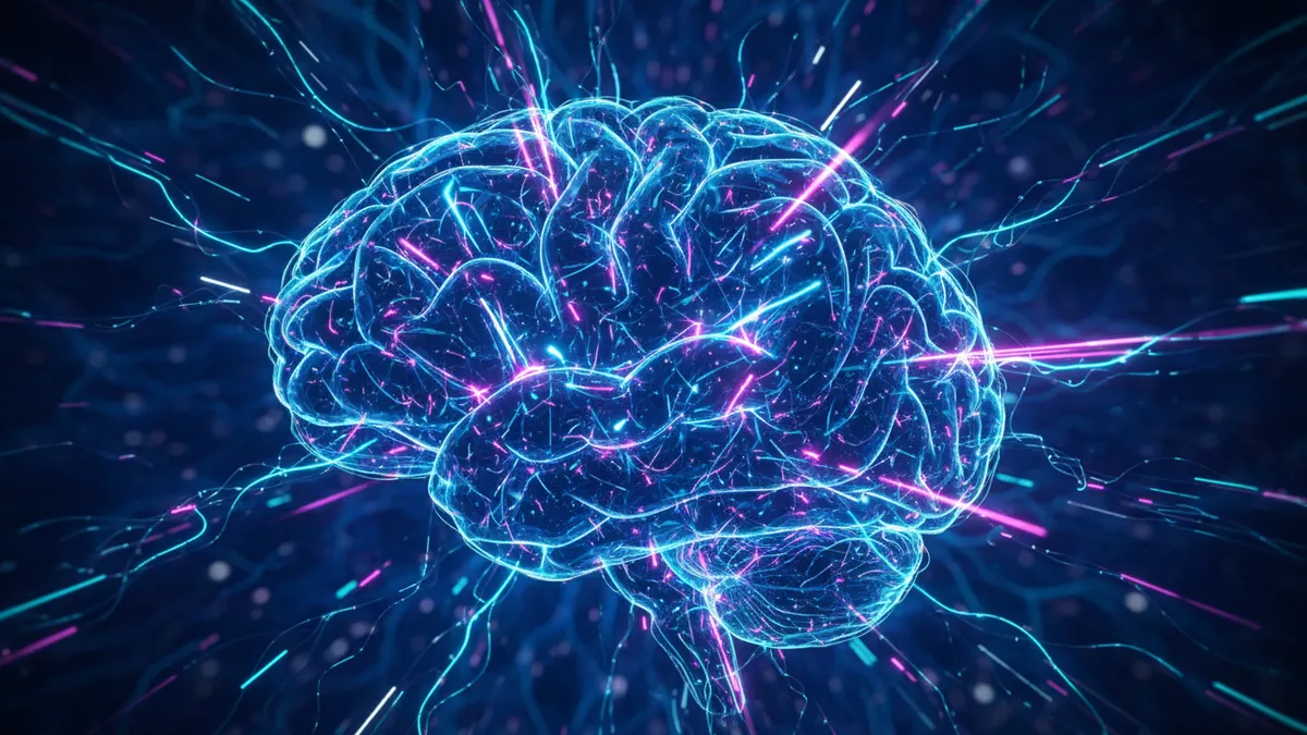
Your brain processes a logo in as little as 400 milliseconds — faster than you can read a single word. In that fraction of a second, your visual cortex extracts color, shape, and symmetry, then routes that information through emotional and memory centers to form a snap judgment about the brand behind it. Understanding how brain processes logos gives designers and brand managers a genuine edge: when you know what the brain prioritizes, you can design for it. Research in logo perception neuroscience shows that this rapid evaluation isn't random. It follows predictable neural pathways that favor certain visual features over others Henderson & Cote, 1998. The rest of this piece breaks down exactly what happens along those pathways — and what you can do about it.
Your brain begins categorizing a logo before you're consciously aware you've seen it. The process starts in the primary visual cortex (V1), where neurons fire in response to basic features — edges, contrast, orientation. Within roughly 100 milliseconds, that raw data moves to higher visual areas (V2, V4) that detect color relationships and spatial patterns Singh, 2006.
Here's the thing: your brain doesn't process a logo the way a scanner reads a file, pixel by pixel. It works in parallel streams:
By 250–400 milliseconds, your prefrontal cortex receives enough processed information to generate a preference signal. You "feel" something about the brand before you can articulate why Hynes, 2009. This is why visual processing branding matters so much — the conscious mind arrives late to a party the visual cortex started.
What to do with this: Design for the first 400 milliseconds. Prioritize high-contrast edges, a clear silhouette, and a limited color palette. If your logo doesn't read clearly at thumbnail size, you're losing the race before it begins. A quick logo analysis can reveal whether your mark survives that critical window.
Color is the first visual attribute your brain resolves, processed roughly 60–80 milliseconds before form and detail. This isn't a trivial head start. It means the emotional tone of your logo's palette reaches the amygdala — your brain's threat-and-reward detector — before the viewer even recognizes what your logo depicts Singh, 2006.
Research by Labrecque and Milne found that specific hues trigger reliable personality associations across large sample groups. Blue consistently activates perceptions of competence and trustworthiness. Red triggers excitement and urgency. Yellow signals warmth but can also read as caution Labrecque & Milne, 2012. These aren't cultural accidents — they're rooted in how photoreceptor cells and the lateral geniculate nucleus route chromatic signals.
Think about it this way: when someone sees your logo for the first time, color is doing the talking while shape is still getting dressed.
A few practical implications:
We explore this more deeply in our guide on color psychology in logos. If you want to see how your specific palette scores on emotional resonance, our neuroscience-backed analysis quantifies these associations.
Simpler logos are more memorable, more likable, and easier for the brain to encode into long-term memory. Henderson and Cote's foundational study on logo design found that marks rated high in "natural" design and low in complexity produced the strongest positive recognition scores Henderson & Cote, 1998. Your visual cortex literally works less hard to process them — and the brain rewards low processing effort with a feeling of fluency and trust.
This preference has a name: processing fluency. When a visual stimulus is easy to decode, your brain interprets that ease as familiarity, safety, and even truth. It's a cognitive shortcut, and logos benefit from it enormously.
Symmetry plays a specific role here. Bilateral symmetry (mirroring along a vertical axis) is detected by specialized neurons in area V4 and the lateral occipital complex. Your brain spots symmetry in under 100 milliseconds, and symmetrical forms consistently score higher on attractiveness ratings Kümmerer, 2022.
But "simple" doesn't mean "boring." The sweet spot is:
You might be wondering how to find that balance for your own mark. Running a logo comparison against competitors can show you where you sit on the complexity spectrum. Brands that nail this balance — think Apple, Nike, Target — all share high fluency scores despite looking nothing alike.
A logo only works if people remember it, and memory encoding depends on how deeply the brain processes the visual stimulus. Neuroscience distinguishes between shallow encoding (noticing a logo exists) and deep encoding (connecting it to meaning, emotion, or personal experience). Logos that reach deep encoding become part of your semantic memory — the same system that stores the meaning of words and concepts Aaker, 1997.
Three factors drive deep encoding for logos:
Here's a practical test: show someone your logo for half a second, then ask them to sketch it from memory an hour later. The elements they reproduce are the ones that made it past shallow encoding. The elements they forget are the ones the brain deemed expendable.
This is exactly why your logo matters beyond aesthetics — it's a memory device. If it isn't encoding properly, it's invisible no matter how often you display it. Our sample reports show how we measure memorability alongside other neuroscience-based metrics.
People prefer logos they've seen before — even if they don't remember seeing them. This is the mere exposure effect, one of the most replicated findings in psychology, and it has massive implications for branding. First documented by Zajonc in 1968, the effect shows that repeated exposure to a stimulus increases liking for it, independent of conscious recognition.
For logo perception neuroscience, this creates a strategic tension:
Labrecque and Milne's research confirmed that familiar brand colors trigger faster and more positive evaluations than unfamiliar ones, even when the actual brand name was removed from the stimulus Labrecque & Milne, 2012. Your brain builds a "color + shape" shortcut over time that bypasses conscious analysis entirely.
This is why radical rebrands are neurologically risky. When you change too many visual elements at once, you break the exposure-built shortcut and force the brain back to effortful processing. Suddenly, your loyal customers feel vaguely uncomfortable — and they may not know why.
If you're considering a redesign, check for signs your logo needs a refresh before committing. The smartest approach is evolutionary: change enough to feel current, keep enough to preserve the neural shortcut. A side-by-side comparison of your old and proposed marks can help you gauge how much recognition equity you'd sacrifice.
Your brain makes trust judgments about a brand within the first second of seeing its logo, and those judgments are surprisingly hard to override later. Research on visual identity and consumer trust shows that design quality functions as a proxy for company quality — a heuristic the brain applies automatically Hynes, 2009.
Several specific visual features signal trustworthiness to the brain:
Think about it this way: your logo is the visual equivalent of a handshake. A firm, consistent handshake builds confidence. A limp or erratic one creates doubt.
This connection between visual identity and trust is one reason professional logo analysis matters. You might love your logo personally, but the question that counts is whether the brain's trust circuitry responds to it the way you intend. Small misalignments or color inconsistencies you've stopped noticing can silently erode credibility with new audiences.
The brain begins processing a logo's basic features — color, edges, contrast — within 100 milliseconds of exposure. Full recognition, including brand association and emotional response, typically completes within 400 milliseconds Singh, 2006. Familiar logos are recognized even faster because the brain uses stored neural shortcuts built through repeated exposure.
Color reaches the brain's processing centers roughly 60–80 milliseconds before shape, making it the first brand signal your audience receives. However, shape drives long-term memorability and distinctiveness. The most effective logos optimize both — using color for instant emotional impact and shape for lasting recognition Labrecque & Milne, 2012.
Yes. The brain uses visual design quality as a heuristic for overall brand quality. Misaligned elements, inconsistent colors, or overly complex designs trigger error-detection responses in the anterior cingulate cortex, creating subconscious doubt about your brand's professionalism and reliability Hynes, 2009.
Simple logos benefit from processing fluency — the brain decodes them with less effort, and that ease gets misattributed as familiarity and trustworthiness. Henderson and Cote's research confirmed that lower-complexity marks scored significantly higher on recognition, liking, and perceived quality Henderson & Cote, 1998.
Modern logo analysis platforms apply findings from visual neuroscience — including processing fluency, color-emotion mapping, and symmetry detection — to evaluate logos systematically. These tools measure what traditional design critique can't: how the brain is likely to respond in those critical first milliseconds. You can learn more about how it works.
Now that you understand how brain processes logos — from the first color signal to deep memory encoding — the natural next question is: how does your logo perform? Logo Analyzer applies these neuroscience principles to give you a data-driven breakdown of your mark's strengths and blind spots. Analyze your logo in minutes and find out what your audience's brains already know.
Visual processing branding unlocks 7 neuroscience secrets that transform how customers perceive your...
Discover how brain science branding transforms your logo design to captivate audiences and drive mem...
Discover powerful logo color combinations that build brand trust and credibility. Learn which color ...
Get a free scientific analysis with 550+ metrics across perception and design.
Try Free Analysis