industry applicationsbeauty
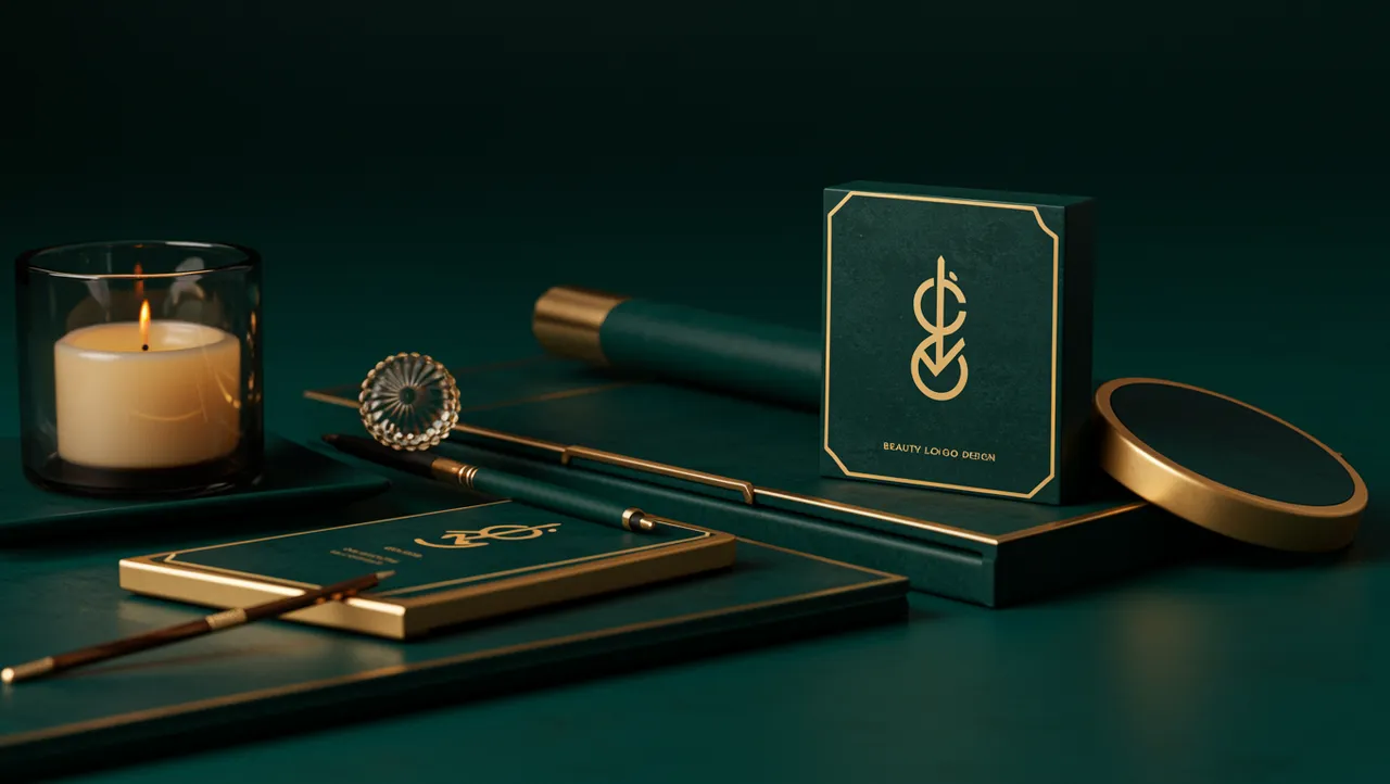
Beauty Logo Design That Captivates at First Glance
Discover stunning beauty logo design ideas that captivate customers instantly. Learn proven strategi...

Discover stunning music logo design examples and expert tips to create a memorable brand identity that resonates with your audience today.
Discover stunning music logo design examples and expert tips to create a memorable brand identity that resonates with your audience today.
A record label founder once told me his logo looked "like a law firm that plays guitar on weekends." He wasn't wrong. The mark featured a stiff serif wordmark with a tiny eighth note crammed into the corner, almost apologetically. Music logo design demands something most industries don't: it has to feel like sound looks. That's a strange brief. And most designers get it wrong by defaulting to predictable visual clichés instead of capturing the emotional frequency of the brand.
The challenge is that music spans everything from death metal to ambient jazz to K-pop. A single set of design rules won't cut it. But the neuroscience behind how people process music-related visuals? That's surprisingly consistent.
Static logos can feel dead for music brands. Research on visual perception shows that implied motion in design elements activates the same brain regions involved in processing actual movement Freyd, 1983. For a music brand, this matters enormously. Your audience expects energy, rhythm, and emotion before they hear a single note.
Think about it this way: Spotify's tilted sound waves suggest vibration. Beats by Dre uses a circle that doubles as a headphone ear cup, implying the act of listening. Neither logo contains a musical note, yet both feel unmistakably musical.
The mistake I see most often is designers reaching for treble clefs, headphones, or vinyl records as a first instinct. These symbols aren't inherently bad, but they've been used so many times that they've lost their punch. A logo analysis of music brands reveals that the most memorable marks tend to suggest sound through abstract means: wave forms, angular typography, asymmetric compositions that feel like they're vibrating.
One thing designers overlook: rhythm exists visually too. Repeating elements at varied intervals, alternating thick and thin strokes, or using negative space to create a visual "beat" can all make a logo feel musical without a single cliché icon.
Color choices in music logo design carry genre-specific weight that other industries rarely face. A hip-hop label using pastel pink sends a very different signal than a classical ensemble using the same palette. Your audience reads these cues instantly, often before they consciously register the logo's shape.
Research by Palmer et al. (2013) found strong cross-modal associations between color and music: people consistently match fast, loud music with saturated warm colors and slow, quiet music with desaturated cool tones. This isn't arbitrary preference. It's wired into how our brains connect sensory experiences.
Here's what this means practically:
But here's the catch: breaking genre color conventions can be a powerful differentiator, as long as you do it deliberately. A metal band using a minimalist white-and-gold logo stands out precisely because it defies expectations. The key is knowing the rules before you break them. Understanding the psychology of color gives you that foundation.
The typeface in a music logo does more emotional heavy lifting than most designers realize. Typography doesn't just spell out a name; it sets a tempo, a mood, a volume level. A condensed grotesque screams something completely different than a flowing script.
Research on font personality Grohmann, 2016 confirms that people assign consistent emotional traits to typefaces. Angular, heavy fonts register as aggressive and exciting. Rounded, lightweight fonts feel friendly and calm. For music brands, this creates an opportunity to "hear" the brand through its letterforms.
Consider this: Iron Maiden's jagged, pointed wordmark practically sounds like distorted guitar. The Grateful Dead's rounded, psychedelic lettering feels like a slow jam. Neither logo needs supporting imagery because the typography carries the entire sonic identity.
Some practical guidelines for music logo typography:
If you're unsure whether your typography matches your brand's sonic identity, a neuroscience-backed analysis can reveal mismatches between what your font communicates and what your audience expects.
Cross-industry inspiration often produces the most original music logos. The animal logo design space, for instance, has mastered the art of conveying personality through a single creature. Music brands can borrow this approach. Think of the Gorillaz, whose animated primate imagery became inseparable from their sound. Or consider how Thundercat's visual identity uses feline imagery to project the same playful unpredictability as his bass lines.
Pet industry branding and pet brand logo design offer another unexpected lesson: emotional immediacy. Pet brands need to trigger warmth and trust within milliseconds. Music brands need a similar speed of emotional connection, just with different target emotions. The techniques are transferable: simplified shapes, expressive eyes or faces, and bold color blocking all create instant recognition.
Even beauty brand identity and cosmetics branding hold relevant insights. Luxury beauty brands have perfected the balance between minimalism and aspiration. A music brand targeting premium audiences (think high-end audio equipment or boutique vinyl labels) can study how brands like Chanel or Aesop use restraint to signal quality. The lesson? Sometimes what you leave out of a logo matters more than what you put in.
Looking at real-world examples across industries reveals patterns that pure music-industry research misses.
Too many music brands skip validation and go straight from design to deployment. That's risky. What feels right to you and your designer might confuse or alienate your actual audience.
I've seen this mistake countless times: a brand owner falls in love with a concept during the design process, only to discover months later that fans associate it with a competing label or a completely different genre. By then, merch has been printed, social profiles are set, and the cost of change is enormous.
Effective testing doesn't require a massive budget. Start by showing your logo to 15 to 20 people in your target demographic without any context. Ask them three questions: What kind of music does this brand make? How does this logo make you feel? Would you trust this brand to curate a playlist you'd enjoy?
Their answers will reveal alignment gaps you can't see from the inside. A logo comparison against competitors can also expose whether your mark is distinctive enough to survive in a crowded streaming marketplace, where logos appear as tiny thumbnails next to dozens of others.
Worth noting: eye-tracking research shows that people scan music platform interfaces in predictable patterns. If your logo doesn't grab attention within the first 200 milliseconds at thumbnail scale, it functionally doesn't exist.
Music logos need to convey sound, energy, and genre through purely visual means. Unlike corporate or healthcare logos that prioritize trust and clarity, music logos must trigger an emotional and almost physical response. The best ones make you "hear" the brand before you press play.
Not necessarily. Musical symbols like treble clefs and headphones are so overused that they often weaken rather than strengthen a brand. Abstract shapes, expressive typography, and strategic color choices can communicate musicality more effectively while keeping your logo distinctive.
Start with your genre's conventions, then decide whether to follow or subvert them. Research shows people associate saturated warm colors with energetic music and cool muted tones with calmer genres Palmer et al., 2013. Test your choices with your target audience before committing.
You should design for this from the start. Create a logo system with variations for different contexts: a full version for large formats, a simplified icon for streaming thumbnails, and a high-contrast version for merchandise. Consistency across touchpoints builds recognition faster.
Your music logo is working for you around the clock, on every platform, playlist, and piece of merch. But is it sending the right signal? Use Logo Analyzer to analyze your logo with neuroscience-backed metrics and find out whether your visual identity sounds as good as your music does.
Discover stunning beauty logo design ideas that captivate customers instantly. Learn proven strategi...

Discover how AI analysis transforms travel logo design into stunning visual identities. Learn expert...

Learn how construction logo design builds client trust and establishes your brand. Discover proven s...
Get a free scientific analysis with 550+ metrics across perception and design.
Try Free Analysis