industry applicationstravel
Travel Logo Design Refined With AI Analysis
Discover how AI analysis transforms travel logo design into stunning visual identities. Learn expert...
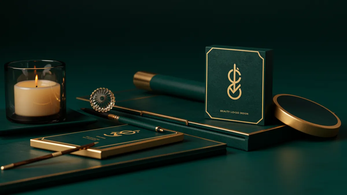
Discover stunning beauty logo design ideas that captivate customers instantly. Learn proven strategies to create memorable, elegant brands that stand out and...
Discover stunning beauty logo design ideas that captivate customers instantly. Learn proven strategies to create memorable, elegant brands that stand out and...
A beauty brand lives or dies by its visual first impression. That's not hyperbole. I once consulted with a skincare startup that had a genuinely superior product, clinically tested, dermatologist-approved, the whole package. But their logo looked like it belonged on a hardware store flyer. They couldn't get shelf space. Retailers took one look at the branding and passed.
Beauty logo design operates under unique pressure. Your mark has to communicate luxury, care, and aspiration before a single word is read. And unlike most industries, beauty consumers make split-second judgments based almost entirely on visual cues. Get the logo wrong, and no amount of influencer marketing will save you.
Beauty consumers are trained to notice design details. Years of exposure to carefully art-directed campaigns from brands like Chanel, Glossier, and Fenty Beauty have calibrated their expectations. Your logo isn't just competing with other startups. It's competing with decades of visual sophistication.
Research on consumer perception in the cosmetics industry shows that packaging aesthetics directly influence perceived product quality Reimann et al., 2010. People literally believe a product works better when it looks better. That's not vanity; it's neuroscience. The brain processes visual attractiveness and assigns value before conscious evaluation even kicks in.
Here's what this means for your beauty brand identity: your logo needs to signal category membership instantly. A consumer scrolling through Sephora's website or walking past a shelf needs to recognize your brand as "beauty" within milliseconds. But you also need differentiation. Looking like every other minimalist sans-serif beauty brand won't cut it either.
The tension between fitting in and standing out is the central challenge. Brands that resolve it well, think Drunk Elephant's playful typography or Aesop's apothecary-inspired aesthetic, earn instant recognition and consumer trust. Those that don't resolve it tend to blend into the background noise.
The typeface you choose for a beauty logo communicates your brand's personality faster than color or imagery. Serif fonts suggest heritage and sophistication. Clean sans-serifs read as modern and clinical. Script fonts evoke femininity and artisanal craft. Each choice attracts a different consumer segment and repels another.
Consider how cosmetics branding has shifted over the past decade. The "blanding" trend, where luxury brands all adopted near-identical minimalist wordmarks, peaked around 2018-2019. Burberry, Balmain, and Saint Laurent all flattened their logos into generic sans-serif type. The beauty industry followed suit.
But the pendulum is swinging back. Brands are rediscovering that distinctive typography creates memorability. Research on font perception demonstrates that consumers associate specific typeface characteristics with brand traits like trustworthiness, excitement, and competence Doyle & Bottomley, 2006. A rounded, soft typeface triggers different emotional responses than an angular, high-contrast one.
One thing designers overlook: legibility at small sizes matters enormously in beauty. Your logo will appear on product tubes, compact mirrors, lip gloss applicators, and tiny Instagram profile pictures. A delicate script that looks gorgeous on a billboard can become an illegible smudge on a mascara wand. Always stress-test your typography at its smallest intended reproduction size before committing.
Color in beauty branding isn't just about aesthetics; it's a shorthand for product category and brand promise. Black signals prestige. Soft pink communicates gentle skincare. Green tells consumers "natural" or "clean beauty." These associations are deeply ingrained, and violating them requires deliberate strategy, not accident.
The psychology of color research consistently shows that color accounts for up to 90% of snap judgments about products Singh, 2006. In beauty, this effect is amplified because the products themselves are about transformation and self-expression.
Think about it this way: Clinique built its entire visual identity around a specific shade of green that communicates dermatological credibility. The Ordinary uses clinical white and black to signal transparency and no-nonsense formulation. Neither choice is random.
What should you do with this? Start by mapping your brand positioning against color associations in your specific sub-category:
Then verify whether your chosen palette actually triggers the intended emotional response. A neuroscience-backed analysis can reveal whether your color choices align with consumer expectations or inadvertently send mixed signals.
This might seem like an unexpected connection, but animal logo design principles offer genuine lessons for beauty brands. The pet industry has quietly become one of the most sophisticated branding spaces, with premium pet care brands now rivaling beauty companies in visual polish.
Pet industry branding faces a similar challenge to beauty: communicating care, trust, and emotional connection through visual identity. Brands like Ollie, The Farmer's Dog, and Wild One have built premium identities that wouldn't look out of place in a beauty aisle. Their logos use warm colors, approachable typography, and clean design systems that signal quality without pretension.
Pet brand logo design also teaches an important lesson about audience duality. Pet brands must appeal to the human buyer while referencing the animal. Beauty brands face their own version of this: you're selling to the person someone wants to become, not just who they are right now. The logo has to reflect aspiration and accessibility simultaneously.
Where these industries converge most is in the trend toward humanized, emotionally resonant branding. Both beauty and pet care have moved away from sterile, corporate aesthetics toward warmer, more personal visual identities. If your beauty logo feels cold or impersonal, studying how premium pet brands create warmth through design could spark useful ideas. You can explore more approaches across sectors in our logo design by industry guides.
Too many beauty brands finalize their logo based on internal consensus alone. The founder likes it. The designer is proud of it. Everyone on the team has seen it so many times it feels "right." But none of those people are your customer.
I've seen this mistake play out repeatedly. A brand spends months refining a mark, launches it, and then discovers through sluggish sales or confused social media feedback that the logo communicates something entirely different from what they intended. A logo that reads as "premium organic skincare" to the team might read as "expensive and unapproachable" to the target consumer.
Quick reality check: your logo will be seen by people who have zero context about your brand. They won't know your ingredient story, your founder's mission, or your price point. They'll see the logo and make a judgment in roughly 50 milliseconds Lindgaard et al., 2006. That judgment determines whether they pick up the product or keep scrolling.
This is where logo analysis becomes essential. Rather than relying on gut feeling or small sample feedback from friends, you can measure how your logo actually performs on cognitive and emotional dimensions. Does it trigger the right associations? Is it memorable after a single exposure? Does it communicate your category correctly? These are testable questions, and you should test them before spending money on packaging, signage, and marketing collateral. Check out our sample reports to see what this kind of analysis reveals.
A logo alone doesn't build a beauty brand. It's the anchor of a larger visual system that includes packaging, social media templates, website design, and retail displays. The strongest beauty brands treat their logo as one element in a tightly coordinated identity system.
Glossier is the textbook example. Their logo is simple, almost plain. But the complete system, the millennial pink, the editorial photography style, the sticker sheets in every order, creates an unmistakable brand world. The logo works because everything around it reinforces the same message.
For your brand, this means thinking beyond the mark itself during the design process. Ask these questions early:
Worth noting: building trust through visual identity requires consistency across every touchpoint. A beautiful logo paired with inconsistent packaging and sloppy social templates actually damages credibility more than a mediocre logo applied consistently. Consistency signals professionalism, and professionalism signals trustworthiness.
Beauty logos must balance aspiration with approachability, often at extremely small physical sizes. They face higher aesthetic scrutiny because consumers associate visual quality with product quality. Category-specific color and typography conventions also play a stronger role than in most other industries.
Most successful beauty brands use wordmarks or wordmark-plus-simple-icon combinations. Overly complex icons reduce legibility on small packaging. Start with a strong typographic solution, then explore whether a minimal icon adds meaning without adding clutter.
Evaluate your logo every 3-5 years against current market positioning and consumer expectations. If you're noticing signs your logo needs a refresh, don't wait. Subtle refinements often outperform dramatic overhauls, which can alienate existing customers.
While beauty logo design and animal logo design share principles around emotional connection and premium signaling, each category has distinct visual conventions. A unified parent brand identity can work, but individual product lines typically need category-appropriate visual treatments.
Your beauty logo is doing more work than you think. It's your brand's first handshake with every potential customer, and in beauty, that handshake determines everything. If you're unsure whether your current mark is sending the right signals, analyze your logo with neuroscience-backed tools that measure what consumers actually feel when they see your brand. The data might surprise you.
Discover how AI analysis transforms travel logo design into stunning visual identities. Learn expert...
Learn how construction logo design builds client trust and establishes your brand. Discover proven s...
Discover stunning music logo design examples and expert tips to create a memorable brand identity th...
Get a free scientific analysis with 550+ metrics across perception and design.
Try Free Analysis