
industry applicationsconstruction
Construction Logo Design That Builds Client Trust
Learn how construction logo design builds client trust and establishes your brand. Discover proven s...
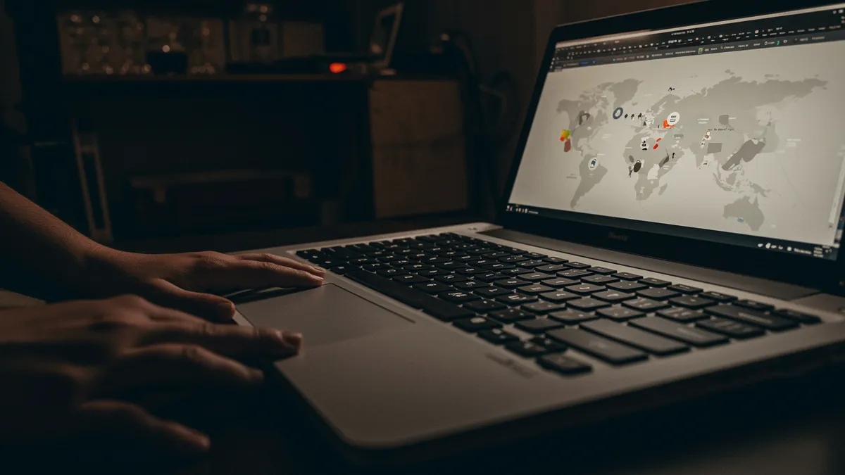
Discover how AI analysis transforms travel logo design into stunning visual identities. Learn expert techniques to elevate your brand today.
Discover how AI analysis transforms travel logo design into stunning visual identities. Learn expert techniques to elevate your brand today.
A travel brand's logo has roughly 50 milliseconds to convince someone it can deliver the trip of a lifetime. That's not much time to communicate trust, adventure, and professionalism all at once. I once worked with a boutique tour operator whose logo featured a generic globe icon, a swooshing airplane, and three different shades of blue. They couldn't figure out why customers kept confusing them with a budget airline. The problem wasn't their service. It was their travel logo design.
The travel industry has a serious visual identity crisis. Open any directory of tour operators, travel agencies, or hospitality brands, and you'll see the same handful of symbols recycled endlessly: globes, compass roses, airplanes, palm trees, and sunsets. Research on visual distinctiveness in branding suggests that logos sharing common category cues become harder to differentiate in memory Pieters & Wedel, 2004. When every competitor uses the same iconography, none of them stand out.
Think about it this way: if your logo could belong to any of your competitors, it's not doing its job. The strongest travel brands break from category conventions. Airbnb abandoned every tourism cliché and built its identity around the Bélo symbol, representing belonging rather than destinations. The result was a mark that felt human and distinctive in a sea of sameness.
Your first step should be auditing your logo against direct competitors. Place them side by side and ask a stranger to identify yours. If they can't pick it out in under three seconds, you have a differentiation problem. A quick logo analysis can reveal exactly how distinctive your mark is compared to industry norms.
Blue dominates travel branding for good reason. It signals reliability and calm, two emotions travelers desperately want when handing over their credit card for a $4,000 vacation. But here's the catch: when 67% of your competitors also use blue, you've traded emotional resonance for invisibility.
Color psychology research shows that warm tones like coral, amber, and terracotta trigger associations with adventure and excitement Labrecque & Milne, 2012. Luxury travel brands lean toward deep navy paired with gold. Eco-tourism companies find success with sage green and earth tones. The psychology of color matters enormously here, because travelers make emotional purchasing decisions more than almost any other consumer segment.
One thing designers overlook: your color palette needs to work across wildly different contexts. A travel logo appears on mobile apps, luggage tags, vehicle wraps, website headers, and sometimes embroidered on staff uniforms. Test your palette at every scale. Colors that look sophisticated on a desktop mockup can turn muddy on a small mobile screen or disappear entirely when printed on dark fabric.
If you're stuck between palettes, run a neuroscience-backed analysis to see which combination generates stronger emotional responses from your target audience.
Font selection in travel logo design communicates your market positioning before a single word is read. Serif typefaces signal heritage, trustworthiness, and premium experiences. Sans-serif fonts lean modern, accessible, and efficient. Script fonts suggest romance and boutique exclusivity. Each choice attracts a different traveler.
A family adventure company using a thin, elegant serif is sending mixed signals. So is a luxury safari brand using a rounded, playful sans-serif. The typography needs to match the emotional promise of the experience you sell.
Consider this: research on typeface personality attributes found that consumers assign specific personality traits to fonts within 500 milliseconds Doyle & Bottomley, 2006. Heavy, geometric sans-serifs feel authoritative. Light, humanist typefaces feel approachable. And travelers respond to these signals even when they can't articulate why one brand "feels" more premium than another.
The practical move here is to test your typography in context. Set your brand name in your chosen font, then place it next to a tagline like "Luxury Escapes" or "Family Adventures." Does the font reinforce that message or contradict it? If there's tension, your typography is working against you.
Some of the most effective travel logos borrow visual strategies from completely unrelated sectors. This is where cross-industry thinking gets interesting.
Animal logo design and pet industry branding offer a useful parallel. The best pet brand logo design uses organic shapes and warm palettes to create instant emotional warmth, exactly what a travel brand targeting families or nature lovers should aim for. Think about how brands like REI or Patagonia use natural forms to evoke outdoor experiences without resorting to literal mountain illustrations.
Similarly, beauty brand identity and cosmetics branding excel at communicating luxury through minimalism, restrained color palettes, generous whitespace, and refined typography. A high-end resort or boutique travel agency could borrow these principles directly. The Four Seasons logo, for instance, feels more like a luxury cosmetics mark than a traditional hospitality brand. That's intentional, and it works.
You can see how different industries approach building trust through visual identity and adapt those strategies for your own travel brand. The lesson? Stop looking only at what other travel companies do. Your best inspiration might come from an entirely different category.
Gut instinct has its limits. You might love your logo, your designer might love it, and your team might unanimously approve it. But none of that tells you how a first-time visitor perceives it in the critical first moments of exposure.
AI-powered logo analysis tools measure what human review often misses: visual complexity scores, color contrast ratios, emotional associations, memorability potential, and scalability issues. These aren't subjective opinions. They're data points grounded in cognitive science and visual perception research.
I've seen travel companies redesign logos based on internal feedback alone, only to discover later that their "improved" mark tested worse with actual consumers. A brand analysis tool removes that guesswork. It can flag problems like overly complex iconography that loses detail at small sizes, or color combinations that create accessibility issues for colorblind users (roughly 8% of men, which is a significant chunk of your audience).
For travel brands operating across multiple markets, this kind of analysis is especially valuable. What reads as "adventurous" in one culture might feel aggressive in another. Our case studies show how brands across industries have used data-driven analysis to refine their visual identities before costly rollouts.
Not every logo needs a full redesign. Sometimes small refinements make a massive difference. But certain warning signs suggest deeper problems.
Your logo might need attention if customers consistently describe your brand differently than you intend. Or if your mark becomes illegible below a certain size, which is common for travel logos with detailed illustrations. Another red flag: your booking conversion rate drops on mobile, where your logo occupies precious screen real estate and sets the visual tone for the entire experience.
Worth noting: if your brand has expanded its offerings since the logo was designed, there's likely a mismatch. A company that started as a beach resort but now offers city tours, culinary experiences, and wellness retreats probably outgrew its original palm-tree icon years ago. Check out our guide on signs your logo needs a refresh for a more detailed diagnostic.
The fix doesn't always mean starting from scratch. Sometimes it means simplifying an overly complex mark, adjusting the color palette for better digital performance, or updating typography to match your current positioning. Small, strategic changes can dramatically shift perception.
Travel logos must balance aspiration with trust. Unlike retail or tech logos, they need to evoke emotional experiences (adventure, relaxation, discovery) while simultaneously communicating reliability. The best ones do this through color and typography rather than literal imagery like airplanes or globes.
Budget depends on your business scale. Solo travel agents might invest $500 to $2,000 for quality freelance work. Mid-size tour operators typically spend $3,000 to $10,000 with a branding agency. Enterprise hospitality brands often invest $50,000 or more. Whatever you spend, include AI-based logo evaluation in your process.
Not necessarily. Literal travel icons (planes, suitcases, maps) can limit your brand as you grow and often blend in with competitors. Abstract marks or wordmarks tend to age better and offer more flexibility across services, markets, and touchpoints.
If both represent the same brand, consistency matters. But a travel blog and a booking agency serve different functions and audiences. You might use the same core mark with variations in color or tagline to differentiate. Test both versions with a sample analysis to see how each performs.
Your travel logo is working for or against you right now, with every website visit, every social media scroll, every brochure pickup. If you're not sure which one it is, analyze your logo with Logo Analyzer and get a neuroscience-backed assessment of how travelers actually perceive your brand. The insights might surprise you.
Learn how construction logo design builds client trust and establishes your brand. Discover proven s...

Discover stunning music logo design examples and expert tips to create a memorable brand identity th...
Discover how effective healthcare logo design builds patient trust and credibility. Learn proven str...
Get a free scientific analysis with 550+ metrics across perception and design.
Try Free Analysis