
design principlesdigital
Digital Brand Logo Design That Scales Across Platforms
Create a digital brand logo that works perfectly across all platforms. Learn scalable design princip...
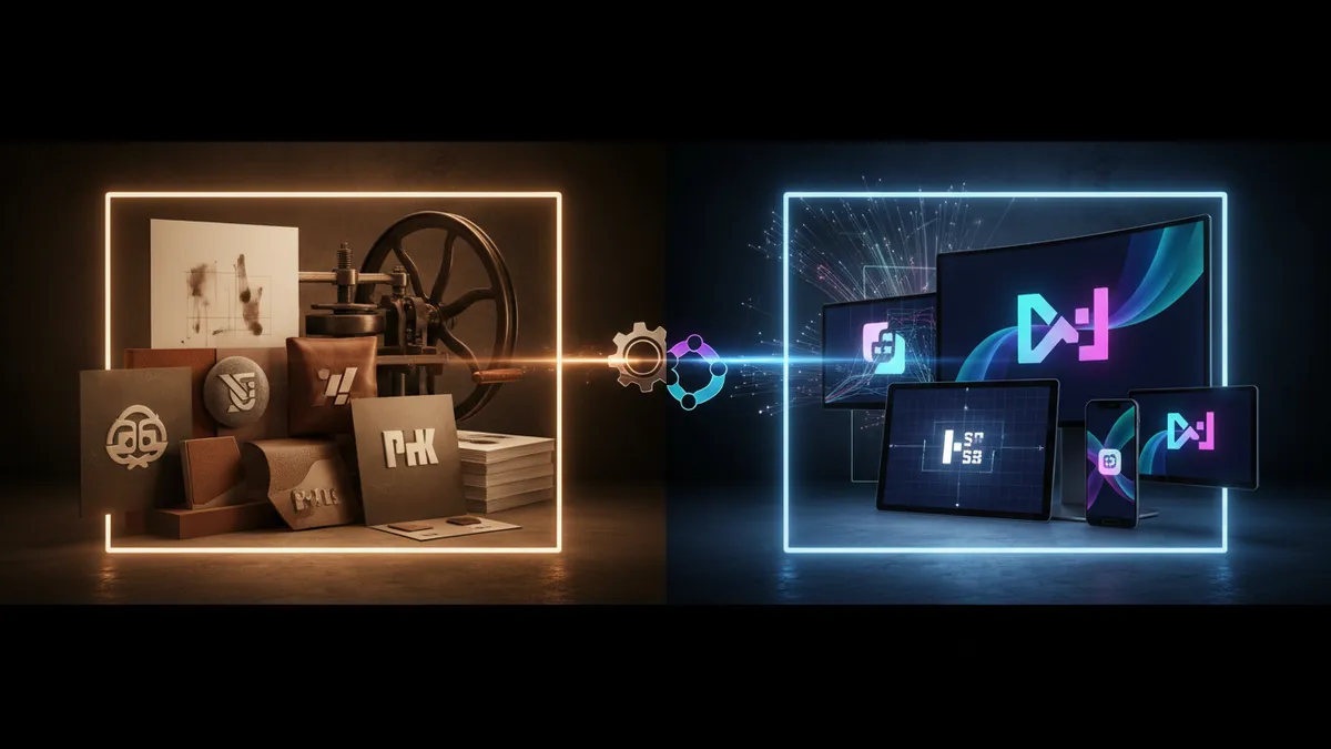
Logo print vs digital optimization strategies for every medium. Learn how to adapt your brand across platforms and maximize visual impact.
Logo print vs digital optimization strategies for every medium. Learn how to adapt your brand across platforms and maximize visual impact.
A logo that looks stunning on your laptop screen can turn into an unreadable smudge on a business card. This gap between logo print vs digital performance is one of the most expensive oversights in brand design, and it hits startups and small businesses the hardest. I've watched founders spend months perfecting a logo in Figma, only to panic when the printer delivers muddy, lifeless results.
The fix isn't complicated. But it does require understanding how light, ink, geometry, and file formats interact across mediums. Let's break it down.
Screens and printed surfaces produce color through fundamentally different physics. Your monitor blends red, green, and blue light (RGB) to create colors. A printer mixes cyan, magenta, yellow, and black ink (CMYK) to absorb light from paper. These two systems don't overlap perfectly, which means certain colors you see on screen simply cannot be reproduced in print.
Research on cross-media color reproduction confirms that up to 20% of the RGB color gamut falls outside the printable CMYK range Green, 2010. Vibrant electric blues, neon greens, and saturated oranges are the usual casualties. If your logo for new business relies heavily on one of these colors, you'll see a noticeable shift when it hits paper.
Here's what's interesting: the problem isn't just color. Screen resolution operates in pixels per inch (PPI), while print uses dots per inch (DPI). A logo that looks crisp at 72 PPI on a website needs 300 DPI minimum for a clean print. Scaling a low-resolution file up doesn't add detail. It adds blur.
What to do: Always design your logo in vector format (SVG, AI, or EPS). Vectors scale infinitely without quality loss. Then export separate optimized versions for print (CMYK color profile, 300+ DPI) and digital (RGB, optimized file size). This single habit prevents the majority of cross-medium disasters.
Logo geometry meaning matters more than most designers admit, especially when a mark needs to work across print and digital contexts. Simple geometric shapes hold up better at small sizes, reproduce more reliably on low-quality printers, and render faster on screens. Complex illustrations with thin lines and intricate details? They fall apart.
Consider the difference between a circular logomark and a detailed crest. The circle reads clearly whether it's embroidered on a polo shirt, stamped on a pen, or squeezed into a 16x16 pixel favicon. The crest loses its detail at every reduction.
Research into shapes in logo design shows that consumers associate basic geometric forms with specific brand traits. Circles suggest community and warmth. Squares and rectangles communicate stability. Triangles imply dynamism and ambition Jiang et al., 2016. These associations remain consistent whether someone encounters the logo on a billboard or a mobile ad, which makes geometric simplicity a strategic advantage, not just a practical one.
One thing designers overlook: rounded shapes tend to trap ink during offset printing, causing "fill-in" at small sizes. If your logo uses tight curves or enclosed counters (like the interior of a lowercase "e"), test it at the smallest size you'll ever need before finalizing the design. A logo analysis can flag these vulnerabilities before they cost you a print run.
Budget-conscious founders often pick colors based on what looks good on their monitor. That's a recipe for expensive reprints. An affordable brand design approach means choosing colors that translate well across both RGB and CMYK from the start.
Stick to colors that exist comfortably in both gamuts. Deep blues, warm reds, forest greens, and earthy tones tend to survive the RGB-to-CMYK conversion with minimal shifting. If you want to understand how specific hues affect perception, exploring color psychology in logos is a smart starting point.
Quick reality check: Pantone spot colors solve the consistency problem for print, but they add cost. For a startup logo design on a tight budget, you might not need Pantone matching for every application. Focus on getting your CMYK and RGB values defined in your brand guidelines, and reserve Pantone specs for high-visibility materials like packaging or trade show banners.
The wrong file format is the silent killer of logo consistency. Every medium has a format that works best, and using the wrong one creates problems that look like design flaws but are really technical mistakes.
For digital use, SVG is the gold standard. It's vector-based, scales to any screen size, and keeps file weight low. PNG works when you need transparency (think watermarks or overlays on photos). JPEG compresses aggressively and introduces artifacts around sharp edges, so avoid it for logos entirely.
For print, PDF or EPS files with embedded CMYK profiles give your printer exactly what they need. Never send a printer a JPEG pulled from your website. I've seen this happen more times than I'd like to admit, and the results are always disappointing.
Think about it this way: your logo file library should contain at least six versions. A full-color SVG for web. A full-color PNG with transparency for presentations. A full-color CMYK PDF for print. Then reversed (white) versions of each for dark backgrounds. Add a single-color black version for faxes, stamps, and low-fidelity reproductions, and you're covered for virtually any scenario.
If you're building a logo for new business applications, creating this file library upfront costs almost nothing in extra time. Recreating it later, under deadline pressure, costs a lot more. For guidance on building a mark that performs everywhere, check out our article on designing a multi-purpose logo that works everywhere.
Designing for both print and digital isn't finished until you've tested in actual conditions. And by "actual," I don't mean zooming in on your screen. I mean printing your logo on the cheapest paper you'll ever use, viewing it on a cracked phone screen in direct sunlight, and shrinking it to the size of a social media avatar.
Eye-tracking research shows that users form impressions of visual marks in under 400 milliseconds Pieters & Wedel, 2004. If your logo isn't immediately legible at the size and medium where someone first encounters it, you've lost that moment. There's no second chance for a first scan.
Build a testing checklist:
This is where it gets tricky. Problems you catch during testing are cheap to fix. Problems you catch after printing 5,000 brochures are not. A neuroscience-backed analysis can simulate how your logo performs across contexts before you commit to production.
Startups face a unique constraint. You need a logo that works everywhere immediately, but you probably can't afford a complete rebrand in 18 months. That tension makes the print-vs-digital question especially critical for early-stage companies.
The smartest startup logo design strategy is to design for the hardest medium first. If your logo works beautifully as a one-color stamp on a napkin, it will absolutely work on a website. The reverse is not true. Designing screen-first and adapting for print almost always forces compromises.
Keep your mark simple. Limit your colors. Choose shapes with clear geometry and enough whitespace to breathe at small sizes. And document everything in a basic brand guide, even if it's just a two-page PDF. Future you (or your first design hire) will be grateful.
Worth noting: many founders skip professional logo analysis because they assume it's only for established brands. But catching a print-digital mismatch before you order business cards, signage, or packaging is exactly the kind of move that separates scrappy-smart startups from ones that burn cash on avoidable mistakes. You can see real-world examples of how this process works in practice.
No. Print requires CMYK color profiles and high resolution (300+ DPI), while digital uses RGB and lower resolution. Using a single file for both will result in color shifts and quality loss. Always maintain separate optimized versions for each medium.
PNG with a transparent background works best for most social platforms. It preserves sharp edges and supports transparency. SVG is ideal for websites but isn't supported by most social media upload systems. Keep file sizes under 1MB for fast loading.
Convert your RGB values to CMYK in your design software and compare them side by side. If you notice a significant shift, adjust your CMYK values manually until the printed result matches your intent. Printing a test proof is always worth the small cost.
Design for print first. Print is the more restrictive medium, with tighter color gamuts, resolution requirements, and size constraints. A logo that works in print will almost always translate well to digital, but the opposite frequently fails.
Your logo needs to perform everywhere your brand shows up, not just on the screen where you designed it. If you're unsure whether your mark survives the jump from digital to print (or vice versa), analyze your logo with our neuroscience-powered platform. You'll get specific, actionable feedback on how your design holds up across every medium that matters.
Create a digital brand logo that works perfectly across all platforms. Learn scalable design princip...

Geometric logo design builds instant credibility for your brand. Learn how clean shapes and modern p...

Learn how startup logo design evolves with your growing business. Create scalable, memorable brandin...
Get a free scientific analysis with 550+ metrics across perception and design.
Try Free Analysis