design principleslogo
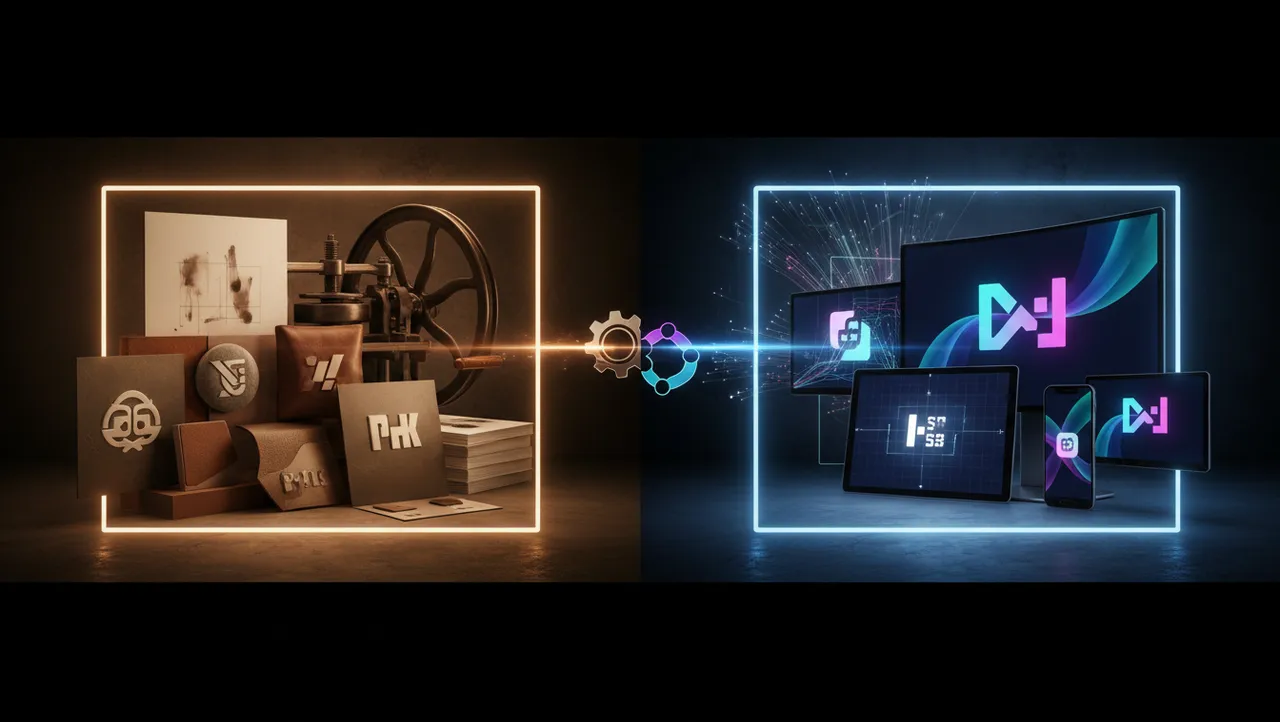
Logo Print vs Digital Optimization for Every Medium
Logo print vs digital optimization strategies for every medium. Learn how to adapt your brand across...

Create a digital brand logo that works perfectly across all platforms. Learn scalable design principles that elevate your brand identity today.
Create a digital brand logo that works perfectly across all platforms. Learn scalable design principles that elevate your brand identity today.
A digital brand logo that looks stunning on a desktop monitor but turns into an unrecognizable smudge on a smartwatch has already failed. I've watched this happen to startups that spent months perfecting their mark on a 27-inch screen, only to discover it fell apart everywhere else. The uncomfortable truth? Most logos aren't designed for the places where people actually encounter them. They're designed for pitch decks and business cards. But your audience lives on phones, tablets, app stores, and social feeds. If your logo can't survive the jump between those contexts, it's not a logo. It's a liability.
A logo that doesn't scale is a logo that doesn't work. Full stop. Your mark will appear at sizes ranging from a 16x16 pixel favicon to a billboard-sized hero image, and it needs to remain legible and emotionally coherent across that entire spectrum.
Research from MIT's AgeLab found that visual complexity significantly reduces recognition speed at small sizes Reimer et al., 2014. The more intricate your design, the faster it degrades when scaled down. Think about it this way: Slack's original plaid hashtag logo was colorful and distinctive, but the company eventually simplified it because the eleven-color version created rendering problems across platforms.
This is where startup logo design gets tricky. Founders often want a logo that communicates everything about their brand at once. The mission, the values, the personality, the product category. But cramming all of that into one mark creates visual noise that collapses at small sizes.
What should you do instead? Design at the smallest size first. If your logo reads clearly at 32x32 pixels, it will almost certainly look great at larger sizes. The reverse is rarely true. You can check how your mark performs across contexts with a quick logo analysis that tests rendering at multiple scales.
Shapes in logo design aren't decorative choices. They carry psychological weight. Circles suggest community, unity, and warmth. Squares communicate stability and reliability. Triangles imply direction, ambition, and energy. These associations aren't arbitrary; they're rooted in how human visual processing works.
A study published in the Journal of Consumer Research found that angular logos increased perceptions of durability, while rounded logos boosted perceptions of comfort and approachability Jiang et al., 2016. Your geometric choices are quietly shaping how people feel about your brand before they read a single word.
Here's what's interesting: logo geometry meaning becomes even more important in digital contexts because you lose so many other cues. There's no paper texture, no physical weight, no spatial context. The shape of your mark is doing more heavy lifting than it would on a printed brochure.
Some practical guidelines for choosing geometry:
One thing designers overlook: rounded shapes render more cleanly at small pixel sizes because they don't create the aliasing artifacts that sharp angles sometimes produce. If your logo will primarily live in digital environments, this matters.
You don't need a $50,000 branding agency to create a logo that works across platforms. But you do need a process. Affordable brand design is about being strategic with limited resources, not about cutting corners.
I've seen founders get excellent results by following a three-step approach:
The cost difference between a logo that works and one that doesn't is rarely about design fees. It's about whether someone tested the mark in realistic conditions before launch. A logo for new business ventures especially needs this validation because you won't get a second chance to establish recognition.
Brand recognition requires repetition, but repetition only works if the thing being repeated is consistent. A 2021 study by Lucidpress found that consistent brand presentation across platforms can increase revenue by up to 23%. Your logo is the anchor of that consistency.
But here's the catch: consistency doesn't mean rigidity. Your logo needs to adapt to different contexts while maintaining its core visual DNA. The color might shift slightly for dark mode versus light mode. The layout might change from horizontal to stacked. The level of detail might decrease for smaller applications.
What stays constant? The proportions, the primary shape, the essential character of the mark. Eye-tracking research shows that people fixate on the overall silhouette of a logo before processing its details. If your silhouette is consistent across platforms, recognition follows.
Consider this: your social media avatar, your app icon, and your website favicon might all show slightly different versions of your logo. That's fine, as long as a person scrolling quickly would still connect them as belonging to the same brand. Test this by placing all your logo variants side by side. If the family resemblance isn't immediately obvious, you have work to do. Our logo versatility checklist can help you audit every touchpoint.
Most logos are designed against a white background. Most logos don't live on white backgrounds. Your digital brand logo will appear on dark app interfaces, colorful social feeds, transparent overlays, gradient backgrounds, and contexts you haven't imagined yet.
The practical fix is straightforward: design your logo with a transparent background and test it against at least five different background colors, including black, white, a mid-tone gray, a saturated color, and a photographic image. If it disappears or becomes illegible against any of them, you need to build in safeguards.
Some options:
Quick reality check: if your logo relies on a specific background color to work, it's not a complete logo. It's half a logo. Brands that nail app icon design understand this instinctively because app icons appear against wallpapers, folders, and interfaces that the designer can't control.
Worth noting: dark mode usage has grown significantly across both iOS and Android. If your logo only looks good in light mode, you're potentially alienating a large segment of your audience.
Not every logo needs to be a minimalist monogram. The "simplify everything" trend has overcorrected in some cases, producing marks so stripped down that they lose all personality. The real question isn't "how simple can I make this?" It's "how much complexity can this logo sustain at its smallest required size?"
A logo for a luxury brand that primarily appears on websites and packaging can afford more detail than a logo for a SaaS product that lives mostly as a 44x44 pixel app icon. Context determines complexity.
The data tells a different story than you might expect. Research by Pieters, Wedel, and Batra found that design complexity in advertising actually increased attention and positive attitudes, but only when the complexity was "feature complexity" (rich detail) rather than "design complexity" (visual clutter) Pieters et al., 2010. Translation: intricate details can work if they're well-organized. Chaos never does.
For your digital brand logo, ask yourself: what's the smallest size this mark will regularly appear? Design your simplified version for that size. Then ask: what's the largest format? Design your detailed version for that context. The gap between those two versions defines your responsive logo system. If you're unsure whether your current mark handles this well, compare logos across different versions to spot weaknesses.
A good logo for new business launches prioritizes clarity at small sizes, works on both light and dark backgrounds, and uses simple geometry that reproduces cleanly across screens. Start with your smallest use case (favicon or social avatar) and design upward. Personality matters, but legibility comes first.
Quality startup logo design ranges from $500 to $5,000 for most early-stage companies. The price matters less than the process. Any designer who doesn't test your logo at multiple sizes and on multiple backgrounds is skipping critical steps. A free logo analysis can help you evaluate what you already have before spending more.
Yes. Research consistently shows that angular shapes convey strength and durability, while curved shapes suggest friendliness and comfort. Logo geometry meaning isn't just design theory; it's grounded in cognitive psychology. Choose shapes that match the emotional response you want your brand to trigger.
Absolutely. A responsive logo system with 2-3 variants (full, simplified, and minimal) ensures your mark stays recognizable whether it appears on a billboard or a social media avatar. The key is maintaining consistent proportions and silhouette across all versions.
Your logo is going to appear in places you haven't planned for yet. The only way to prepare for that is to build a mark that's fundamentally sound, one that holds its shape, its meaning, and its impact no matter where it lands. Ready to see how yours measures up? Analyze your logo with neuroscience-backed data and find out exactly where it excels and where it needs work.
Logo print vs digital optimization strategies for every medium. Learn how to adapt your brand across...
Learn how logo brand guidelines protect your visual identity and ensure consistency across all platf...

Geometric logo design builds instant credibility for your brand. Learn how clean shapes and modern p...
Get a free scientific analysis with 550+ metrics across perception and design.
Try Free Analysis