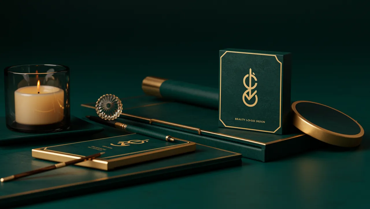
industry applicationsbeauty
Beauty Logo Design That Captivates at First Glance
Discover stunning beauty logo design ideas that captivate customers instantly. Learn proven strategi...
Discover how professional law firm logo design builds client trust and credibility. Learn key design principles that strengthen your firm's brand identity to...
Discover how professional law firm logo design builds client trust and credibility. Learn key design principles that strengthen your firm's brand identity to...
A managing partner once told me his firm spent $40,000 on office renovations but wouldn't invest more than $500 in their logo. The irony? Prospective clients saw the logo weeks before they ever stepped into that office. Law firm logo design is the first trust signal your practice sends, and most firms get it wrong by defaulting to generic scales-of-justice clipart or overly ornate serif typography that says nothing about who they actually are.
The legal industry has a branding problem. Not because firms lack prestige, but because they all look the same. When every competitor uses navy blue and a columned courthouse icon, differentiation disappears. Your logo needs to communicate authority and approachability simultaneously, and that's a harder balance than most designers realize.
Legal services are built on trust before anything else. A potential client searching for representation is often stressed, vulnerable, or facing high-stakes decisions. Your logo is doing emotional work before a single word on your website gets read.
Research on visual credibility supports this. A study by Robins and Holmes (2008) found that users form judgments about a website's trustworthiness in as little as 50 milliseconds, with visual design being the dominant factor. For law firms, that snap judgment can determine whether someone clicks "Contact Us" or hits the back button.
Here's what's interesting: trust in visual identity doesn't come from looking expensive. It comes from looking coherent. A logo that aligns with the firm's typography, color palette, and overall brand voice reads as trustworthy. A logo that clashes with the rest of the brand experience creates cognitive dissonance, and potential clients feel it even if they can't articulate why.
Think about the firms you respect most. Their visual identities tend to feel inevitable, like the logo couldn't belong to anyone else. That's the goal. Not decoration. Identity.
If you're unsure whether your current mark hits that standard, a logo analysis can reveal the gaps between what you intend to communicate and what viewers actually perceive.
Navy blue dominates legal branding for a reason. Blue consistently ranks as the most trusted color across cultures, and darker shades carry connotations of seriousness and stability Labrecque & Milne, 2012. But "everyone uses navy" is precisely the problem.
Consider alternatives that still carry weight. Deep charcoal paired with a warm accent color (think burgundy or forest green) can differentiate a firm while preserving the gravitas clients expect. Some immigration and family law practices have successfully introduced warmer palettes, using teal or muted gold, to signal empathy alongside competence.
One thing designers overlook: the psychology of color shifts depending on practice area. A criminal defense firm needs different emotional cues than an estate planning boutique. A personal injury practice benefits from colors that feel accessible and human. A white-shoe corporate firm can lean into the formality that navy and black provide.
What you want to avoid is color that undermines your positioning. Bright orange might work for a tech startup, but it sends confusing signals on a litigation firm's letterhead. The color has to match the emotional expectation of the person seeking your specific services.
Quick reality check: if your firm's colors are indistinguishable from five competitors in your market, your palette isn't working hard enough.
The typeface in your law firm logo carries more meaning than the words it spells. Serif fonts like Garamond or Times communicate tradition and formality. Sans-serif options like Helvetica or Avenir suggest modernity and clarity. Neither choice is inherently better. The right one depends on your firm's personality.
But here's the catch: most law firms default to serif fonts without questioning the assumption. A younger firm focused on startup law or tech transactions might actually benefit from clean sans-serif typography that mirrors the visual language of their clients' industries. Matching your clients' aesthetic expectations can be more effective than matching your industry's conventions.
Weight and spacing matter enormously too. Tight letter-spacing can feel aggressive or cramped. Generous spacing reads as confident and composed. I've seen firms transform their perceived professionalism simply by adjusting tracking in their wordmark, no redesign required.
Custom lettering offers another path. Firms like Cravath and Wachtell are recognizable partly because their logotypes feel proprietary. You don't need a Fortune 500 budget to achieve this. Even subtle modifications to an existing typeface (a custom ligature, a distinctive ampersand) can create ownable typography.
If your firm name is long, test how the type renders at small sizes. A logo that looks elegant on a building sign but becomes illegible on a mobile screen has a serious functional problem.
Sometimes the best branding lessons come from outside your own field. Animal logo design in the pet industry, for instance, demonstrates something law firms rarely attempt: emotional warmth paired with professionalism. Pet brands manage to feel trustworthy and approachable at the same time, which is exactly the balance many law practices struggle to achieve.
Pet industry branding succeeds because it prioritizes the client's emotional state. Someone choosing a veterinarian or a premium pet food brand is making a decision rooted in care and anxiety, not unlike someone hiring a family law attorney. The visual strategies differ, obviously, but the underlying psychology is similar.
Beauty brand identity offers another parallel worth studying. Cosmetics branding has mastered the art of aspirational simplicity. Brands like Glossier and Aesop use minimal design elements to project sophistication, proving that restraint often communicates luxury more effectively than ornamentation. Law firms chasing prestige through elaborate crests and gold foil could learn from this discipline.
The takeaway isn't to make your law firm logo look like a pet brand or a skincare line. It's to study how other industries solve the same core problem: building trust through visual identity with audiences who are making emotionally charged decisions. Our case studies show how cross-industry insights frequently lead to stronger brand outcomes.
Scales of justice. Gavels. Greek columns. The Parthenon, for some reason. Legal iconography is so overused that it's become visual noise. When every firm in your city uses the same symbols, those symbols stop differentiating and start blending.
Research on brand distinctiveness by Romaniuk and Sharp (2016) shows that unique visual assets are critical for brand recall. Distinctive logos are recognized faster and remembered longer. A generic scales icon does the opposite; it makes your firm forgettable.
So what should you use instead? Some firms succeed with abstract marks that suggest concepts like balance, protection, or forward motion without resorting to literal legal imagery. Others skip the icon entirely and let a strong wordmark do all the work. Wordmark-only logos have an advantage in legal branding because the firm's name itself is often the primary brand asset.
If you do want a symbol, make it proprietary. A custom geometric shape, an abstracted letterform, or a monogram built from the partners' initials can all create recognition without cliché. The test is simple: cover the firm name and show someone just the icon. If they can't tell it's yours, the symbol isn't earning its space.
Worth noting: whatever direction you choose, run a logo comparison against your direct competitors. If your mark looks like it could belong to three other firms, you have a differentiation problem that no amount of marketing spend will fix.
Designing a law firm logo in isolation is risky. What looks authoritative on a designer's screen might feel sterile on a business card, or worse, unreadable on a courthouse filing. Testing across contexts isn't optional.
Start with size. Your logo needs to function at 16 pixels (browser favicon) and at 16 feet (building signage). If it only works at one extreme, the design needs refinement. Print it. Shrink it. Put it on a dark background. Put it on a photograph. Each test reveals vulnerabilities.
Then test with people who aren't designers. Show your logo to five prospective clients for three seconds each, then ask what kind of company they think it represents. If nobody says "law firm" or "professional services," you have a communication gap. If everyone says "law firm" but nobody can distinguish it from competitors, you have a differentiation gap.
Eye-tracking research shows that viewers process logos in predictable scan patterns, and elements that fall outside those patterns get ignored entirely. A neuroscience-backed analysis can pinpoint exactly where attention lands on your mark and whether the most important elements are actually being seen.
Don't skip this step. A logo that tested well with real audiences will outperform a logo that only tested well in a boardroom presentation.
Budget depends on firm size and ambitions, but expect $2,000 to $15,000 for quality work from an experienced designer. Cheap template logos often cost more in the long run when you need to rebrand after realizing the design doesn't differentiate your practice. Invest in something you won't need to replace in two years.
Generally, no. The scales icon is so overused in legal branding that it actively hurts memorability. Your logo should differentiate your firm, not blend it into a sea of identical marks. If you feel strongly about including a symbol, consider an abstract or custom-designed element instead.
Most firms benefit from a refresh every 7 to 10 years, or sooner if the firm's practice areas, leadership, or client base have shifted significantly. Watch for signs your logo needs a refresh, like poor digital rendering or a visual identity that no longer matches your firm's positioning.
Absolutely. Modern doesn't mean trendy or casual. Clean typography, restrained color palettes, and minimal design elements can feel both contemporary and authoritative. The key is matching the logo's tone to your clients' expectations, not to an outdated idea of what law firms "should" look like.
Your law firm's logo is working for or against you right now, every time a potential client sees it. If you're not sure which one it is, analyze your logo with our neuroscience-backed platform and find out exactly what your mark communicates before your next client does.
Discover stunning beauty logo design ideas that captivate customers instantly. Learn proven strategi...

Discover how AI analysis transforms travel logo design into stunning visual identities. Learn expert...

Learn how construction logo design builds client trust and establishes your brand. Discover proven s...
Get a free scientific analysis with 550+ metrics across perception and design.
Try Free Analysis