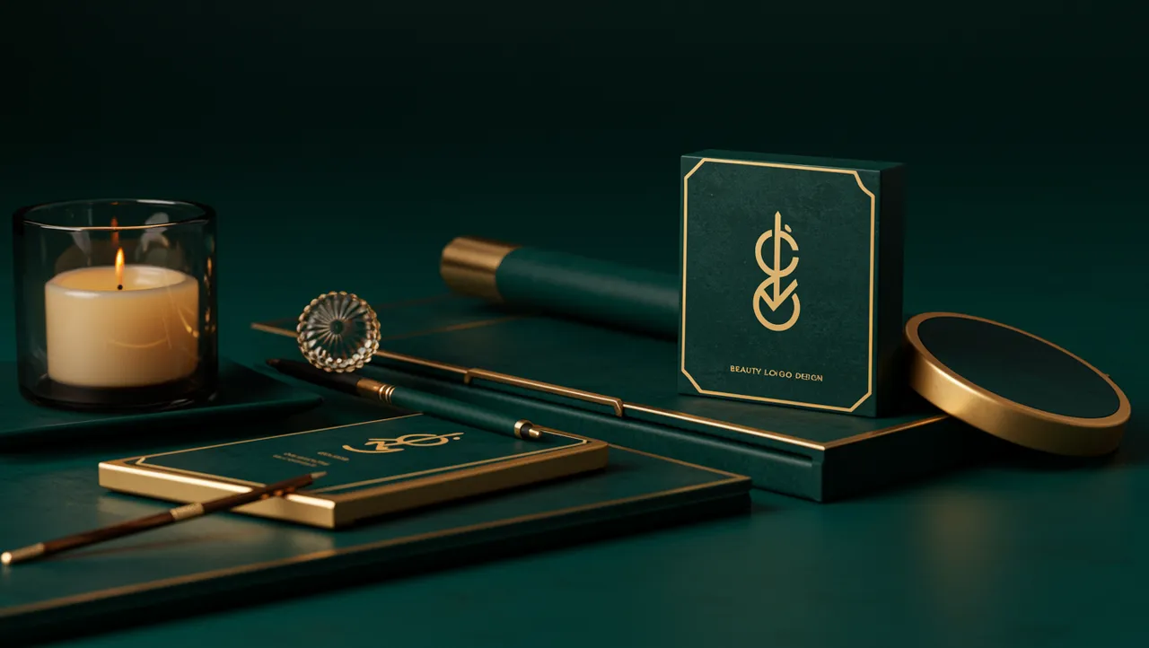
industry applicationsbeauty
Beauty Logo Design That Captivates at First Glance
Discover stunning beauty logo design ideas that captivate customers instantly. Learn proven strategi...

Discover how gaming logo design builds lasting player loyalty. Learn proven strategies to create memorable brand identities that engage your gaming community...
Discover how gaming logo design builds lasting player loyalty. Learn proven strategies to create memorable brand identities that engage your gaming community...
A gaming studio's logo does something most brand marks never have to do: it survives being shrunk to a 16x16 pixel favicon, blown up on a convention banner, and animated in a loading screen, all before lunch. Gaming logo design sits at a unique intersection of entertainment, identity, and raw emotional response. Get it right, and players tattoo your mark on their arms. Get it wrong, and your Discord server stays empty.
I once worked with an indie studio that had a beautifully detailed logo. Intricate linework, gorgeous gradients. It looked stunning on Behance. But on Steam thumbnails? Unreadable mush. They learned the hard way that gaming logos play by different rules than almost any other industry.
Gaming logos must perform across more contexts than virtually any other category of brand mark. A cosmetics brand logo lives on packaging and Instagram. A pet brand logo design shows up on bags and collars. But a gaming logo appears on splash screens, app icons, merchandise, esports jerseys, Twitch overlays, and loading animations, sometimes all within a single player session.
Research on visual complexity and brand recall shows that simpler logos are recognized 13% faster in rapid-exposure conditions Henderson & Cote, 1998. For gaming, where your logo flashes during a 2-second intro, that speed matters enormously.
Here's what's interesting: the most iconic gaming logos (think Riot Games, Valve, Rockstar) are deceptively simple. A fist. A valve on a head. A star. They feel bold and energetic, but their geometry is clean enough to read at any size.
Your takeaway? Start every gaming logo concept at its smallest required size. If it works as a 32x32 icon, you can always add detail for larger formats. The reverse almost never works.
Color in gaming logos carries a heavier psychological load than in most industries. The psychology of color works differently when your audience is primed for excitement, competition, or fantasy. Red and black dominate competitive gaming brands for a reason: they signal intensity and power. Blues and purples lean toward RPGs and strategy titles, evoking mystery and depth.
But here's the catch: gaming audiences are visually sophisticated. They consume more designed content per day than almost any demographic. A study on color preferences among 18-to-34-year-old males (the core gaming demographic) found that saturated, high-contrast palettes generated 27% more engagement than muted tones Labrecque & Milne, 2012.
Compare this to beauty brand identity work, where softer palettes and elegant gradients communicate luxury. Or animal logo design, where earthy greens and warm oranges build trust with pet owners. Gaming operates in a completely different emotional register.
One thing designers overlook: your color palette needs to work on dark backgrounds. Most gaming platforms, launchers, and streaming interfaces use dark UI. A logo designed for white backgrounds will look washed out where players actually encounter it. Test your palette against #1a1a1a before you finalize anything.
The typeface in a gaming logo tells players what kind of experience to expect before they process a single letter. Aggressive, angular sans-serifs signal competitive shooters. Ornate serifs with weathered textures suggest RPGs or historical settings. Rounded, playful fonts point toward casual or family-friendly games.
This isn't just aesthetic intuition. Research on typeface personality perception confirms that people assign consistent emotional traits to font categories Brumberger, 2003. Angular, condensed fonts score high on "potency" and "activity," while rounded fonts score high on "friendliness" and "approachability."
Think about it this way: if someone showed you the Fortnite logo and the Dark Souls logo with the names removed, you'd still have a strong sense of each game's tone. That's typography doing heavy lifting.
Custom lettering gives you the most control, but it's expensive. A practical middle ground: start with a strong typeface and modify key letterforms. Extend a descender into a blade. Turn a counter into an eye. Small customizations create distinctiveness without a full type design budget.
Worth noting: if your studio publishes across multiple genres, your studio logo should be typographically neutral enough to sit alongside different game logos without clashing. Riot Games does this well; their fist mark works next to League of Legends, Valorant, and Teamfight Tactics without competing.
A static logo comp is only half the job in gaming. Your mark will be animated in intros, stream overlays, and social media content. If animation wasn't part of the brief, you've already limited the logo's potential.
The best gaming logos have what I call "animation logic" built into their structure. They contain elements that naturally suggest motion: a shape that can rotate, a form that can assemble from particles, negative space that can reveal itself. Valve's logo animates beautifully because the concept (a valve turning on a human head) inherently contains motion.
Consider this: eye-tracking research shows that animated brand marks hold viewer attention 1.5 to 2 times longer than static ones. In a competitive attention economy like gaming, that extra second of engagement compounds across millions of impressions.
For scalability testing, run your logo through what I call the "five-size gauntlet":
If the logo fails at any of these sizes, it needs refinement. A logo analysis tool can help you identify where legibility breaks down before you ship assets to production.
Gaming doesn't exist in a visual vacuum. Smart studios borrow principles from other brand-heavy industries, then remix them for their audience.
Pet industry branding offers a surprisingly useful lesson. The best pet brand logos communicate personality and trust simultaneously. They use mascot-style marks that feel approachable but professional. Gaming studios building character-driven franchises can study how brands like BarkBox or Chewy create mascots that work as standalone icons.
Cosmetics branding teaches restraint. High-end beauty brands prove that negative space, precise spacing, and typographic discipline create premium perception. For gaming studios targeting an older or luxury-adjacent audience (think collector's editions, premium subscriptions), these principles translate directly.
The crossover insight? Every industry solves the same core problem: make a mark that communicates the right emotion in under a second. The specific emotions change. The neuroscience doesn't. Running a logo comparison between your gaming logo and top performers in adjacent industries can reveal blind spots you wouldn't catch otherwise.
Player loyalty starts with recognition, and recognition starts with consistency. A neuroscience-backed analysis of brand marks shows that repeated, consistent exposure to a visual identity builds neural pathways that associate the mark with positive experiences Zajonc, 1968. This is the mere-exposure effect, and it's one of the most reliable findings in psychology.
For gaming studios, this means your logo needs strict usage guidelines from day one. Define minimum clear space. Lock your color values for RGB, CMYK, and hex. Specify which variations are acceptable (monochrome, reversed, icon-only) and which are not.
So what does this mean for your brand? Every time a streamer uses a slightly wrong version of your logo, or your social media team stretches the mark to fit a banner, you're weakening the neural association players have built. Small inconsistencies add up.
Studios that invest in building trust through visual identity see measurable returns. Players develop a relationship with the brand mark itself. They recognize it instantly in a crowded store page. They feel a pulse of anticipation when it appears in a loading screen. That's loyalty, built pixel by pixel.
Gaming logos must perform across far more contexts: app icons, splash screens, merchandise, stream overlays, and esports broadcasts. They need to be scalable, animation-ready, and emotionally tuned to signal a specific genre or play style within milliseconds.
Only if the mascot can work as a simplified icon at small sizes. Mascot logos build strong emotional connections, but overly detailed characters lose legibility on thumbnails and favicons. Design the simplified version first, then add detail for larger applications.
High-contrast, saturated palettes perform best. Red and black dominate for a reason: they signal intensity. But differentiation matters too. If every competitor uses red and black, a bold purple or electric blue can help you stand out while still conveying energy.
You can, but most successful studios separate them. Your studio logo should be genre-neutral and professional. Individual game logos can be expressive and genre-specific. This gives you flexibility as your catalog grows.
Your gaming logo is the first promise you make to players. Before they see gameplay footage, read reviews, or hear from friends, your mark tells them what kind of experience to expect. Make sure it's telling the right story. Analyze your logo with neuroscience-backed tools to see exactly how players perceive your brand, and where you can sharpen that first impression.
Discover stunning beauty logo design ideas that captivate customers instantly. Learn proven strategi...

Discover how AI analysis transforms travel logo design into stunning visual identities. Learn expert...

Learn how construction logo design builds client trust and establishes your brand. Discover proven s...
Get a free scientific analysis with 550+ metrics across perception and design.
Try Free Analysis