
color psychologywarm
Warm Colors vs Cool Colors Logo Choices That Shape Percep...
Discover how warm colors vs cool colors logo choices influence brand perception and customer behavio...
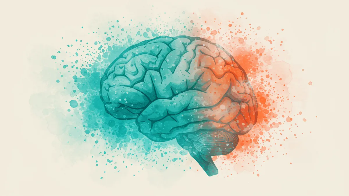
Optimize logo colors using neuroscience research to boost brand recognition and customer engagement. Learn proven strategies that increase conversions.
Optimize logo colors using neuroscience research to boost brand recognition and customer engagement. Learn proven strategies that increase conversions.
A logo color that "feels right" to your design team might be actively repelling your target customers. That's not opinion; it's what neuroscience research consistently shows about how the brain processes color before conscious thought even kicks in. I once worked with a health tech company that swapped its logo from a vibrant orange to a muted teal based purely on founder preference. Conversions dropped 18% in three weeks. The fix wasn't complicated, but it required data, not instinct, to optimize logo colors effectively.
Color signals reach the amygdala, your brain's emotional processing center, roughly 80 milliseconds before they're consciously perceived Gegenfurtner & Kiper, 2003. That means your audience has already formed an emotional response to your logo's color before they've read your brand name, processed your tagline, or evaluated your product.
This pre-conscious response is why brand color testing matters so much. You can't survey your way to the right palette because people often can't articulate why a color makes them feel a certain way. They just know they trust one brand more than another.
Here's what's interesting: the specific hue matters less than its alignment with your brand's intended personality. A study from the University of Winnipeg found that up to 90% of snap judgments about products are based on color alone Singh, 2006. But the "right" color isn't universal. It depends on what emotion you want to trigger and whether your audience associates that color with your category.
Quick reality check: if you chose your logo colors from a Pinterest mood board, you're designing for aesthetics, not for neural response. A neuroscience-backed analysis can reveal whether your palette actually triggers the trust, excitement, or calm you're aiming for.
Strong color contrast in a logo doesn't just improve readability. It fundamentally changes how the brain prioritizes visual information. Research on visual salience shows that high-contrast elements capture fixation 2-3x faster than low-contrast ones Itti & Koch, 2001. Your logo is competing with dozens of other visual stimuli on any given screen or shelf. Contrast determines whether it wins that competition.
But there's a catch. Too much contrast creates visual tension that can feel aggressive or cheap. Think about discount retailer logos versus luxury brands. Luxury tends toward lower contrast, tonal palettes. Discount brands scream with high-contrast complementary colors. Neither approach is wrong; they're just targeting different neural responses.
One thing designers overlook: contrast ratios affect accessibility, too. Roughly 8% of men and 0.5% of women have some form of color vision deficiency Birch, 2012. If your logo relies on a red-green distinction for meaning, a significant chunk of your audience literally can't see what you intended.
When you compare logos side by side, contrast differences become obvious. Test your palette in grayscale. If your logo loses its structure without color, your contrast game needs work.
White signals purity and cleanliness in Western markets. In several East Asian cultures, it's the color of mourning. This isn't a minor footnote for global brands; it's a conversion killer.
Research by Madden, Hewett, and Roth (2000) across eight countries found that color associations vary dramatically by culture. Blue was the only color with consistently positive associations across all markets studied. Everything else, from red to green to yellow, shifted meaning depending on geography.
So what does this mean for your brand? If you're operating in multiple markets, you need to test your logo colors regionally. A single global palette might work for some brands (Coca-Cola's red has enough cultural momentum to transcend borders), but most companies don't have that luxury.
Consider this: even within a single country, subcultures respond differently. A logo analysis that accounts for your specific target demographic will outperform generic color psychology in logos advice every time. The goal isn't to find a "universally good" color. It's to find the color that resonates with your people.
Stop guessing. Here are the approaches that actually produce reliable data when you optimize logo colors:
The most effective approach combines at least two of these methods. A single data point can mislead. Multiple signals pointing the same direction give you confidence to commit.
Not every color problem requires a rebrand. Sometimes a 10% saturation shift solves the issue. Other times, you need a complete palette overhaul. Knowing the difference saves you months of work and thousands of dollars.
Change your colors when:
Hold your colors when:
I've seen brands throw away years of color equity because one executive didn't like the shade of green. That's expensive. Before making changes, run a proper logo analysis to identify whether color is truly the weak link. You might discover that signs your logo needs a refresh point to structural issues, not chromatic ones.
Worth noting: brands like purple-forward tech companies have shown that unconventional color choices can become powerful differentiators, but only when backed by consistent application and audience validation.
Most effective logos use two to three colors. Research shows that simplicity improves recall, and logos with fewer colors are recognized faster Henderson & Cote, 1998. A primary color, a secondary accent, and a neutral give you enough range without visual clutter.
Absolutely. Adjusting saturation, brightness, or contrast ratios can shift perception without abandoning your existing palette. Minor tweaks often produce measurable results in brand color testing without the cost or risk of a complete overhaul.
Logo color doesn't directly affect search rankings. However, it influences user behavior metrics like bounce rate and time on site, which search engines do consider. A logo that builds trust keeps people on your page longer, and that matters.
Run an A/B test on your landing page with two color variants. Measure conversion rates over at least two weeks with statistically significant traffic. You can also try the demo on our platform for a quick neuroscience-based color assessment.
Your logo colors are sending neural signals to every person who encounters your brand. The question is whether those signals match your intent. Instead of relying on intuition or trend reports, let data guide your decisions. Analyze your logo with our neuroscience-backed platform and find out exactly what your colors are communicating, and what they should be.
Discover how warm colors vs cool colors logo choices influence brand perception and customer behavio...
Discover how effective logo colors influence consumer behavior using neuroscience principles. Learn ...
Discover how color A/B testing logo designs increases brand recognition and conversions. Learn prove...
Get a free scientific analysis with 550+ metrics across perception and design.
Try Free Analysis