neuroscience brandinglogo
Applying Logo Colors Brain Science to Your Rebrand
Learn how logo colors brain science influences customer perception and drives brand loyalty. Discove...

Discover how brain response to colors influences consumer behavior and learn proven strategies to create logos that captivate and convert your audience effec...
Discover how brain response to colors influences consumer behavior and learn proven strategies to create logos that captivate and convert your audience effec...
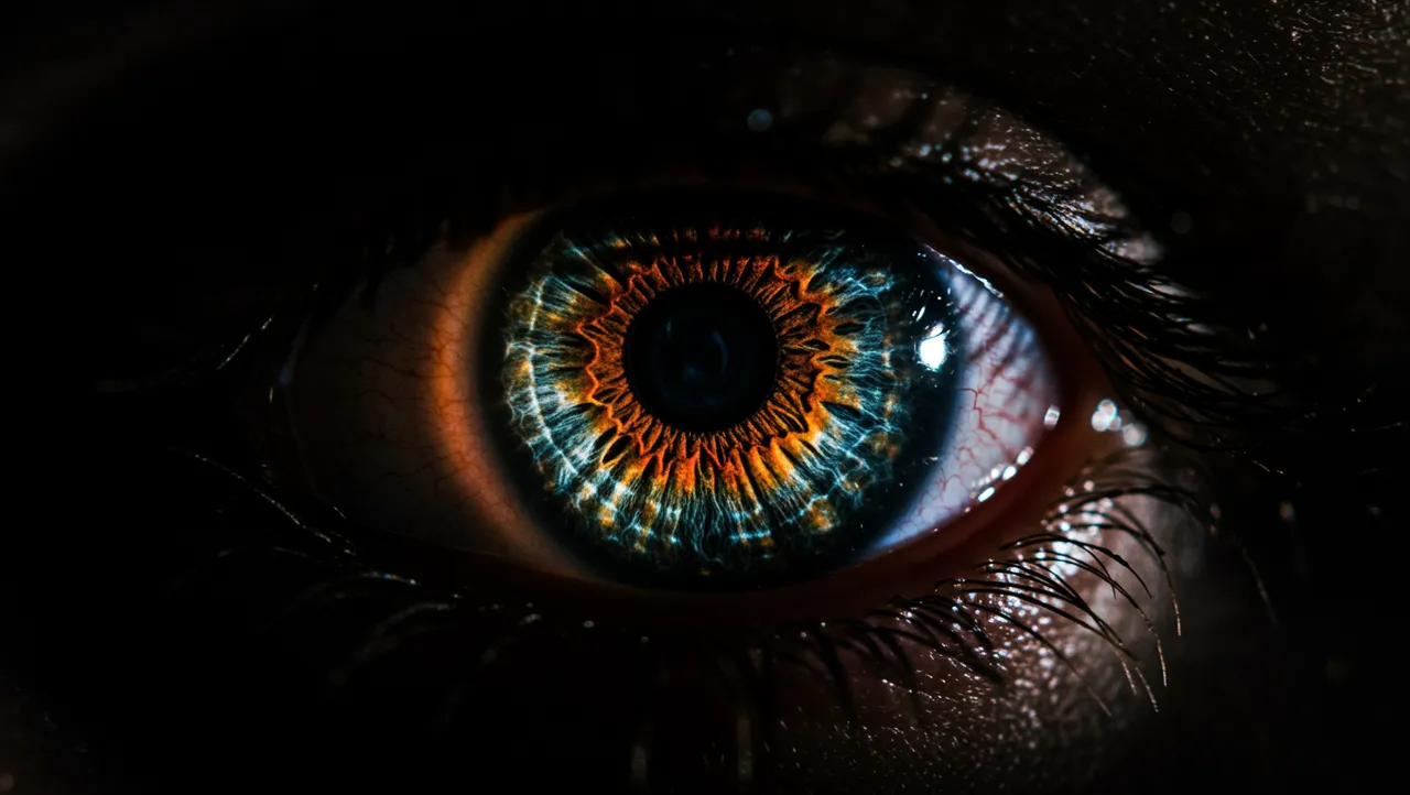
A red logo doesn't just look red to your brain. It triggers a cascade of neural activity, raising heart rate, sharpening attention, and priming you for action, all within about 100 milliseconds. Most designers pick colors based on aesthetics or trend reports. But the brain response to colors operates on a level that mood boards can't capture, and ignoring it means leaving real cognitive impact on the table.
I once worked with a wellness brand that couldn't figure out why their calming messaging felt "off." The culprit? A saturated orange accent in their logo that was neurologically screaming urgency while the tagline whispered relaxation. The fix was subtle, just a shift in hue and saturation, but the results in user testing were dramatic.
Color information reaches the amygdala and hypothalamus before it's fully processed by the visual cortex. This means your emotional and physiological response to a color begins before conscious recognition kicks in Elliot & Maier, 2014. Your pupils adjust, your autonomic nervous system responds, and your brain starts forming associations, all in a fraction of a second.
This pre-conscious processing is why color choices in logos carry so much weight. A consumer scrolling past your brand on a shelf or a screen doesn't stop to analyze your palette. Their brain has already reacted. And that reaction either pulls them closer or pushes them away.
Here's what's interesting: the speed of this response varies by wavelength. Longer wavelengths (reds, oranges) trigger faster autonomic responses than shorter wavelengths (blues, greens) Hill & Barton, 2005. Red literally gets processed with more urgency. That's not metaphor; it's measurable neural activity.
So what does this mean for your brand? If your logo needs to grab attention in a crowded feed, warm colors give you a neurological head start. But if your brand promise centers on trust or calm, cooler tones align your visual identity with the emotional state you're trying to create. Understanding the psychology of color at this neural level separates strategic design from decorative choices.
Red and orange activate the sympathetic nervous system. Blue and green activate the parasympathetic. This isn't pop psychology; it's been measured through galvanic skin response, fMRI imaging, and pupillometry across dozens of studies Valdez & Mehrabian, 1994.
But here's the catch: the effect isn't binary. Saturation and brightness matter as much as hue. A muted, dusty red triggers a very different neural response than a fire-engine red. Research from the University of British Columbia found that blue environments enhanced creative performance, while red environments improved performance on detail-oriented tasks Mehta & Zhu, 2009. The takeaway for logo design? Context shapes everything.
Consider this: T-Mobile's magenta works because it's unexpected in telecom, a category dominated by blues. The warm hue grabs attention precisely because it violates category norms, creating what neuroscientists call a "prediction error" that forces the brain to pay closer attention.
Practical guidance for designers:
A thorough logo analysis can reveal whether your current palette is working with or against your brand's intended emotional positioning.
Negative space logo design creates what cognitive scientists call "perceptual puzzles," and when you combine that technique with strategic color choices, you get a one-two punch of memorability. The brain rewards itself with a small dopamine hit when it "solves" a hidden image in negative space Ramachandran & Hirstein, 1999. Color contrast determines how quickly, or whether, that discovery happens.
The FedEx arrow is the classic example. But notice that the arrow sits between the "E" and "x" in a specific color pairing. The purple-to-orange transition creates just enough contrast to guide the eye without making the hidden element too obvious. Too much contrast and the puzzle is solved instantly, reducing the reward. Too little and it's never found.
Clever logo design techniques often exploit this balance. The best negative space logos use color to control the timing of discovery. One thing designers overlook: if your negative space branding relies on a color relationship that falls apart in monochrome reproduction, you've built your memorability on a fragile foundation.
Think about it this way: color is the volume knob for negative space. Turn it up (high contrast) and the hidden element jumps out immediately. Turn it down (subtle tonal shifts) and you create a slower, more rewarding discovery moment. Both approaches work, but they serve different strategic goals.
Memory consolidation branding depends heavily on distinctiveness. The Von Restorff effect tells us that items which stand out from their surroundings are remembered more readily Hunt, 1995. In logo design, your color combination is the primary tool for creating that distinctiveness.
But logo memorability science reveals something counterintuitive. More colors don't equal more memorability. Research on visual working memory shows that humans can hold roughly 3-4 color chunks in working memory simultaneously Luck & Vogel, 1997. Logos with more than three dominant colors actually become harder to encode accurately.
The data tells a different story than what many brand guidelines suggest. Some of the world's most memorable logos use just one or two colors. Google is the notable exception, but their four-color approach works because each color maps to a distinct letter, creating separate memory chunks rather than a blended palette.
Quick reality check: if someone saw your logo for two seconds and then had to describe it to a friend, could they accurately recall the colors? That mental test approximates how memory consolidation actually works. The simpler and more distinctive your palette, the better your chances.
For brands questioning whether their current colors serve them well, exploring why your logo matters can provide the broader strategic context for making changes.
No color means the same thing everywhere, and the brain response to colors is shaped by both biology and culture. White signals purity in Western markets and mourning in parts of East Asia. Red means luck in China and danger in the United States. These aren't just cultural preferences; they're learned neural associations that become automatic through repeated exposure Adams & Osgood, 1973.
I've seen brands expand internationally without adjusting their color strategy, then wonder why conversion rates tank in new markets. The neural pathways that connect color to meaning are partly hardwired and partly trained by environment. You can't override years of cultural conditioning with a clever tagline.
Worth noting: even within a single market, demographic factors shift color perception. Age affects color sensitivity (the lens yellows over time, altering blue perception). Gender differences in color discrimination are well-documented, with women typically distinguishing more subtle hue variations Abramov et al., 2012.
So before you finalize a palette based on a single market's associations, stress-test it. Run it through neuroscience-backed analysis to understand how different audiences might respond. And if your brand operates across cultures, build flexibility into your color system rather than forcing a single palette to do universal work.
Theory without process is useless. Here's how to translate color neuroscience into actual design decisions.
Start with the desired neural state. Before opening a color picker, ask: what should someone's nervous system be doing when they encounter this brand? Feeling alert? Calm? Curious? Your answer narrows the palette before aesthetics even enter the conversation.
Test in context, not in isolation. A color swatch on a white background tells you almost nothing about how it will perform on a shelf, in a social feed, or on a billboard. The brain processes color relationally, always comparing it to surrounding colors Lotto & Purves, 2000. Design your test conditions to match real-world viewing scenarios.
Audit your competitive set. Eye-tracking research consistently shows that logos with colors distinct from competitors attract faster first fixations. Pull up a grid of your top ten competitors' logos. Where's the chromatic gap? That's your opportunity.
Measure, don't guess. Subjective color preferences ("I just like green") aren't strategy. Use tools that quantify the cognitive and emotional impact of your palette. A proper logo analysis can surface patterns that intuition misses.
Yes. Screen-emitted light (RGB) stimulates the retina differently than reflected light from print (CMYK). Saturation typically appears higher on screens, which can amplify the neural arousal response. Always test your logo colors in both mediums to ensure consistent emotional impact.
Absolutely. Even a subtle hue shift can alter the pre-conscious emotional response your logo triggers. A/B testing with real audiences frequently reveals that single-color changes affect trust ratings, perceived quality, and purchase intent by measurable margins.
Research on visual working memory suggests two to three colors is the sweet spot. This gives you enough chromatic information for distinctiveness while staying within the brain's encoding capacity. Fewer colors generally means faster, more accurate recall.
Both strategies can work, but for different reasons. Matching industry norms builds instant category recognition. Breaking from them creates a prediction error that forces attention. Your choice depends on whether your brand strategy prioritizes belonging or differentiation.
Your logo's colors are doing neurological work every time someone glances at your brand. Whether that work helps or hurts you depends on how well your palette aligns with your brand strategy. If you're unsure where your colors stand, analyze your logo with our neuroscience-backed platform and see exactly how your palette performs across cognitive and emotional dimensions.
Learn how logo colors brain science influences customer perception and drives brand loyalty. Discove...
Discover how brain science branding transforms your logo design to captivate audiences and drive mem...
Learn how memory consolidation branding creates logos that stick in customers' minds. Discover prove...
Get a free scientific analysis with 550+ metrics across perception and design.
Try Free Analysis