industry applicationsbeauty
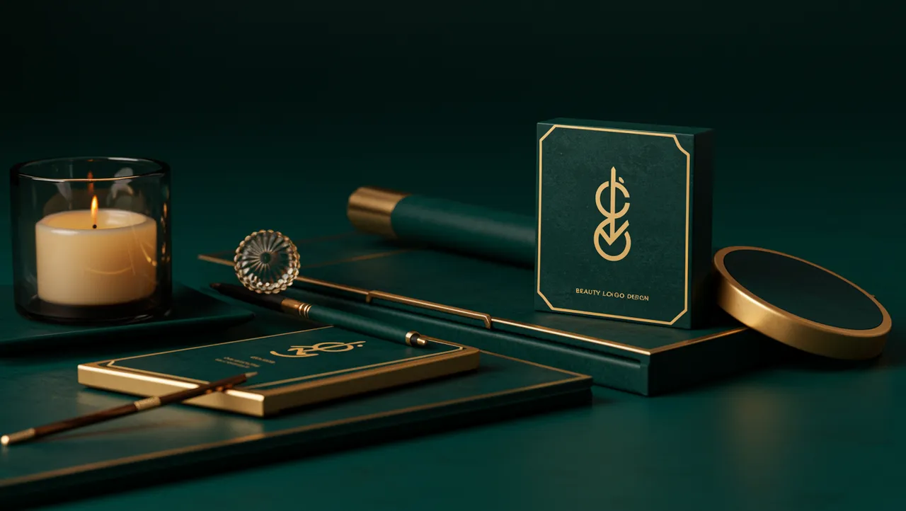
Beauty Logo Design That Captivates at First Glance
Discover stunning beauty logo design ideas that captivate customers instantly. Learn proven strategi...
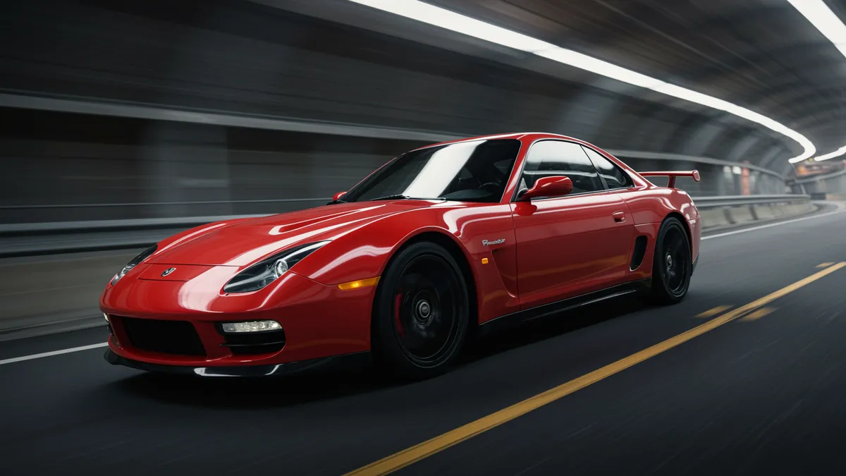
Automotive logo design shapes brand identity and customer loyalty. Discover proven strategies to create memorable logos that accelerate your brand's success ...
Automotive logo design shapes brand identity and customer loyalty. Discover proven strategies to create memorable logos that accelerate your brand's success ...
Most people think automotive logos are about speed. Wings, swooshes, forward-leaning italics. But the brands with the strongest recall don't lean on motion cues at all. Think about BMW's roundel or Mercedes-Benz's three-pointed star. These marks succeed because they're rooted in symmetry, simplicity, and cultural memory, not because they look fast.
Automotive logo design operates under constraints that most other industries never face. Your logo has to work stamped into chrome at three inches wide, printed on a dealer banner at thirty feet, and rendered as a tiny favicon on a mobile screen. That range of applications alone eliminates most design approaches before you even pick up a pencil.
I've seen designers approach car branding the same way they'd approach a tech startup. That almost never works. Here's why, and what actually does.
The most memorable automotive logos share one trait that has nothing to do with style: bilateral symmetry. Your brain processes symmetrical shapes faster and judges them as more trustworthy. Research on visual perception confirms this. Symmetrical stimuli are processed with greater fluency, which leads to higher aesthetic preference Reber, Schwarz & Winkielman, 2004.
Look at the logos that dominate the road. Audi's four rings. Toyota's overlapping ovals. Volkswagen's stacked initials inside a circle. Every single one is symmetrical.
This isn't coincidence. Cars represent the second-largest purchase most people will ever make. Trust matters enormously. And symmetry, at a neurological level, signals genetic fitness, structural integrity, and reliability. Your potential buyer doesn't consciously think "that logo is symmetrical, so I trust this brand." But their brain does the math anyway.
Here's what's interesting: this principle extends well beyond the automotive sector. In beauty brand identity and cosmetics branding, symmetry plays a nearly identical role. Brands like Chanel and Dior use symmetrical monograms for the same neurological reason. The context changes; the brain science doesn't.
If you're designing an automotive mark, start with a symmetrical framework. You can introduce subtle asymmetry later for personality, but the underlying structure should feel balanced.
Circular enclosures appear in automotive logos more than any other industry. BMW, Mercedes-Benz, Volkswagen, Alfa Romeo, Vauxhall, Skoda. The list goes on. And there's a functional reason beyond aesthetics.
Circles are the only shape that reads identically from every angle. On a rotating wheel hub, a spinning key fob, or a badge viewed from the side as a car passes, a circle never distorts your perception of the mark inside it. Squares tilt. Triangles point the wrong way. Circles just work.
But the neuroscience adds another layer. Research on shape symbolism shows that curved shapes are consistently associated with approachability and harmony, while angular shapes trigger associations with aggression and energy Bar & Neta, 2006. Most mainstream automotive brands want to project approachability alongside power. The circle lets them do both: a soft container holding a sharp, distinctive symbol inside.
Consider this: if your automotive brand targets performance enthusiasts, you might break the circle convention deliberately. Lamborghini's shield does exactly that, using angular geometry to signal aggression. But that's a strategic choice, not a default. Know the rule before you break it.
A logo analysis can help you measure whether your shape choices are triggering the emotional responses you intend.
Silver, black, and blue account for roughly 80% of automotive logo color palettes. There's a reason. These colors map directly onto the material associations buyers care about: metal, precision, and technology.
But the psychology of color in automotive branding goes deeper than material metaphor. Blue activates associations with competence and dependability Labrecque & Milne, 2012. That's why Ford, Subaru, and Hyundai all anchor their identities in blue. Black signals premium positioning and exclusivity, which is why Bentley, Lincoln, and Genesis lean into it.
Red is the outlier worth discussing. Ferrari and Tesla both use red, but for different strategic reasons. Ferrari's red connects to Italian racing heritage. Tesla's red (now largely phased out of their primary mark) originally signaled disruption and energy. Same color, completely different brand logic.
One thing designers overlook: color in automotive logos must work in monochrome first. Chrome badges, embossed leather, etched glass. Your logo will spend significant time living without color. If it falls apart in single-tone applications, it fails the most basic automotive requirement.
Quick reality check: this monochrome-first principle also applies to pet brand logo design and animal logo design, where marks frequently appear embroidered on products, stamped on tags, or laser-cut into accessories. Cross-industry lessons like these are exactly why neuroscience-backed analysis matters.
The automotive industry is split between two logo philosophies right now, and the tension is fascinating.
On one side, brands like Porsche and Alfa Romeo maintain complex, heraldic crests packed with historical symbols. These marks carry decades (sometimes centuries) of brand equity. They're deliberately intricate because complexity signals heritage and craftsmanship.
On the other side, brands like Kia, Nissan, and GM have recently stripped their logos down to flat, simplified versions. Kia's 2021 rebrand removed the oval entirely. Nissan flattened its dimensional badge. The goal? Digital readability and a modern, tech-forward impression.
Neither approach is inherently better. But each carries risks.
Heritage marks can feel outdated if not carefully maintained. They also struggle at small digital sizes. Flat redesigns risk severing the emotional connection that existing owners feel toward the brand. When Kia launched its new logo, search queries for "KN car brand" spiked because people couldn't read the stylized letterforms.
So what does this mean for your brand? If you're building a new automotive identity, lean toward simplicity with one distinctive element that can accumulate meaning over time. If you're refreshing an existing mark, preserve the single most recognizable element and modernize everything around it. Our case studies show how this balance plays out across different industries.
Here's a practical test I use with every automotive logo project. I call it the badge test, and it exposes weaknesses that screen-based design reviews miss entirely.
Print your logo at exactly 2.5 inches wide. That's roughly the size of a steering wheel badge. Now hold it at arm's length. Can you identify the brand in under one second? If not, the mark has a recognition problem.
Next, view it in direct sunlight and deep shadow. Chrome and brushed metal badges live in extreme lighting conditions. Thin lines disappear in glare. Fine details vanish in shadow. Your logo needs to survive both.
Finally, rotate it 15 degrees in each direction. Drivers and pedestrians rarely see a car logo perfectly straight-on. The mark should remain identifiable at slight angles.
Most logos designed primarily for screens fail at least one of these checks. The fix usually involves increasing the weight of key strokes, simplifying interior details, and ensuring adequate negative space between elements.
You can start with a digital logo evaluation to identify potential weak points before investing in physical prototype testing.
The constraints of automotive logo design produce lessons that transfer remarkably well to other sectors. The emphasis on scalability? Essential for pet industry branding, where logos appear on everything from tiny collar tags to massive trade show banners. The focus on material-first design? Directly relevant to cosmetics packaging, where logos are embossed, foil-stamped, and molded into plastic.
Even the automotive industry's approach to building trust through visual identity has parallels in legal branding. Law firms and car manufacturers both need their marks to project reliability and competence before a single word is spoken.
The throughline is this: the best logos are designed for their hardest use case first. For automotive brands, that's a chrome badge in direct sunlight. For your industry, it might be something completely different. But identifying that constraint and designing for it will make your logo stronger everywhere else it appears.
Automotive logos must function across extreme size ranges, from tiny key fobs to building-sized dealer signs. They also need to work in physical materials like chrome, leather, and glass, not just on screens. This demands higher contrast, simpler geometry, and stronger silhouettes than most other industries require.
No. While silver, black, and blue dominate the category, the right color depends on your positioning. Performance brands often use red or yellow. Eco-focused brands might use green. The key is ensuring your color choice works in monochrome applications, since many automotive uses strip color away entirely.
Most successful automotive brands evolve their logos gradually every 10 to 15 years rather than making dramatic changes. Subtle refinements preserve brand equity while keeping the mark current. If your logo feels dated or fails basic recognition tests, it may be time to refresh your logo.
Absolutely. Ferrari's prancing horse, Lamborghini's bull, Jaguar's leaping cat, and Peugeot's lion all prove that animal logo design works powerfully in automotive contexts. The key is choosing an animal whose symbolic associations (speed, power, agility) align with your brand positioning.
Your automotive logo carries your brand into every parking lot, highway, and showroom. Whether you're launching a new marque or refreshing an established one, the principles of symmetry, scalability, and material-first design will serve you well. Ready to see how your mark measures up? Analyze your logo with our neuroscience-backed platform and get data-driven insights in minutes.
Discover stunning beauty logo design ideas that captivate customers instantly. Learn proven strategi...

Discover how AI analysis transforms travel logo design into stunning visual identities. Learn expert...

Learn how construction logo design builds client trust and establishes your brand. Discover proven s...
Get a free scientific analysis with 550+ metrics across perception and design.
Try Free Analysis