Logo Score Index · #482 of 487
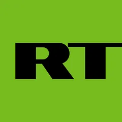
RT Logo Analysis
RT's bold logo achieves strong recognition but faces critical accessibility and cultural risks that threaten global market acceptance.
Entertainment · 12 points below the Entertainment average of 82 (83 logos)
The verdict
The RT logo projects a strong, modern, and highly recognizable brand identity, scoring well in immediate recognition and professional credibility. However, its current design presents significant market and accessibility risks due to critical color contrast failures and high-sensitivity cultural associations with its dominant green. To secure global market penetration and ensure inclusive reach, strategic adjustments to the color palette are imperative, balancing its distinctive visual appeal with universal accessibility and cultural appropriateness.
Score breakdown
How the RT logo scores across the analysis categories.
- Design86
- Psychology61
- Trust74
- Cognitive85
- Market66
- Typography83
- Color56
- Cultural58
Strengths and weak spots
What works
The logo's primary strengths lie in its exceptional recognition speed and memorability, driven by its bold, high-contrast design and simple composition. Its strong geometric forms and direct typography convey competence and professionalism, contributing to a solid first impression. The high symmetry and clear figure-ground balance ensure visual stability and ease of processing, making it highly scalable across various platforms.
Where it could improve
Key areas for improvement include addressing critical color contrast issues for accessibility, mitigating potential negative cultural associations of the green color, and enhancing overall color preference. The logo could also benefit from a more nuanced emotional impact to foster deeper brand loyalty, and a more focused attention spread to guide the viewer's eye more intentionally.
If this were your logo, we'd suggest
- Enhance Color Contrast for Accessibility
- Address Cultural Sensitivity of Green
- Refine Color Palette for Preference
- Introduce Subtle Dynamic Elements
What the analysis found
Positioning
The logo's bold, geometric forms and vibrant green position RT as a modern, direct, and somewhat unconventional player in the entertainment industry. It aims for high visibility and a distinct identity, differentiating it from more traditional competitors. The strong visual statement suggests a brand that is confident and forward-thinking.
Trust
The clear, blocky typography and symmetrical composition contribute to a perception of competence and reliability, fostering a moderate level of trust. The directness of the design suggests transparency and professionalism. However, the lack of softer, more inviting elements prevents it from achieving a higher trust score that might come from warmth or approachability.
Recognition
With its simple, high-contrast design and prominent initials, the logo excels in recognition. The unique, vibrant green background ensures it stands out, and the bold, legible font allows for rapid processing. This contributes to high memorability and quick identification, making it effective across various media.
Emotion
The logo evokes a sense of energy, modernity, and perhaps a hint of rebellion due to its striking color and assertive typography. While it captures attention, its emotional impact is somewhat limited, lacking the warmth or nuanced appeal that might foster deeper emotional connection or brand loyalty. The color preference score is below average, indicating a less universally appealing emotional response.
Design
From a design perspective, the logo demonstrates high harmony and symmetry, with excellent figure-ground balance and scalability. Its simplicity and geometric precision contribute to a low cognitive load. However, the critical failure in color contrast for WCAG accessibility and the below-average color preference score highlight significant design flaws that need immediate attention.
Brand personality
The RT logo strongly projects 'Competence' (90/100) through its bold, geometric, and clear sans-serif typography, which conveys reliability, intelligence, and success. The directness and lack of ornamentation reinforce a no-nonsense, efficient image. 'Excitement' (70/100) is also present, primarily driven by the vibrant, high-saturation green background, suggesting daring and a modern, up-to-date feel. 'Ruggedness' (40/100) is moderately present due to the bold, heavy forms, but it lacks earthy tones or textures. 'Sincerity' (20/100) and 'Sophistication' (15/100) are low, as the design lacks warmth, traditional elements, elegance, or subtle charm, opting instead for a more assertive and functional aesthetic.
The logo embodies 'The Rebel' archetype through its bold, unconventional color choice (a vibrant, almost aggressive green) and strong, no-nonsense typography. It projects an image of challenging the status quo, being direct, and standing out from traditional norms. The stark contrast and minimalist design suggest a brand that is unafraid to be different and to make a strong, perhaps provocative, statement, aligning with the Rebel's desire for revolution and breaking rules.
Color and typography
The vibrant yellow-green evokes feelings of energy, freshness, and modernity, contributing to an immediate, attention-grabbing effect. The black adds a sense of authority and seriousness. While the combination is striking and distinctive, its intensity and below-average preference score suggest it may not universally elicit deep positive emotional responses, potentially leading to a more neutral or even slightly jarring emotional impact for some viewers.
The heavy, geometric sans-serif font perfectly matches the brand's assertive and modern personality. It conveys strength, clarity, and directness, aligning with a brand that aims to be impactful and easily recognizable. The font choice reinforces the brand's competence and bold stance, making it an excellent fit for its intended message.
Explore the full RT scorecard
Every metric behind the 70/100 — attention prediction, color harmony, typography and more, in the interactive report.
More from the index


Independent analysis. Logo Analyzer is not affiliated with or endorsed by RT; all trademarks and logos belong to their respective owners. Scores and commentary reflect one AI model's assessment of the logo's design and are not an official ranking, endorsement, or measure of brand or commercial success.