Logo Score Index · #483 of 487
Elsevier Logo Analysis
This logo commands trust and heritage but its scholarly design is a critical mismatch for the entertainment industry.
Entertainment · 13 points below the Entertainment average of 82 (83 logos)
The verdict
Your logo projects exceptional authority and trustworthiness, leveraging a rich, classical aesthetic that signals deep-rooted knowledge and reliability. However, its current visual narrative is fundamentally misaligned with the entertainment industry, creating a significant barrier to market relevance and audience connection. To unlock its full potential, a strategic re-evaluation of its industry fit and a modernization of its intricate design elements are crucial to ensure broader appeal and digital adaptability.
Score breakdown
How the Elsevier logo scores across the analysis categories.
- Design73
- Psychology65
- Trust71
- Cognitive80
- Market69
- Typography88
- Color58
- Cultural65
Strengths and weak spots
What works
The logo's primary strengths lie in its strong sense of heritage, authority, and intellectual credibility, largely conveyed by the detailed, classical illustration and Latin motto. It projects a high degree of trustworthiness and professionalism, making a strong first impression of an established and reliable entity. The unique visual storytelling potential of the illustration also contributes to its memorability and distinctiveness.
Where it could improve
Key areas for improvement include the significant mismatch with the stated 'entertainment industry' context, which undermines its relevance and impact. The low color contrast within the illustration and the potential for poor scalability due to its intricate details are also concerns. The overall design, while classic, may be perceived as dated by some audiences, potentially limiting its appeal to younger demographics or in more dynamic sectors.
If this were your logo, we'd suggest
- Realign Brand Identity with Industry Context
- Improve Color Contrast for Accessibility
- Simplify Illustration for Digital Scalability
- Modernize Overall Aesthetic for Broader Appeal
What the analysis found
Positioning
The logo's classical illustration and Latin motto position the brand as an authority in knowledge and tradition, which is highly effective for academic or professional services. However, this positioning is severely misaligned with the entertainment industry, making it difficult for the brand to resonate with target audiences seeking leisure and diversion. The contrast with the modern orange wordmark creates a stylistic tension rather than a cohesive brand story for entertainment.
Trust
The intricate, traditional illustration and the scholarly figure inherently convey a strong sense of credibility, history, and reliability, contributing to a high trust score. The use of Latin further reinforces an image of established authority and intellectual rigor. This visual language suggests a brand that is well-established, knowledgeable, and dependable, fostering confidence in its offerings.
Recognition
The logo's unique and detailed illustration, combined with the bold, distinct orange wordmark, ensures high memorability and recognition speed. The saliency data confirms that the wordmark is a primary fixation point, guaranteeing brand name recall. The distinctiveness of the classical style also helps it stand out in a crowded market, aiding in rapid identification.
Emotion
The logo evokes emotions of respect, wisdom, and intellectual curiosity through its scholarly imagery and classical aesthetic. The orange wordmark adds a touch of energy and warmth, preventing the overall impression from being overly austere. However, for the entertainment industry, it lacks the excitement, joy, or escapism typically associated with emotional engagement in that sector, leading to a moderate emotional impact score.
Design
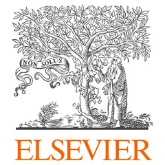
The design exhibits strong harmony and symmetry, with a balanced composition and a clear figure-ground relationship. The intricate details of the illustration showcase artistic craftsmanship. However, the complexity of the woodcut poses challenges for scalability, potentially losing detail at smaller sizes, and the low internal contrast within the illustration impacts accessibility. The blend of classical and modern elements is visually interesting but can be difficult to maintain consistently across all applications.
Brand personality
The logo's dominant personality is 'Competence' (88). This is strongly conveyed by the scholarly illustration, the classical aesthetic, and the Latin motto, all signaling reliability, intelligence, and success. The precise lines of the woodcut and the clear typography reinforce a sense of professionalism and capability. 'Sincerity' (70) is also present, stemming from the wholesome, traditional imagery and the implied pursuit of truth. 'Sophistication' (75) is evident in the elegant, detailed artwork and the historical reference. 'Excitement' (35) is low, as the classical, serious tone doesn't align with daring or imaginative qualities, though the orange wordmark adds a slight modern edge. 'Ruggedness' (20) is very low, as there are no visual cues suggesting outdoorsy or tough attributes.
The logo strongly embodies 'The Sage' archetype. The intricate illustration of a scholar, the tree of knowledge (or life), and the Latin motto "NON SOLUS" (not alone, implying collective knowledge or wisdom) all point to a brand dedicated to wisdom, knowledge, and truth. The classical, detailed aesthetic reinforces a sense of established authority and intellectual pursuit, aligning perfectly with the Sage's quest for understanding and enlightenment.
Color and typography
The emotional impact of the logo's colors is moderate. The dominant grays of the illustration evoke feelings of seriousness, professionalism, and stability, which can be perceived as calming or, conversely, as somewhat dull. The vibrant orange of the wordmark injects energy, enthusiasm, and warmth, providing a necessary emotional lift. The combination creates a balanced but not intensely emotional experience, leaning towards intellectual rather than visceral engagement.
The font choices demonstrate a strong personality match. The classical serif font for 'NON SOLUS' perfectly complements the traditional, scholarly illustration, reinforcing the brand's heritage and intellectual authority. The bold, modern sans-serif for 'ELSEVIER' provides a contemporary anchor, signaling clarity, professionalism, and forward-thinking, while still maintaining a sense of gravitas. This combination effectively bridges tradition and modernity.
Explore the full Elsevier scorecard
Every metric behind the 69/100 — attention prediction, color harmony, typography and more, in the interactive report.
More from the index


Independent analysis. Logo Analyzer is not affiliated with or endorsed by Elsevier; all trademarks and logos belong to their respective owners. Scores and commentary reflect one AI model's assessment of the logo's design and are not an official ranking, endorsement, or measure of brand or commercial success.