Logo Score Index · #481 of 487
Taco Bell Logo Analysis
Iconic Taco Bell logo drives recognition and appetite but struggles with accessibility and broad color appeal.
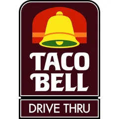
Food & Beverage · 9 points below the Food & Beverage average of 80 (25 logos)
The verdict
The Taco Bell logo effectively leverages strong recognition mechanics and emotional triggers to stimulate appetite, aligning well with its fast-food market position. However, its current design presents significant accessibility challenges and a lower-than-average universal color preference, which could limit broader market appeal and brand trust. Strategic updates to the color palette are crucial to enhance inclusivity and optimize instinctive customer attraction without compromising its iconic identity.
Score breakdown
How the Taco Bell logo scores across the analysis categories.
- Design76
- Psychology67
- Trust77
- Cognitive80
- Market66
- Typography78
- Color68
- Cultural64
Strengths and weak spots
What works
The logo boasts strong recognition due to its iconic bell symbol and bold typography. Its vibrant color palette effectively stimulates appetite and creates an energetic, fun brand image. The design is highly symmetrical, contributing to a sense of visual stability and harmony. The clear communication of 'DRIVE THRU' enhances functional clarity for customers.
Where it could improve
The logo's color contrast ratio fails WCAG AA and AAA standards, impacting accessibility. Its cultural sensitivity score is low due to specific color associations in certain regions. The overall color preference score is below average, potentially limiting instinctive appeal. The visual complexity is high, which could slightly hinder processing fluency in some contexts.
If this were your logo, we'd suggest
- Improve Color Contrast for Accessibility
- Refine Color Palette for Broader Appeal
- Simplify Visual Elements for Modernity
- Address Cultural Color Sensitivities
What the analysis found
Positioning
The logo's vibrant colors and iconic bell clearly position Taco Bell as an energetic and fun fast-food brand. Its industry fit is high, with visual cues that resonate with the quick-service restaurant sector. However, its high complexity and specific color choices might limit its ability to adapt to more premium or diverse market segments without significant modification.
Trust
The logo's strong symmetry and professional typography contribute to a respectable trust score, suggesting reliability. The established nature of the brand, reinforced by the familiar bell, also builds inherent trust. However, the critical failure in WCAG contrast ratio could erode trust among users who experience accessibility barriers, signaling a lack of consideration.
Recognition
The bell icon is a powerful recognition driver, ensuring high memorability and quick identification. The bold, distinct typography further aids in rapid brand recall. The eye-tracking data confirms that key elements like the bell and brand name are primary fixation points, ensuring efficient information processing and strong attention capture.
Emotion
The logo's warm and dynamic color palette, particularly the red and yellow, effectively stimulates appetite and evokes feelings of excitement and energy. This contributes to a strong emotional impact and arousal. The Jester archetype alignment suggests a brand that aims to bring joy, fostering a positive emotional connection, though the overall color preference is below average.
Design
The design exhibits good harmony and symmetry, creating a visually balanced composition. The figure-ground balance is effective, ensuring clarity of elements. However, the visual complexity is quite high, and the color contrast ratio is critically low, indicating significant design flaws in terms of accessibility and potentially hindering processing fluency for some viewers.
Brand personality
The Taco Bell logo strongly embodies the 'Excitement' personality. Its vibrant red and yellow colors, dynamic bell icon, and bold typography convey a sense of daring, spiritedness, and imagination. The brand feels up-to-date and lively, aligning perfectly with the fast-food experience. 'Sincerity' is moderately present (65) through the familiar, almost comforting bell shape and the traditional serif font, suggesting a down-to-earth quality. 'Competence' (60) is conveyed by the clear, structured layout and legible text, implying reliability. 'Sophistication' (30) is low, as the design prioritizes fun and accessibility over elegance. 'Ruggedness' (40) is also low, as the design lacks earthy tones or rough textures, focusing instead on a more polished, energetic aesthetic.
The logo, with its vibrant colors, playful bell icon, and bold typography, aligns with The Jester archetype. It suggests a brand that is fun, lighthearted, and aims to bring joy and entertainment. The energetic color palette and slightly whimsical bell contribute to an image of a brand that doesn't take itself too seriously, focusing on enjoyment and a lively experience, which is fitting for a fast-food chain targeting a broad, often younger, demographic.
Color and typography
The combination of deep reddish-brown, vibrant red, and bright yellow creates a strong emotional impact. Red stimulates appetite, energy, and excitement, while yellow adds a sense of happiness and optimism. The reddish-brown provides a grounding, rich feel. This palette is highly effective at evoking a sense of warmth, fun, and culinary desire, aligning well with a fast-food brand.
The bold, uppercase serif font for 'TACO BELL' conveys a personality that is established, confident, and slightly traditional, yet with a playful edge due to its distinctive serifs. This matches the brand's long-standing presence and its fun, energetic fast-food identity. The clean sans-serif for 'DRIVE THRU' communicates efficiency and modernity, aligning with the convenience aspect of the service.
Explore the full Taco Bell scorecard
Every metric behind the 71/100 — attention prediction, color harmony, typography and more, in the interactive report.
More from the index


Independent analysis. Logo Analyzer is not affiliated with or endorsed by Taco Bell; all trademarks and logos belong to their respective owners. Scores and commentary reflect one AI model's assessment of the logo's design and are not an official ranking, endorsement, or measure of brand or commercial success.