neuroscience brandingluxury
Luxury Brand Psychology Applied to Your Logo Design
Learn how luxury brand psychology shapes logo design and elevates your brand perception. Discover pr...
Repeated brand exposure builds lasting customer memories and drives recognition. Learn proven tactics to wire your brand into minds and boost loyalty today.
Repeated brand exposure builds lasting customer memories and drives recognition. Learn proven tactics to wire your brand into minds and boost loyalty today.
Most brand managers obsess over the first impression a logo makes. But the real magic happens on the fifth, tenth, or fiftieth viewing. Repeated brand exposure physically rewires neural pathways, turning a stranger's logo into something that feels familiar, trustworthy, and even preferred. The catch? Your logo has to be designed in a way that rewards repeated viewing, not just survives it.
I once worked with a health tech startup that had poured thousands into a beautiful logo. Gorgeous on a pitch deck. Completely forgettable after a week. The problem wasn't aesthetics. It was that the design offered nothing new on second glance, nothing to discover, nothing to pull the brain back for another look.
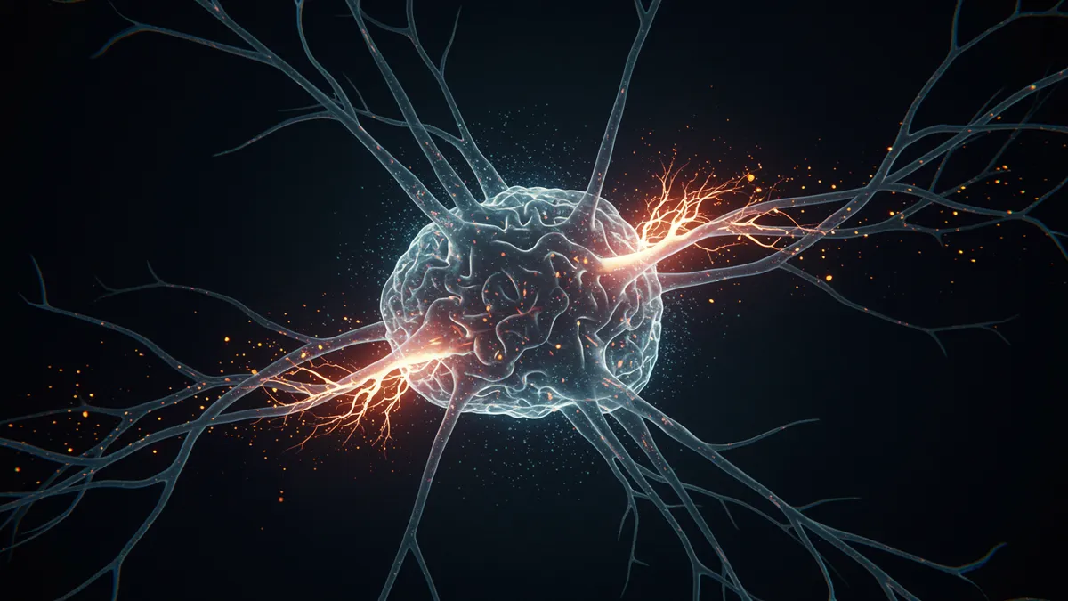
Every time someone sees your logo, their brain strengthens the synaptic connections associated with that visual. This process, known as memory consolidation branding, is how short-term recognition becomes long-term recall. Neuroscientists call it long-term potentiation (LTP), and it's the same mechanism that helps you remember a childhood phone number decades later.
Here's what's interesting: the effect isn't linear. Research on the mere exposure effect shows that preference for a stimulus increases with exposure, but only up to a point before habituation sets in Bornstein, 1989. That curve matters enormously for brand designers. Too few exposures and your audience never forms a memory trace. Too many identical exposures without variation, and they tune you out entirely.
The sweet spot? Consistent core elements (shape, color, spatial relationships) with enough visual richness to keep the brain engaged across viewings. Think of how the mere exposure effect works in branding and you'll see why repetition alone isn't enough. The design itself needs to be worth repeating.
Negative space logo design gives the brain something to discover on the second or third look. FedEx's hidden arrow. The Spartan helmet inside the Spartan Golf Club logo. The bear tucked into the Matterhorn on the Toblerone package. These aren't just clever tricks. They're cognitive hooks that reward repeated viewing.
Why does this work so well? When your brain detects a hidden element it missed before, it triggers a small dopamine response, the same reward chemical associated with solving puzzles Topolinski & Reber, 2010. That micro-reward creates a positive association with the brand and, critically, makes the viewer more likely to look again next time.
Negative space branding also increases what psychologists call "processing fluency." Once someone discovers the hidden element, every subsequent viewing becomes easier to process. And easier processing feels good. The brain interprets fluency as familiarity, and familiarity as trustworthiness. You can explore how Gestalt design principles strengthen your logo to understand the perceptual mechanics behind this.
Practical takeaway: if your logo is entirely literal, with nothing to decode, you're leaving neural engagement on the table. Even a subtle figure-ground reversal can add that second layer of discovery.
Not every logo needs hidden imagery. But every logo needs visual durability. Clever logo design techniques are the ones that hold up across hundreds of exposures without becoming wallpaper.
What separates durable designs from forgettable ones?
One thing designers overlook: context variation matters as much as the logo itself. A logo seen on a billboard, then a mobile app, then a product label creates richer memory encoding than the same logo seen three times in the same Instagram ad. Varied contexts force the brain to extract the logo's essential features, which strengthens the underlying memory trace.
Spacing matters more than volume. Cognitive science has known this since Ebbinghaus mapped the forgetting curve in the 1880s, but most marketing teams still ignore it. Showing your logo to someone 10 times in one day is far less effective than showing it once a day for 10 days.
This is called the spacing effect, and it's one of the most reliable findings in logo memorability science Cepeda et al., 2006. Spaced repetitions force the brain to actively retrieve the memory each time, which strengthens it. Massed repetitions (cramming) create the illusion of familiarity without the durable neural pathways.
So what does this mean for your brand? Plan your touchpoints deliberately. Map out where and when your audience encounters your logo across a week, a month, a quarter. If all your brand exposure happens in a single campaign burst followed by silence, you're working against your own biology.
Consider this: retargeting ads that show your logo at calculated intervals (say, days 1, 3, 7, and 14 after first contact) will outperform the same number of impressions crammed into 48 hours. The logo doesn't change. The timing does. And that timing difference can mean the gap between "I think I've seen that before" and genuine recall.
You can't manage what you can't measure. But most brand tracking studies ask the wrong questions. They test recognition ("Have you seen this logo before?") when they should test recall ("Draw the Apple logo from memory"). Recognition is easy. Recall is what drives purchase decisions when your logo isn't physically present.
A 2015 study asked 150 participants to draw the Apple logo from memory. Despite seeing it thousands of times, only 1 in 85 could reproduce it accurately Blake, Nazarian & Castel, 2015. That's a humbling number for one of the most exposed logos on the planet.
The lesson isn't that Apple's logo fails. It's that even massive repeated brand exposure doesn't guarantee accurate recall unless the design contains memorable anchors. Running a logo analysis through a neuroscience-backed analysis framework can reveal whether your mark has the structural features, contrast ratios, and color psychology in logos needed to encode properly.
Track these metrics over time: unaided recall rate, time-to-recognition in cluttered environments, and emotional valence associated with the mark. If those numbers aren't improving with exposure, the problem is the design, not the media spend.
There's a ceiling. After enough exposures, familiarity stops breeding preference and starts breeding boredom. Psychologists call this the inverted-U relationship between exposure and liking. Your job is to stay on the right side of that curve.
How? Controlled variation. Coca-Cola has used the same basic script logo for over a century, but they constantly refresh the context: seasonal packaging, limited edition cans, campaign-specific color treatments. The core identity stays locked. Everything around it evolves.
Google does something similar with its Doodles. The logo framework remains constant, four colors, a specific typeface weight, a particular spatial rhythm. But the surface expression changes daily. Each Doodle is a fresh exposure that reinforces the underlying brand architecture without triggering habituation.
You don't need Google's budget to apply this principle. Even rotating between a full-color logo, a monochrome version, and an icon-only mark across different touchpoints creates enough variation to keep the brain engaged. The key is maintaining what brand strategists call "identity coherence," the structural DNA that makes your logo yours, regardless of surface treatment. If you're unsure whether your variations maintain coherence, a logo comparison can help you spot where consistency breaks down.
Research suggests 5 to 7 exposures create basic recognition, but durable recall typically requires 10 or more spaced encounters Krugman, 1972. The number drops significantly when the logo contains distinctive features like hidden imagery or an unusual silhouette. Design quality and exposure spacing matter more than raw frequency.
Yes. Logos with discoverable hidden elements create a "reward" response in the brain when the viewer spots them. This dopamine-linked reaction strengthens the memory trace and increases the likelihood of voluntary re-engagement. Even subtle negative space techniques can measurably improve recall rates.
Absolutely. Overexposure without variation leads to habituation, where the brain essentially filters out the stimulus. Research on advertising wear-out confirms that identical creative shown too frequently can decrease both attention and preference Pechmann & Stewart, 1988. Vary your contexts and creative treatments to stay fresh.
Recognition means identifying a logo when you see it ("Yes, that's Nike"). Recall means reproducing or describing it from memory without a visual prompt. Recall is harder, rarer, and far more valuable for purchase decisions made away from the point of sale.
Your logo isn't just seen once and judged. It's encountered repeatedly, processed unconsciously, and gradually wired into your audience's memory. The question is whether your design rewards that repetition or wastes it. Use our logo analysis tools to find out whether your mark has the neural staying power to benefit from repeated brand exposure, or whether it's time to rethink the design before your next campaign dollar goes to work.
Learn how luxury brand psychology shapes logo design and elevates your brand perception. Discover pr...
Discover how brand loyalty psychology shapes effective logo design. Learn the psychological principl...
Learn how brand perception speed impacts customer decisions and discover proven design strategies to...
Get a free scientific analysis with 550+ metrics across perception and design.
Try Free Analysis