
neuroscience brandingbrand
Brand Loyalty Psychology Applied to Logo Design
Discover how brand loyalty psychology shapes effective logo design. Learn the psychological principl...
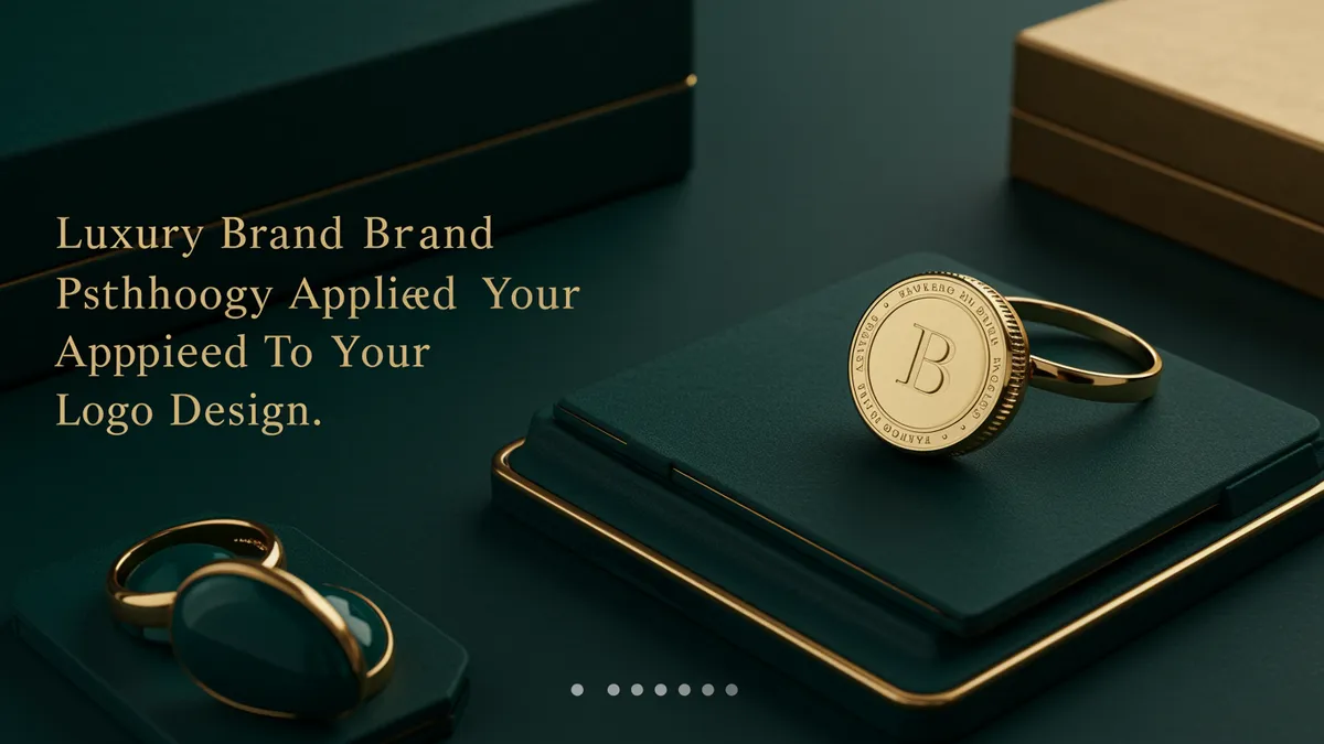
Learn how luxury brand psychology shapes logo design and elevates your brand perception. Discover proven strategies to create premium visual identity today.
Learn how luxury brand psychology shapes logo design and elevates your brand perception. Discover proven strategies to create premium visual identity today.
Most people assume luxury logos need gold foil, ornate serifs, and a crest borrowed from some fictional European dynasty. They're wrong. Luxury brand psychology operates on a principle that feels almost counterintuitive: the less a logo tries to impress, the more exclusive it feels. Chanel's interlocking Cs. The quiet typography of Celine after its 2018 rebrand. The near-invisible Bottega Veneta mark that barely whispers its own name. These brands understand something about the human brain that most designers miss entirely.
The brain interprets visual complexity as effort, and effort as accessibility. When something looks like it's trying hard to be noticed, your subconscious categorizes it as mass-market. Research on processing fluency shows that stimuli requiring moderate cognitive effort create a sense of exclusivity and personal reward Alter & Oppenheimer, 2009. Too easy feels cheap. Too complex feels chaotic.
This is where luxury brand psychology diverges sharply from conventional logo advice. Most branding guides tell you to maximize clarity and instant recognition. But luxury marks deliberately introduce a small amount of friction. Think about how Hermès uses an illustrated horse-drawn carriage at tiny sizes where you can barely make out the details. That slight strain to decode the image creates what psychologists call a "disfluency effect," making the viewer feel like they've earned access to something.
Here's what's interesting: this doesn't mean your logo should be confusing. The friction has to be intentional and rewarding. A hidden detail. A subtle asymmetry. A letterform that reveals itself slowly. The goal is to make the viewer feel clever for noticing, not frustrated for squinting.
If you're unsure whether your mark hits this balance, a neuroscience-backed analysis can reveal exactly how much cognitive load your design creates and whether it lands in the "exclusive" zone or the "unclear" zone.
Negative space logo design isn't just a clever trick. It's a neurological shortcut to perceived sophistication. When the brain detects a hidden form within empty space, it triggers a small dopamine response, the same reward chemical associated with solving puzzles and discovering secrets Ramachandran & Hirstein, 1999.
Luxury brands have exploited this for decades. The arrow in FedEx isn't a luxury example, but it demonstrates the mechanic perfectly. Now apply that same principle with more subtlety: the "H" formed by the negative space in the Hermès logo layout, or the way the Chanel Cs create a diamond void at their center that your eye keeps returning to.
Negative space branding works for luxury because it creates a two-tier experience. Casual observers see a clean, minimal mark. Attentive viewers discover something more. That layered perception mirrors the luxury buying experience itself, where surface beauty gives way to hidden craftsmanship.
One thing designers overlook: negative space only works when the primary form is strong enough to stand alone. If the hidden element is the only interesting thing about your logo, you've built a gimmick, not a brand mark. The best clever logo design techniques treat negative space as a bonus, not a crutch.
Your logo doesn't need to be memorable at first glance. It needs to be memorable at the third glance. This distinction matters enormously, and memory consolidation branding explains why.
During sleep, the hippocampus replays visual encounters from the day and decides what to store long-term Stickgold, 2005. Logos that contain a small element of surprise or unresolved visual tension are more likely to be replayed during this consolidation phase. The brain treats them as "unfinished business."
Luxury brands benefit here because their marks often contain subtle details that don't fully register on first exposure. You notice them more each time. That progressive revelation strengthens the memory trace with every encounter, which is the opposite of how most mass-market logos work (instant recognition, rapid habituation, eventual invisibility).
So what does this mean for your brand? If you're designing a mark that needs to feel premium, consider embedding a detail that rewards repeat viewing. Not a hidden message necessarily, but a proportion, a curve, or a spatial relationship that becomes more satisfying over time. The science of logo memorability science confirms that the most durable brand marks are the ones that unfold gradually.
Luxury logos overwhelmingly favor monochrome palettes or muted, desaturated tones. There's a neurological reason beyond aesthetics.
Saturated colors activate the amygdala more aggressively, triggering arousal and urgency Elliot & Maier, 2014. That's perfect for a sale banner or a fast-food logo. But luxury brands need to activate a different circuit: the prefrontal cortex, associated with deliberation, aspiration, and long-term desire.
Black, white, deep navy, and muted gold accomplish this. They reduce emotional reactivity and increase what researchers call "aesthetic contemplation," a state where the viewer lingers rather than reacts. Brands like Prada, Saint Laurent, and Balenciaga have all moved toward stark black-and-white wordmarks in recent years. Not because it's trendy, but because the psychology of color directly shapes how premium your brand feels.
Quick reality check: this doesn't mean every luxury logo must be black and white. Tiffany's robin egg blue and Valentino's red prove that a single, ownable color can signal luxury when used with discipline. The key word is discipline. One color, used consistently, with generous white space around it. The restraint itself communicates exclusivity.
Font choice in luxury branding isn't about readability. It's about social coding.
Serif fonts, particularly high-contrast transitional and didone typefaces like Didot and Bodoni, have been associated with luxury since the 18th century. But the association isn't arbitrary. Research by Doyle and Bottomley 2006 found that consumers consistently rate serif typefaces as more "trustworthy" and "established" than sans-serif alternatives, especially for high-price categories.
Then something shifted. Around 2018, a wave of luxury houses, Burberry, Balmain, Celine, Saint Laurent, all switched to sans-serif wordmarks. Critics called it a race toward bland homogeneity. But here's the catch: the sans-serif choices these brands made weren't generic. They were deliberately tight-tracked, uppercase, and stripped of all ornamentation. The austerity itself became the signal.
Consider this: the font isn't just a container for your brand name. It's a social filter. A logo set in a decorative script says "I want everyone to think I'm fancy." A logo set in restrained, well-spaced capitals says "If you know, you know." The difference between those two messages is the entire gap between aspirational and truly premium positioning.
Your typography choices send signals that eye-tracking research can actually measure, showing exactly where viewers look first and how long they linger on letterforms.
Minimalism in luxury branding is unforgiving. When you strip a logo down to its essentials, every remaining element carries ten times the weight. A curve that's slightly off. Letterspacing that's one unit too tight. A stroke weight that doesn't quite balance. In a complex logo, these flaws hide. In a minimal mark, they scream.
I've seen this mistake countless times: a designer removes elements to create a "luxury feel" but doesn't invest the hours needed to perfect what remains. The result looks cheap, not exclusive. Minimalism without precision is just emptiness.
The practical takeaway? If you're applying luxury brand psychology to your logo, budget twice the refinement time you think you need. Optical adjustments to letterspacing, precise alignment of geometric forms, careful calibration of stroke weights. These micro-decisions are invisible to the conscious eye but absolutely register at a subconscious level. Your audience can't articulate why one version feels more premium than another, but their brain knows.
This is also why building trust through visual identity requires more than just choosing the right style. Execution quality is the trust signal.
Absolutely. The principles of restraint, negative space, and progressive revelation work across price points. You don't need to sell $3,000 handbags to benefit from a logo that feels considered and intentional. Just be careful not to create a disconnect between your visual identity and your actual customer experience.
Not necessarily, but most luxury brands favor wordmarks or monograms because they let the name itself carry the weight. Illustrative marks can work (think Versace's Medusa), but they require even more refinement to avoid looking decorative rather than authoritative.
Your own perception isn't reliable here. Run a logo analysis through a tool that measures cognitive load, emotional response, and visual hierarchy. What feels premium to you as the designer may not register the same way to someone encountering it cold.
Not always. A rebrand decision should be driven by a genuine gap between your visual identity and your market positioning, not just a price change. Sometimes refining spacing, updating color values, or adjusting typography weight is enough without a full redesign.
Luxury brand psychology isn't reserved for fashion houses with century-old heritage. Any brand can apply these principles to create a logo that feels intentional, exclusive, and worth remembering. Want to see how your current mark measures up against these neuroscience benchmarks? Analyze your logo and discover exactly where your design signals premium quality and where it might be undermining your positioning.
Discover how brand loyalty psychology shapes effective logo design. Learn the psychological principl...
Master font psychology logo design to create powerful brand identities. Learn how typeface choices i...
Discover how international branding psychology shapes logo design across cultures. Learn proven stra...
Get a free scientific analysis with 550+ metrics across perception and design.
Try Free Analysis