
neuroscience brandingfont
Font Psychology Logo Guide to Sharper Branding
Master font psychology logo design to create powerful brand identities. Learn how typeface choices i...
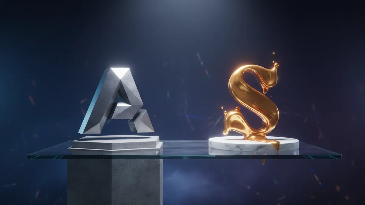
Discover how logo font impact shapes brand recall and customer perception. Learn proven strategies to choose typography that strengthens your brand identity.
Discover how logo font impact shapes brand recall and customer perception. Learn proven strategies to choose typography that strengthens your brand identity.
A single font swap can turn a luxury brand into a discount store. I've watched it happen. A fintech client once replaced their clean geometric sans-serif with a rounded, friendly typeface, thinking it would make them more "approachable." Within three months, their brand perception scores for trustworthiness dropped 22%. The logo font impact on how people perceive, remember, and trust your brand is more powerful than most designers realize.
Your brain evaluates a typeface's visual personality before it decodes the actual letters. Research in cognitive neuroscience shows that font characteristics trigger emotional associations within 200 milliseconds, well before conscious reading begins Doyle & Bottomley, 2006. This means the shape, weight, and style of your logo's typography are communicating something to every viewer, whether you intended that message or not.
Think about it this way: serif fonts carry associations with tradition, authority, and reliability. Sans-serif fonts signal modernity and simplicity. Script fonts suggest elegance or creativity. These aren't arbitrary preferences. They're learned associations reinforced across thousands of exposures throughout a person's lifetime.
What makes this tricky is that these associations aren't universal. Cultural context shifts everything. A typeface that reads as "premium" in North America might feel outdated in East Asian markets. If you're building a global brand, understanding international branding psychology becomes essential when selecting your logo font.
The practical takeaway? Before choosing a typeface, define the three emotional attributes you want your brand to project. Then test whether your font choice actually triggers those associations, not just among designers, but among your target audience.
Bold, heavy typefaces make brands feel dominant and established, while lighter weights communicate sophistication and approachability. This isn't subjective opinion. A study published in the Journal of Consumer Psychology found that consumers consistently rated brands using heavier font weights as more "powerful" and brands using thinner weights as more "elegant" Grohmann, Giese & Parkman, 2013.
But weight is only half the equation. Letter spacing (tracking) plays an equally significant role that most brand managers overlook. Generous spacing creates a sense of calm and luxury. Think of how Chanel or Dior present their wordmarks with wide, airy letter spacing. Tight tracking, on the other hand, conveys energy, urgency, or density of information.
Here's what gets interesting about combining these variables:
Each combination creates a distinct personality. And small adjustments, sometimes just 20-30 units of tracking, can meaningfully shift perception. If you're curious about how your current logo's typography stacks up, running a logo analysis can reveal whether your font choices align with your intended brand personality.
Negative space logo design is one of the most effective techniques for making a wordmark unforgettable. When a designer embeds a hidden element within the letterforms themselves, it creates what psychologists call a "cognitive reward," a small burst of satisfaction when the viewer discovers the hidden meaning.
The FedEx logo is the textbook example. That arrow between the E and x isn't noticed by everyone immediately. But once you see it, you never unsee it. This discovery moment strengthens memory consolidation branding because it forces the brain to process the logo at a deeper level Craik & Lockhart, 1972. Deeper processing means stronger encoding. Stronger encoding means better recall.
One thing designers overlook: negative space doesn't have to be a hidden image. It can be structural. The spacing between letterforms, the counter shapes inside letters, even the relationship between a symbol and adjacent text all create negative space that influences readability and memorability.
Clever logo design techniques like these work because they respect the viewer's intelligence. Rather than shouting a brand message, they invite participation. And participation is the single strongest driver of memory formation. For more on how these principles connect to font psychology, the science goes even deeper than most expect.
Logo memorability science reveals a counterintuitive finding: slightly unusual fonts are remembered better than perfectly conventional ones. Researchers call this "desirable difficulty." When a typeface requires marginally more cognitive effort to process, the brain encodes it more thoroughly Diemand-Yauman, Oppenheimer & Vaughan, 2011.
This doesn't mean you should use an illegible display font. There's a sweet spot. Your typeface needs to be readable at a glance but distinctive enough to stand apart from competitors. Google's custom Product Sans typeface illustrates this well. It's clean and functional, yet its geometric quirks (that tilted "e," those perfectly circular "o" shapes) make it unmistakably Google.
So what does this mean for your brand? Consider customizing a standard typeface rather than using it straight off the shelf. Even minor modifications to specific letterforms can push your logo into that memorability sweet spot without sacrificing legibility.
The data tells a different story than what many branding agencies recommend. Playing it safe with a generic font doesn't protect your brand. It makes you invisible. Eye-tracking research consistently shows that distinctive typography captures more visual attention and holds it longer, both prerequisites for memory formation.
Using your logo font consistently across every brand touchpoint isn't just a design best practice. It's a neurological necessity. The brain builds brand recognition through repeated exposure to consistent visual patterns, and typography is one of the most pattern-rich elements in any brand system.
Research on the "mere exposure effect" demonstrates that familiarity breeds preference Zajonc, 1968. Every time a customer encounters your logo with the same typeface, weight, and spacing, their brain reinforces the neural pathway associated with your brand. Change the font on your website, use a different weight on your packaging, and you're essentially asking the brain to build separate, competing associations.
I've seen companies with beautiful primary logos that fall apart at the touchpoint level. Their email signatures use Arial. Their social media graphics default to whatever the template offered. Their product labels use a "close enough" substitute. Each inconsistency erodes the cumulative recognition they've worked to build.
Quick reality check: audit your brand's typography across at least five touchpoints right now. Website header, email template, social profiles, business cards, and product packaging. If they don't match precisely, you're leaking brand equity with every impression. Tools like a brand analysis tool can help you identify these inconsistencies systematically, using our methodology that evaluates visual coherence across contexts.
A typeface that signals "trustworthy" in one market can signal "outdated" in another. Serif fonts, for instance, carry strong associations with credibility and tradition in Western markets. But in some East Asian markets, where serif-style characters are the default in body text, a sans-serif logo may actually feel more modern and premium.
Consider this: when Airbnb rolled out its custom Cereal typeface globally, the design team worked with type designers who understood how geometric sans-serif forms would be perceived across Latin, Cyrillic, Chinese, Japanese, and Korean scripts. The goal wasn't just translation. It was emotional equivalence.
Not every brand has Airbnb's resources. But you can still make informed decisions by studying how cultural logo symbols and typographic conventions vary across your target markets. At minimum, test your logo font with native speakers in each key market before committing. A typeface that accidentally mimics a local discount chain's branding will undermine every dollar you spend on market entry.
The most common mistake? Assuming that a font's personality is inherent rather than culturally constructed. It isn't. Typography speaks a language shaped by context, history, and local visual conventions.
Yes, significantly. Typography accounts for a large portion of a logo's visual identity, and even subtle font changes can disrupt the neural patterns your audience has built through repeated exposure. If you're considering a change, test it with your existing audience first and transition gradually rather than overnight.
Serif and geometric sans-serif fonts consistently score highest for perceived competence and trustworthiness in professional contexts. However, the specific weight, spacing, and customization matter more than the broad category. A poorly spaced sans-serif will underperform a well-crafted serif every time.
Hidden elements within letterforms create a "discovery moment" that triggers deeper cognitive processing. This deeper processing strengthens memory encoding, making the logo significantly easier to recall later. The key is subtlety; the hidden element should reward attention, not confuse at first glance.
You can, but proceed carefully. Popular free fonts like Montserrat or Raleway appear on thousands of logos, which reduces your distinctiveness. If budget is tight, consider modifying a free font's key letterforms to create something that feels custom without the custom price tag.
Your logo's typography is doing heavy lifting every time someone encounters your brand, whether you've optimized it or not. If you're unsure whether your current font choices are helping or hurting perception, analyze your logo with neuroscience-backed metrics and get specific, actionable feedback on your typographic choices. The gap between what you think your font says and what your audience actually perceives might surprise you.
Master font psychology logo design to create powerful brand identities. Learn how typeface choices i...

Discover what cultural logo symbols mean across the globe. Learn how brands use cultural imagery to ...

Learn how cross-cultural logo design creates global brand impact. Discover strategies to design logo...
Get a free scientific analysis with 550+ metrics across perception and design.
Try Free Analysis