
industry applicationsarchitecture
Architecture Firm Branding Done Right With AI Analysis
Discover how architecture firm branding transforms with AI analysis. Learn proven strategies to elev...
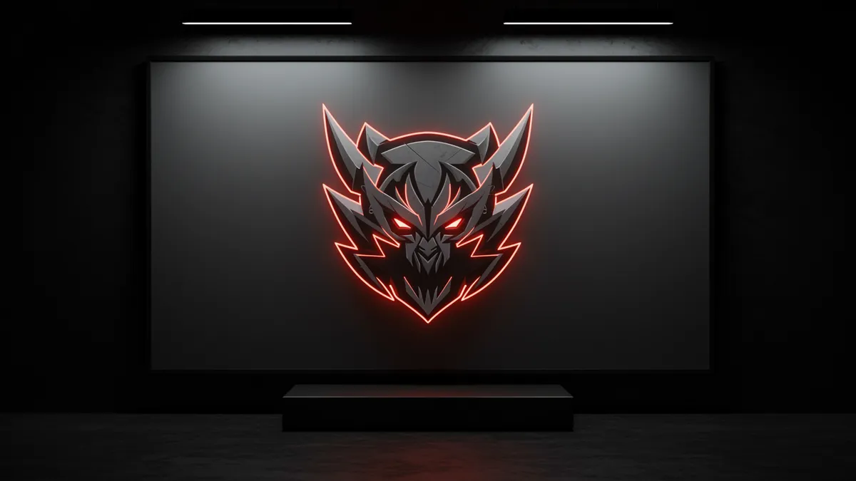
Discover how esports branding leverages neuroscience data to create winning strategies. Learn proven techniques that boost engagement and build loyal fan com...
Discover how esports branding leverages neuroscience data to create winning strategies. Learn proven techniques that boost engagement and build loyal fan com...
Most esports teams design their logos to look aggressive. Skulls, fangs, lightning bolts, all cranked to maximum intensity. But esports branding that actually builds lasting fan loyalty works differently than you'd expect. The brands winning the merchandise war and the sponsorship deals aren't always the loudest ones in the room. They're the ones whose visual identity triggers the right neurological response in under 400 milliseconds.
I once consulted with a competitive gaming org that couldn't figure out why their merch wasn't selling. Their logo looked incredible on screen. Printed on a hoodie? It became an unreadable smear of gradients and fine lines. That disconnect between digital-first design and real-world application is one of the most common failures in esports visual identity.
Esports logos operate under constraints that traditional sports branding never had to consider. A Premier League crest needs to work on a jersey and a stadium sign. An esports logo needs to work on a Twitch overlay at 80 pixels wide, a team jersey, a Discord emoji, and a 4K broadcast overlay, sometimes all within the same hour.
Research on visual complexity and brand recognition suggests that simpler logos are recognized faster and remembered more accurately Henderson & Cote, 1998. Yet the esports industry gravitates toward intricate, highly detailed marks. This creates a tension that smart brands resolve through modular logo systems rather than a single fixed mark.
Think about it this way: T1 (formerly SK Telecom T1) stripped their branding down to a clean, geometric wordmark. It scales perfectly from a 16x16 favicon to a stadium banner. Team Liquid went even further, reducing their mark to a stylized horse head that reads clearly at any size.
The takeaway? Design your primary mark for the smallest use case first. If it works as a Discord avatar, it'll work everywhere else. Running a logo analysis can reveal exactly where your mark breaks down across different scales.
Color selection in esports branding isn't just aesthetic preference; it's a cognitive strategy. Blue dominates the space for a reason. Research on color and emotion shows that blue hues are associated with competence and trust Labrecque & Milne, 2012, which matters when you're asking fans to buy into a team identity and sponsors to write six-figure checks.
But here's the catch: when everyone picks blue, nobody stands out. Cloud9, Team Liquid, Evil Geniuses, and dozens of smaller orgs all lean heavily into blue palettes. The psychology of color tells us that distinctiveness drives recall. If your competitors are all blue, being orange might be the smarter neurological play.
100 Thieves understood this instinctively. Their red, black, and white palette cuts through the sea of blue logos in competitive gaming. It also happens to align with color associations that signal excitement and energy Elliot & Maier, 2014.
Quick reality check: choosing a distinctive color only works if you own it consistently. That means enforcing your palette across every touchpoint, from your website to your player cam borders during broadcasts.
The animal logo design tradition runs deep in competitive sports, and esports inherited it wholesale. Wolves, eagles, bears, dragons. The instinct makes sense: animal mascots create immediate emotional shortcuts. A study on anthropomorphism in branding found that animal mascots increase perceived brand warmth without sacrificing competence Connell, 2013.
But not every animal mascot works in competitive gaming contexts. The most effective ones share three traits:
One thing designers overlook: the same principles that make animal mascots work in esports apply directly to pet industry branding and pet brand logo design. A premium dog food brand and an esports team both need an animal mark that's instantly recognizable, emotionally resonant, and scalable. The difference is tonal, not structural. Where an esports wolf snarls, a pet brand wolf might appear noble and protective. Same geometric principles, different emotional target.
If you want to see how your animal mascot performs across different contexts, a neuroscience-backed analysis can measure exactly how viewers perceive your mark's emotional tone.
This might surprise you, but some of the most relevant branding lessons for esports teams come from the beauty brand identity space. Hear me out.
Cosmetics branding has spent decades perfecting something esports desperately needs: the ability to create aspirational identity through visual design. Glossier, Fenty Beauty, and Charlotte Tilbury don't just sell products. They sell belonging to a specific aesthetic tribe. Their visual systems are cohesive, emotionally precise, and ruthlessly consistent.
Esports organizations are selling the same thing. When a fan puts on a 100 Thieves hoodie, they're signaling tribal membership, not just team support.
Consider this: luxury beauty brands typically use restrained typography, generous white space, and limited color palettes. The most successful esports lifestyle brands (100 Thieves, FaZe Clan's fashion line) have adopted exactly these principles for their merchandise and lifestyle branding, even while keeping their competitive logos more aggressive.
The lesson is clear. Your competitive mark and your lifestyle brand don't need to look identical. They need to share DNA: the same color palette, the same typographic family, the same proportional relationships. This dual-identity approach lets you compete credibly on broadcast while selling streetwear that people actually want to wear in public.
Too many esports brands launch their visual identity based on internal consensus rather than audience data. The founding team loves it. Their designer friends love it. Then it hits the market and generates zero emotional connection with the target audience.
Eye-tracking research shows that viewers form their first impression of a logo in roughly 400 milliseconds. In that fraction of a second, your mark needs to communicate energy, competence, and distinctiveness. You can't course-correct after launch without significant brand equity loss.
Before committing to a final mark, test these specific variables:
A structured logo analysis can give you objective data on all four of these dimensions before you spend a dollar on implementation. I've seen teams save months of rebranding headaches by testing early.
Short-term hype kills esports brands. A flashy rebrand generates Twitter buzz for 48 hours, then fades. Lasting brand equity comes from consistency, and consistency is boring. That's why so few orgs do it well.
The teams with the strongest brand recognition, think Fnatic, Cloud9, T1, have maintained their core visual identity for years. They evolve incrementally. A refined wordmark here, a slightly adjusted color value there. Never a wholesale reinvention.
Research on brand familiarity and preference confirms this approach. Repeated exposure to a consistent visual identity increases both recognition and positive affect Zajonc, 1968. Every time you dramatically change your logo, you reset that familiarity clock.
So what does this mean for your brand? If you're building a new esports organization, invest heavily in getting your initial identity right. If you're managing an existing one, resist the urge to rebrand every two years. Instead, audit what you have. Check for signs your logo needs a refresh based on performance data, not boredom. Sometimes the best branding decision is the one you don't make.
No. Aggressiveness is one valid emotional strategy, but brands like T1 and 100 Thieves prove that clean, modern marks can be equally effective. The key is matching your visual tone to your brand personality and audience expectations, not defaulting to skulls and claws because everyone else does.
Avoid major rebrands more than once every five to seven years. Minor refinements, like adjusting proportions or simplifying details for better digital performance, can happen more frequently. Consistency builds recognition, and frequent changes erode the familiarity that makes fans feel connected.
At minimum: SVG for scalable digital use, PNG with transparency for overlays, and a simplified icon version for favicons and social avatars. Many teams also need animated versions (After Effects or Lottie files) for broadcast and stream packages. Always maintain a master vector file.
It can, but many successful orgs use a modular system instead. A bold, detailed mark for competition and broadcast, paired with a simplified or typographic version for apparel and lifestyle products. Both versions should share core design DNA like color and proportional relationships.
Your esports brand lives across more touchpoints than almost any other type of identity. Stream overlays, merchandise, social media, broadcast packages, sponsor decks. That's a lot of places for a logo to fail quietly. Before you launch or rebrand, analyze your logo with neuroscience-backed data so you can see exactly how your audience's brain responds to your mark. The insights might change everything.
Discover how architecture firm branding transforms with AI analysis. Learn proven strategies to elev...

Discover how entertainment branding powered by AI insights captivates audiences and drives engagemen...

Discover how sustainable branding powered by AI logo insights transforms your brand identity while r...
Get a free scientific analysis with 550+ metrics across perception and design.
Try Free Analysis