
color psychologycolor
Color Trends Logos Should Follow for Stronger Impact
Discover the latest color trends logos should follow to create stronger visual impact. Learn how to ...
Color pairing for brands builds trust through strategic psychology. Learn proven color combinations that establish credibility and boost customer confidence ...
Color pairing for brands builds trust through strategic psychology. Learn proven color combinations that establish credibility and boost customer confidence ...
A fintech startup I worked with last year had a brilliant product, a sharp wordmark, and a color palette that was quietly sabotaging their credibility. Their color pairing for brands consisted of bright orange on electric blue. It felt energetic, sure. But their target audience, CFOs and finance directors, read it as "unserious." One palette swap later, conversions on their signup page jumped 22%.
Color pairing isn't decoration. It's a trust signal your audience processes before they read a single word.
Choosing a single brand color gets all the attention, but the relationship between your colors is what shapes perception. Research on color harmony shows that people form aesthetic judgments about color combinations within 90 milliseconds, faster than they can process your tagline or logo shape Schloss & Palmer, 2011. That snap judgment carries weight: it influences whether someone perceives your brand as trustworthy, innovative, or cheap.
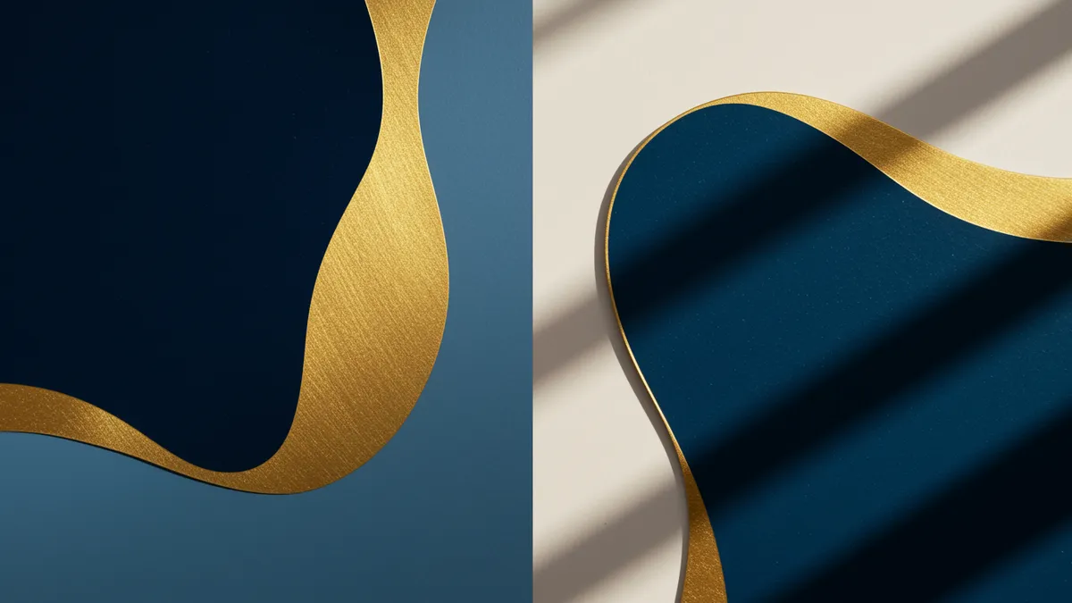
Think about it this way: navy blue alone signals reliability. Pair it with gold, and you get "premium financial institution." Pair that same navy with lime green, and suddenly you're a challenger brand or a sports drink. The individual color didn't change. The pairing changed everything.
This is why looking at the psychology of color in isolation only tells half the story. Your secondary and accent colors create context for your primary color. They tell people which version of blue, red, or green you mean.
What should you do with this? Stop evaluating brand colors one at a time. Always test them as pairs or full palettes against your target audience's expectations.
Certain color relationships consistently outperform others in trust-building contexts. Analogous color pairs (colors that sit next to each other on the color wheel) tend to feel harmonious and safe. Complementary pairs (opposite each other) create energy and tension. Neither is inherently better; the right choice depends on what your brand needs to communicate.
A study published in Color Research & Application found that moderate contrast between paired colors increased perceived professionalism, while very high contrast reduced it Ou et al., 2004. This explains why so many law firms and banks pair dark blue with muted gray or cream rather than dark blue with bright yellow.
But here's the catch: trust isn't universal. Cultural context matters enormously. White paired with gold reads as luxury in Western markets. In parts of East Asia, white carries associations with mourning. If your brand operates across regions, your color pairing for brands needs to account for these differences.
Here's a practical framework for trust-oriented palettes:
Running a logo analysis on your current palette can reveal whether your combination lands where you intend or sends mixed signals.
The purple color meaning brand strategists love to cite is "creativity meets authority." And there's real substance behind it. Purple sits between the warmth of red and the calm of blue, which is why it often registers as both imaginative and trustworthy. That duality makes it especially popular in purple branding tech circles.
Twitch, Roku, Nubank, Figma. The list of tech companies leaning into purple keeps growing. Research by Joe Hallock found that purple ranks as the favorite color of roughly 23% of women and is rarely cited as a "least favorite" by either gender, giving it broad appeal without the overuse problem that plagues blue Hallock, 2003.
One thing designers overlook: purple is notoriously difficult to pair. It fights with most warm colors and can look muddy next to certain greens. The most successful purple tech brands typically pair it with white, light gray, or a single high-contrast accent (Nubank's purple and white is a masterclass in restraint).
Worth noting: purple fails when the brand context demands ruggedness or simplicity. A construction equipment company in purple would confuse more than it would differentiate. Context always wins over color theory.
If you're considering purple, test it. Don't assume. Use brand color testing methods to validate that your audience actually associates your purple palette with the traits you're targeting.
Color A/B testing logo variations sounds straightforward, but most teams do it wrong. They test entirely different palettes against each other, which introduces too many variables. You can't tell if the blue won because of the blue, or because the typeface looked better against it.
Better approach: isolate one variable at a time.
Test your primary color at two different saturations. Test your color pair with the same primary but two different secondary colors. Test background color while keeping the logo fixed. This way, you actually learn something useful.
The short answer? Small, controlled tests beat dramatic overhauls every time.
A few practical tips for brand color testing:
Our analysis methodology uses neuroscience principles to evaluate how color pairs perform on perception metrics before you commit to live testing, which can save weeks of experimentation.
Your logo doesn't live in one place. It shows up on white backgrounds, dark app interfaces, social thumbnails, printed business cards, and trade show banners. A color pair that looks stunning on your website hero section might turn to mud on a dark mobile UI.
This is where many brands discover their palette has hidden weaknesses. To optimize logo colors, you need to stress-test them across contexts:
Consider this: Slack's original plaid logo used 11 colors and looked terrible on most backgrounds. Their 2019 redesign simplified the palette, improving recognition and reproduction across every medium.
You can compare logos side by side across different background contexts to see how your palette holds up before committing to a redesign. If your colors only work in ideal conditions, they don't really work.
Most effective brand palettes use two to three core colors plus one or two neutrals. More than five total colors creates inconsistency and dilutes recognition. Start with a strong primary-secondary pair and add accent colors only when you have a clear functional reason for them.
Technically yes, but it's a bad idea. Color pairing is one of the fastest ways audiences distinguish between brands in the same space. If your competitor owns navy and gold in your category, find an adjacent combination that still communicates your values without creating confusion.
Color pairing doesn't directly affect search rankings, but it significantly impacts user behavior metrics that search engines track. Poor color contrast increases bounce rates and reduces time on page. Accessible, well-paired colors keep people engaged longer, which sends positive signals to search algorithms.
Review your palette every two to three years, or whenever you notice declining engagement metrics. If your signs your logo needs a refresh are showing, your colors are likely part of the problem. Markets shift, display technology evolves, and competitor palettes change around you.
Your color palette is doing more persuasion work than your copy, and most of it happens before conscious thought kicks in. If you haven't validated your color pairing with real data, you're guessing at one of the most consequential brand decisions you'll make. Analyze your logo to see how your current colors score on trust, recognition, and emotional resonance, then make changes backed by evidence instead of instinct.
Discover the latest color trends logos should follow to create stronger visual impact. Learn how to ...
Learn how color accessible logo design reaches every audience. Discover inclusive design principles ...

Discover how color symbolism cultures shape brand perception. Learn to design logos that resonate gl...
Get a free scientific analysis with 550+ metrics across perception and design.
Try Free Analysis