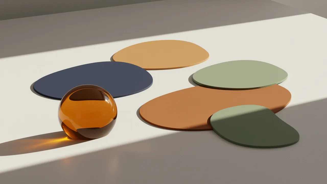
color psychologybrand
Brand Color Combinations That Trigger the Right Emotions
Discover powerful brand color combinations that evoke emotions and drive customer action. Learn psyc...

Brand color and buying habits shape customer decisions. Learn how strategic logo colors influence consumer psychology and boost sales today.
Brand color and buying habits shape customer decisions. Learn how strategic logo colors influence consumer psychology and boost sales today.
A fintech founder I worked with once told me his team spent four months choosing their tech stack but picked their brand colors in an afternoon. They went with blue because "that's what financial companies do." Six months later, their conversion rates were lagging behind a competitor whose entire visual identity was built around a deep violet. The difference wasn't the product. It was how brand color and buying behavior intersected at every customer touchpoint.
Color isn't decoration. It's a decision-making shortcut your customers use before they ever read your copy or compare your pricing.
Your brain processes color 60,000 times faster than text Singh, 2006. That speed matters because purchasing decisions are overwhelmingly emotional first, rational second. A study in the journal Management Decision found that up to 90% of snap judgments about products can be based on color alone Singh, 2006.
Think about it this way: when a shopper scrolls past your logo on a crowded marketplace page, they aren't reading your tagline. They're registering a color impression. That impression either pulls them closer or pushes them away, and it happens in roughly 90 milliseconds.
This is why the connection between brand color and buying habits deserves more than a mood board brainstorm. The colors in your logo create an immediate emotional frame. If that frame conflicts with your audience's expectations or desires, no amount of clever messaging will fully compensate.
Here's what makes this tricky. The "right" color isn't universal. It depends on your industry, your target demographic, and the specific emotional state that precedes a purchase in your category. A calming sage green might be perfect for a wellness brand but disastrous for an energy drink. Context is everything, and a logo analysis can help you understand whether your current palette matches your audience's buying psychology.
Purple color meaning in brand contexts has shifted dramatically over the past decade. Historically associated with royalty, luxury, and spirituality, purple has become a go-to choice for tech companies that want to signal innovation without the coldness of blue.
Twitch, Roku, Nubank, Wonolo. The list of purple branding tech success stories keeps growing. Research by Joe Hallock found that purple ranks as the second most preferred color among women and carries strong associations with creativity and imagination across genders Hallock, 2003. For tech brands targeting creative professionals or younger demographics, that association is gold.
But here's the catch: purple can backfire in categories where trust and stability matter more than creativity. Financial services for older demographics, industrial B2B, healthcare for seniors. In those spaces, purple sometimes reads as unfamiliar or even unserious. One study on color and brand personality found that consumers expect color choices to "fit" the brand's perceived purpose Bottomley & Doyle, 2006. When the fit feels off, trust drops.
So if you're considering purple for your tech brand, ask yourself two questions. First, does your audience value innovation over tradition? Second, are your competitors mostly using blue and gray? If yes to both, purple can be a powerful differentiator. If your audience skews conservative, proceed with caution and test first.
Guessing which colors will drive conversions is expensive. Brand color testing removes the guesswork, but only if you do it right.
The most common approach is color A/B testing for logos and brand assets. You create two or more variations of your logo or landing page with different color palettes, then measure which version produces better engagement, click-through rates, or conversions. Simple in theory. Messy in practice.
The biggest mistake I see? Testing colors in isolation. Swapping a blue button for an orange one tells you almost nothing about your brand's color strategy. You need to test the full color system: logo, background, typography color, and accent colors together. Colors interact. A red CTA button performs differently against a white background than against a navy one.
A few practical guidelines for meaningful color tests:
Tools like our neuroscience-backed analysis can give you a head start by evaluating how your current colors perform against cognitive and emotional benchmarks before you invest in a full A/B testing cycle.
Misalignment between color and brand promise is more common than you'd think. And it quietly bleeds revenue.
Consider a premium organic food brand using bright, saturated primary colors. Those colors scream "mass market" and "kid-friendly," not "artisanal" or "worth the premium price." The product might be exceptional, but the color story undermines the positioning before the customer even picks up the package.
Research by Labrecque and Milne (2012) demonstrated that color saturation and value (lightness/darkness) influence brand personality perceptions independently of hue. High saturation signals excitement and energy. Low saturation communicates sophistication and calm. A brand promising luxury but using highly saturated colors creates cognitive dissonance, and cognitive dissonance kills conversions.
Worth noting: this alignment issue often hides in plain sight. Teams get so used to their own brand colors that they stop questioning whether those colors still match the brand's evolved positioning. If you've pivoted your messaging, expanded your audience, or moved upmarket in the past two years, your colors might be telling yesterday's story. That's one of the clearest signs your logo needs a refresh.
To check your own alignment, try this exercise. Show your logo to ten people who've never seen your brand. Ask them to describe the brand's personality using only the visual impression. If their descriptions don't match your brand strategy, your colors are working against you.
Here's where many brand managers freeze up. They know their colors need work, but they're terrified of losing the equity they've built. Fair concern. But the solution isn't to do nothing.
You can optimize logo colors incrementally. Small shifts in hue, saturation, or brightness can dramatically change emotional impact without making your brand unrecognizable. Mastercard's 2019 update is a perfect example. They warmed their red and brightened their yellow, modernizing the emotional tone while keeping the brand instantly identifiable.
The key is understanding which element of your color carries the most recognition weight. Sometimes it's the hue itself (Coca-Cola red, Tiffany blue). Other times it's the contrast ratio between two colors, or the specific shade rather than the general color family.
A few approaches that work:
Before making any changes, run your current logo through a logo analysis to establish a baseline. Knowing exactly how your existing colors perform gives you a clear target to beat, not just a vague hope that the new version "feels better."
For teams managing multiple brand assets, corporate branding services can help ensure color optimization stays consistent across every touchpoint.
Yes. Research consistently shows that color influences purchase intent, brand perception, and trust. A color that misaligns with your audience's expectations can reduce conversions by creating unconscious friction. The effect is strongest for new customers who haven't yet formed other associations with your brand.
There's no single best color. Blue dominates tech because it signals trust, but that also means it's harder to stand out. Purple branding in tech has gained traction for brands wanting to signal creativity and innovation. The best choice depends on your specific audience and competitive positioning.
Look for a gap between traffic and conversion rates. If people visit but don't buy, color misalignment could be a factor. Run a brand analysis tool assessment to see how your colors score on emotional resonance and category fit, then compare against competitors.
You can, but test carefully. Changing only the logo color while keeping everything else the same isolates the variable, which is good for data clarity. Just make sure you run the test long enough to account for novelty bias, typically at least four to six weeks.
Your logo's colors are doing more selling (or more repelling) than you probably realize. If you haven't pressure-tested your palette against actual buying psychology, you're leaving revenue on the table. Analyze your logo to see how your colors score on emotional impact, category fit, and conversion potential, then make changes backed by data instead of guesswork.
Discover powerful brand color combinations that evoke emotions and drive customer action. Learn psyc...
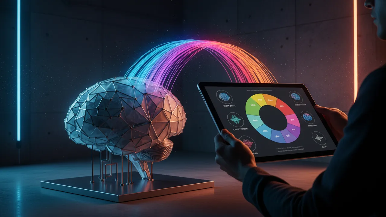
Create a powerful brand color guide using neuroscience principles to influence customer behavior and...
Discover how color A/B testing logo designs increases brand recognition and conversions. Learn prove...
Get a free scientific analysis with 550+ metrics across perception and design.
Try Free Analysis