
color psychologycolor
Red Color Psychology Branding Done Right for Your Logo
Learn how red color psychology branding transforms your logo and captivates customers. Discover prov...
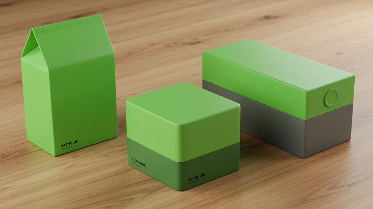
Discover how green color branding builds trust and reflects your values. Learn strategies to align your brand identity with meaningful colors today.
Discover how green color branding builds trust and reflects your values. Learn strategies to align your brand identity with meaningful colors today.
A brand I once consulted with spent six months perfecting their shade of green, only to discover it reminded their target audience of mouthwash. Green color branding can signal growth, trust, and environmental responsibility, but it can also misfire spectacularly when the shade, context, or industry alignment is off. The difference between a green that builds credibility and one that feels cheap comes down to choices most designers make on instinct rather than evidence. That instinct isn't always right.
Green occupies a unique position in the color spectrum because it sits where warm and cool tones meet. The human eye can distinguish more shades of green than any other color, a trait researchers attribute to our evolutionary need to detect subtle differences in vegetation Changizi et al., 2006. This biological wiring means your audience will notice even small shifts in hue, saturation, or brightness.
What does that mean for your brand? It means green gives you an unusually wide palette to work with, but also less room for error. A yellow-green reads as energetic and youthful. A deep forest green communicates luxury and heritage. Teal-greens lean clinical or tech-forward. Each variant triggers a distinct emotional response, and your audience won't consciously know why they feel what they feel.
Think about it this way: Whole Foods uses a dark, earthy green that reinforces organic authenticity. Spotify chose a vivid, almost electric green that feels nothing like nature. Both work because the shade matches the brand promise. The psychology of color isn't about picking a "good" color. It's about picking the right version of that color for your specific positioning.
Before committing to a green, map your brand's core attributes. Then test whether your chosen shade actually communicates those attributes to real people, not just your design team.
The biggest mistake in green color branding is choosing a shade based on personal preference rather than strategic fit. I've seen this happen more times than I can count: a founder loves sage green, so sage green it is. No testing, no audience input, no competitive analysis.
Here's a more reliable approach. Start by listing three to five adjectives that define your brand personality. Then create a shortlist of green variants that plausibly match those descriptors. Research from the University of British Columbia found that color appropriateness for a brand matters more than the color itself Labrecque & Milne, 2012. In other words, consumers don't care if they personally "like" green. They care whether green feels right for what you're selling.
A practical framework:
Run your shortlisted options through a brand analysis tool to see how each shade scores on trust, energy, and memorability. You might be surprised. The green you assumed would feel "trustworthy" might actually read as "boring" to your target demographic.
Sometimes the best green color branding decision is realizing green isn't your color at all. If your competitive space is saturated with green logos (pun intended), standing out might require a completely different direction.
This is where purple branding tech companies have found an edge. Purple combines the calm stability of blue with the energy of red, making it a strong choice for brands that want to signal innovation without sacrificing trust. Cadbury, Twitch, and Roku all use purple to differentiate in crowded markets. The purple color meaning brand strategists care about most is creativity paired with premium positioning Labrecque & Milne, 2012.
Consider this: if you're a fintech company, you're competing against a sea of blue and green logos. A well-chosen purple could make you instantly more recognizable while still communicating sophistication.
But switching colors isn't a decision to make lightly. Before abandoning green for purple or any other hue, use brand color testing to measure how your audience responds to each option. A side-by-side comparison of two or three color directions, tested with real users, removes the guesswork entirely. You want data, not opinions from a conference room.
Color A/B testing logo variations is one of the highest-ROI activities a brand team can undertake, yet most companies skip it entirely. They test button colors on landing pages but never question whether their logo's green is actually performing.
Here's a simple testing protocol that works:
One thing designers overlook: screen calibration matters enormously. The green on your MacBook Pro looks different on a budget Android phone. Research by Fairchild 2013 demonstrates that perceived color can shift meaningfully across devices, which means your carefully chosen #00A86B might look muddy to half your audience.
To optimize logo colors, you need to test across devices and contexts, not just in Figma. Our analysis methodology accounts for these perceptual differences, giving you a clearer picture of how your color choices actually land.
Using green as part of a broader color system introduces another layer of complexity. Green paired with white feels clean and medical. Green paired with brown feels artisanal. Green paired with black feels premium or even aggressive. The companion colors reshape green's meaning entirely.
Research on color harmony suggests that analogous combinations (green with blue or yellow) create a sense of cohesion, while complementary pairings (green with red or magenta) generate visual tension and energy Schloss & Palmer, 2011. Neither approach is inherently better. Your brand strategy should dictate the choice.
Quick reality check: if you're building a colorful brand identity with smarter hue choices, you need to stress-test your green against every color in your palette. A green that looks fantastic on its own might clash with your secondary orange or get lost next to a dominant blue.
For brands using multiple colors in their logo, a multicolor logo design strategy needs to account for hierarchy. Which color leads? Which supports? Green often works best as a primary when the brand's core message is growth or health, and as a secondary accent when the primary message is something else.
Starbucks is the obvious success story. Their deep green communicates premium quality and a connection to origin, even though they're one of the largest fast-food chains on the planet. The green does heavy lifting in making an industrial-scale operation feel artisanal.
On the other end, you can look at early-2010s tech startups that defaulted to bright green because "it tested well" in generic surveys. Many of those brands struggled with differentiation because they all looked the same. Generic logo analysis would have flagged the problem: their green wasn't wrong, it was just identical to their competitors'.
Animal Planet's 2018 rebrand moved away from their iconic green, and the response was mixed. Some felt the new direction lost the brand's environmental authority. Others argued the shift was necessary to signal a broader content strategy. The lesson? Green builds strong associations, and walking away from it has real costs.
If you're curious whether your green is working as hard as it should, reviewing real-world examples of how color choices impact brand perception can provide useful benchmarks. Your green doesn't need to be Starbucks-level iconic, but it does need to be intentionally chosen and rigorously tested.
Deep, saturated greens like hunter or emerald tend to perform best for financial brands. These shades communicate stability and established authority. Avoid neon or lime greens, which can feel frivolous in a financial context. Test your specific shade with your target audience to confirm it reads as trustworthy.
Yes, but carefully. Green and purple sit relatively close on the color wheel, so the combination can feel harmonious when the values (lightness/darkness) contrast enough. The pairing works well for wellness, creative, or innovation-focused brands. Run a logo comparison to see how the combination performs against single-color alternatives.
If your competitors have adopted similar greens, or if your shade looks dated compared to current design trends, it might be time to refresh your logo. Also watch for poor reproduction across digital and print media, which often signals a shade that's too nuanced for practical use.
Absolutely, though it's less common than blue. Brands like Spotify, Robinhood, and Android prove green can work in tech when the shade is bold and distinctive. The key is choosing a green that signals innovation rather than tradition. Purple branding tech is an alternative worth testing if green feels too expected in your category.
Your green might be perfect. Or it might be quietly undermining the brand identity you've worked so hard to build. The only way to know is to measure it. Analyze your logo with neuroscience-backed tools that go beyond gut instinct, and find out whether your color choices are actually doing what you think they are.
Learn how red color psychology branding transforms your logo and captivates customers. Discover prov...

Learn how color temperature branding aligns your logo with customer emotions. Discover warm and cool...
Learn color theory branding with 7 science-backed logo rules that boost brand recognition and custom...
Get a free scientific analysis with 550+ metrics across perception and design.
Try Free Analysis