
industry applicationswellness
Wellness Brand Logo Design to Earn Client Trust
Wellness brand logo design builds trust and credibility with your audience. Discover proven strategi...
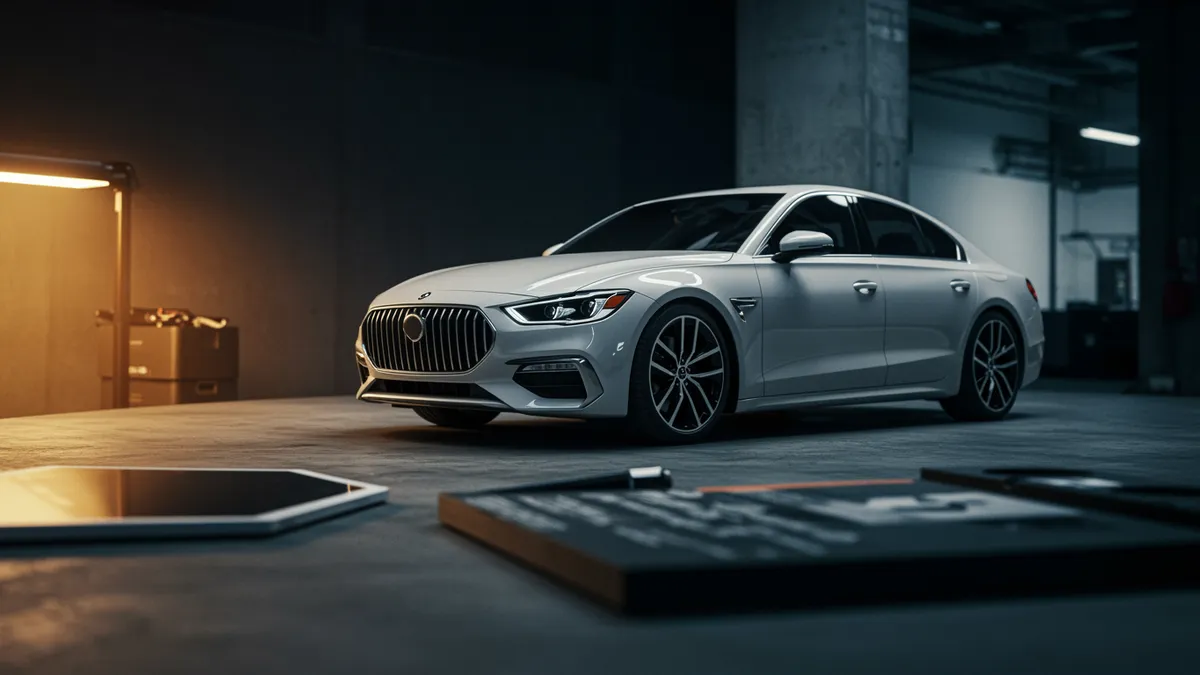
Discover how car brand logo design shapes market identity and consumer perception. Learn strategic insights to elevate your automotive branding today.
Discover how car brand logo design shapes market identity and consumer perception. Learn strategic insights to elevate your automotive branding today.
A car brand logo does more than sit on a grille. It carries decades of engineering reputation, emotional loyalty, and split-second recognition at highway speeds. I once consulted with a regional auto dealership group that spent six figures on a rebrand, only to discover their new emblem was nearly invisible on digital inventory listings. The fix wasn't a complete redesign. It was understanding why certain automotive marks work and others quietly fail.
That distinction between working and failing is exactly what separates iconic car emblems from forgettable ones. And the principles behind automotive logo success extend far beyond the showroom floor, reaching into animal logo design, pet industry branding, and even cosmetics branding. Let's unpack what makes these marks tick.
The most recognizable automotive logos succeed because they optimize for a single cognitive task: instant recall under constrained viewing conditions. You're passing a vehicle at 60 mph. You glance at the badge for maybe half a second. That's the entire window.
Research on visual memory by Standing 1973 showed that humans can retain thousands of images with remarkable accuracy, but only when those images carry distinctive structural features. The BMW roundel, the Mercedes three-pointed star, the Audi rings: each one is geometrically unique enough to register in peripheral vision. None of them rely on text alone.
Here's what's interesting: this constraint has pushed automotive designers toward radically simple forms. Circles, shields, and crosses dominate the category. The reason isn't aesthetic laziness. These shapes process faster in the brain's ventral visual pathway, which handles object recognition Grill-Spector & Malach, 2004.
If you're designing or evaluating a car brand logo, test it at thumbnail size first. Shrink it to 16x16 pixels. Can you still identify the brand? If not, complexity is working against you. A thorough logo analysis can reveal exactly where visual clarity breaks down, even before you run expensive focus groups.
The pet industry might seem worlds apart from automotive, but the branding challenges overlap more than you'd expect. Both sectors rely heavily on emotional attachment. Both need logos that work across wildly different contexts: a car badge goes from a key fob to a billboard; a pet brand logo design goes from a 1-inch treat bag label to a veterinary clinic sign.
Consider how Subaru uses the Pleiades star cluster in its mark. It's abstract enough to scale cleanly, yet carries a subtle emotional narrative (the stars represent the six companies that merged to form Fuji Heavy Industries). Pet brands can learn from this dual-purpose approach. An animal logo design doesn't need to be a literal paw print or cartoon dog. Abstract symbols that suggest companionship or vitality often outperform literal depictions in recall tests.
One thing designers overlook: pet owners form identity-level bonds with their brands, much like car enthusiasts do. A 2021 survey by the American Pet Products Association found that 67% of U.S. households own a pet. That's a massive audience making repeat purchases based partly on packaging recognition.
So your pet brand mark needs the same highway-speed clarity that automotive badges demand. Test it on a shelf from six feet away. If it blurs into the background, revisit the structure. Our neuroscience-backed analysis can measure exactly how much visual attention your mark captures relative to competitors.
Color choices in automotive logos follow surprisingly rigid patterns, and those patterns reveal universal truths about brand positioning. Silver and black dominate luxury tiers (Lexus, Lincoln, Infiniti). Red signals performance and passion (Ferrari, Alfa Romeo). Blue conveys reliability and technology (Ford, Subaru, Volkswagen).
The psychology of color research backs this up. Labrecque and Milne 2012 found that blue increases perceptions of competence, while black drives sophistication associations. These aren't arbitrary preferences. They're deeply embedded cognitive shortcuts.
Now apply this to beauty brand identity and cosmetics branding. The luxury beauty segment mirrors automotive luxury almost perfectly in its color vocabulary. Chanel's black-and-white palette. Tom Ford Beauty's gold on black. Dior's restrained gray typography. They're borrowing from the same psychological playbook that Mercedes-Benz and Rolls-Royce established decades ago.
But here's the catch: mid-market beauty brands often default to pink or purple without strategic intent. If your cosmetics brand is targeting a premium audience, studying how automotive luxury badges use achromatic palettes might be more instructive than looking at your direct competitors.
Quick reality check: color alone won't save a weak mark. But the wrong color will undermine a strong one. Run a logo comparison against your top three competitors to see if your palette is differentiating or blending in.
Circular logos dominate automotive branding. BMW, Mercedes, Volkswagen, Audi, Toyota: all use circles or circular arrangements. This isn't coincidence. Circles are processed by the brain as non-threatening, complete, and harmonious Bar & Neta, 2006. For an industry selling machines that move at lethal speeds, projecting safety through shape is a smart unconscious signal.
Angular shapes tell a different story. Lamborghini's shield, Tesla's pointed "T," and Dodge's rhombus-like badge all use sharp angles to communicate aggression, speed, and disruption.
Think about it this way: the shape of your logo is making a promise before anyone reads your brand name. In pet industry branding, rounded forms can signal gentleness and care, which is exactly what pet owners want to feel. Sharp, geometric marks might work for a performance-oriented pet nutrition brand targeting working dog owners, but they'd feel wrong on a luxury pet spa's signage.
I've seen this mistake countless times in cross-industry branding work. Designers pick shapes based on aesthetics without considering the cognitive associations those shapes trigger. A brand analysis tool can quantify these associations, giving you data instead of guesswork.
Between 2018 and 2023, nearly every major automaker flattened its logo. BMW dropped the 3D shading. Volkswagen went minimal. Kia completely reimagined its wordmark. Nissan, Peugeot, GM: the list keeps growing.
The driver wasn't just aesthetics. Flat logos render better on screens, load faster on mobile interfaces, and scale cleanly across digital touchpoints from app icons to EV dashboard displays. As vehicles become software platforms, the logo needs to function as a UI element, not just a chrome ornament.
This shift carries a clear lesson for every industry. If you're building a pet brand logo design or a beauty brand identity, your mark will live primarily on screens: Instagram ads, e-commerce listings, mobile apps. The embossed, gradient-heavy logo that looked gorgeous on printed packaging in 2015 might be time to refresh your logo.
Worth noting: going flat doesn't mean going generic. Peugeot's 2021 redesign stripped away dimension but added a fierce, heraldic quality that actually increased brand distinctiveness. The goal is simplification without loss of character. Check our case studies to see how other brands have navigated this balance.
The gap between what a brand intends its logo to communicate and what audiences actually perceive is often enormous. I worked with a startup whose founders were convinced their angular, metallic logo conveyed "innovation." Audience testing revealed the dominant association was "cold" and "unapproachable."
Eye-tracking research has shown that viewers form their first impression of a logo within 400 milliseconds. That impression is driven by shape, color, and spatial arrangement, not by the brand story you've carefully crafted on your About page.
For automotive brands, this measurement gap can cost millions in misaligned marketing spend. For smaller brands in the pet or beauty sectors, it can mean the difference between shelf pickup and being ignored entirely.
The solution isn't more opinions from your design team. It's structured analysis. A logo evaluation grounded in cognitive science can tell you precisely which emotions your mark triggers, how it compares to category norms, and where the perception gaps live. That's the kind of data that turns subjective design debates into clear strategic decisions.
Most major automakers refresh their logos every 15 to 25 years, with minor refinements happening more frequently. The key trigger isn't time but relevance: if your mark doesn't perform well in digital contexts or consumer perception has shifted, it's worth evaluating sooner.
Absolutely. The core principles of scalability, shape psychology, and color strategy are universal. Pet brands benefit from the same emphasis on instant recognition and emotional resonance that makes automotive logos effective. Adapt the principles to your audience's expectations.
Yes, when executed with restraint. Flat design can convey sophistication if the typography, spacing, and color palette are carefully chosen. Many luxury beauty brands have already moved toward flatter marks while maintaining premium associations through minimalism and proportion.
Use a structured logo analysis that measures cognitive and emotional responses. Pair that with a small audience survey asking open-ended association questions. The combination of neuroscience data and real feedback gives you the clearest picture.
Your logo is making promises every time someone sees it. Whether you're in automotive, pet products, or beauty, the question is whether those promises align with your brand strategy. Run a quick analyze your logo session with Logo Analyzer to find out exactly what your mark is communicating, and where the opportunities are hiding.
Wellness brand logo design builds trust and credibility with your audience. Discover proven strategi...
Discover how property brand logo design builds client trust and sets your real estate business apart...
Discover what makes a luxury brand logo truly prestigious. Learn design principles that elevate your...
Get a free scientific analysis with 550+ metrics across perception and design.
Try Free Analysis