
industry applicationsarchitecture
Architecture Firm Branding Done Right With AI Analysis
Discover how architecture firm branding transforms with AI analysis. Learn proven strategies to elev...
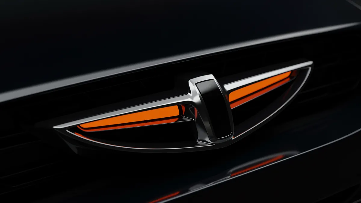
Discover how automotive branding leverages neuroscience to create powerful emotional connections with consumers and drive brand loyalty.
Discover how automotive branding leverages neuroscience to create powerful emotional connections with consumers and drive brand loyalty.
A luxury car brand once spent $8 million redesigning its logo, only to discover through consumer testing that the new version triggered weaker emotional responses than the original. Automotive branding lives and dies by visual signals that most people process in under 400 milliseconds. That split-second reaction determines whether a potential buyer perceives quality, speed, reliability, or nothing at all. The question isn't whether your automotive logo matters. It's whether you understand why it works or fails.
Car logos function differently in the brain compared to marks in other sectors. A vehicle is one of the most expensive purchases a consumer makes, and the logo becomes a proxy for trust, safety, and social identity. Research on consumer brand attachment shows that automotive emblems activate both the ventromedial prefrontal cortex (associated with personal identity) and the amygdala (emotional processing) more strongly than logos from lower-involvement product categories Reimann et al., 2012.
Think about it this way: nobody gets a grocery store logo tattooed on their arm. But people tattoo car brand logos regularly. That level of identity fusion doesn't happen by accident. It's built through decades of consistent visual language.
What makes automotive marks unique is their dual role. They appear on the product itself, not just marketing materials. Your logo sits on the hood, the steering wheel, the key fob. It needs to work at highway speed on the car ahead of you and as a 16-pixel favicon on a dealer website. This demands a kind of geometric clarity that few other industries require.
If you're working on an automotive identity, start by testing recognition at multiple scales. A logo analysis can reveal whether your mark holds its structure when scaled down to the size of a thumbnail.
Color choices in automotive branding cluster around a surprisingly narrow palette, and there's a neurological reason for that. Silver, black, blue, and red dominate because each triggers specific associations that align with what car buyers want to feel.
Silver and chrome effects signal precision engineering. Blue communicates reliability and technological competence. Red conveys performance and excitement. Black projects luxury and authority. You'll notice that green, yellow, and pink are almost entirely absent from major automotive logos. That's not coincidence.
The psychology of color plays a measurable role here. A study on color and brand personality found that blue logos increased perceived competence by 22% compared to warmer tones in technology-adjacent categories Labrecque & Milne, 2012. Automotive brands sit squarely in that zone.
Here's the catch: what works for cars doesn't necessarily transfer to other vehicle-adjacent industries. I've seen motorcycle brands try to mimic the chrome-and-blue formula of automotive giants, only to end up looking like a budget sedan dealership. Motorcycles carry different emotional codes. So do electric vehicle startups, which increasingly lean toward minimalist white space and softer blues to signal environmental consciousness.
Your color palette should match the specific emotional territory you want to own, not just industry convention.
Cross-industry pattern analysis reveals something fascinating. The principles that make automotive logos effective, namely geometric precision, emotional coding through color, and scalability, apply directly to seemingly unrelated sectors like pet industry branding and beauty brand identity.
Consider animal logo design. The best pet brands borrow automotive branding's obsession with silhouette clarity. A dog food logo needs to be instantly recognizable on a shelf from six feet away, just as a car emblem needs to read from across a parking lot. Pet brand logo design that works tends to use clean, confident shapes rather than overly detailed illustrations.
Cosmetics branding shares another automotive trait: the logo must convey premium quality through restraint. Think about how Lexus and Chanel both rely on simple geometric letterforms. Neither brand clutters its identity with unnecessary decoration. Both trust the consumer to associate minimalism with luxury.
One thing designers overlook: the weight of the logo's lines communicates price tier across all these industries. Thinner, more refined strokes suggest higher price points. Heavier, bolder lines suggest accessibility and value. This pattern holds whether you're designing for a car manufacturer, a pet wellness startup, or a skincare line.
Check out our real-world examples to see how brands across industries have applied these cross-sector insights.
Most iconic automotive logos incorporate bilateral symmetry, and your brain is wired to prefer it. Symmetrical faces are perceived as more attractive. Symmetrical logos are perceived as more trustworthy. A meta-analysis of visual preference studies confirmed that symmetry increases both aesthetic appeal and perceived quality Reber, Schwarz & Winkielman, 2004.
But pure symmetry can also feel static. The most effective automotive marks introduce subtle directional cues that suggest forward motion. BMW's propeller-inspired quadrants create rotational energy. Tesla's stylized "T" narrows upward, pulling the eye like an accelerating vehicle. These aren't decorative choices. They're perceptual strategies.
Eye-tracking research shows that logos with implied motion hold viewer attention 15-20% longer than static marks. For an automotive brand, where the core product promise is movement, this extra attention translates directly into stronger brand recall.
So what does this mean for your brand? If your current logo feels "parked," consider whether subtle angular adjustments could introduce a sense of kinetic energy without sacrificing the stability that symmetry provides. A neuroscience-backed analysis can measure exactly how viewers' eyes move across your mark and where attention drops off.
Automotive brands that chase design trends almost always regret it. The data supports what experienced designers already suspect: heritage consistency builds exponentially more brand equity than periodic modernization.
Porsche's crest has remained fundamentally unchanged since 1952. Mercedes-Benz's three-pointed star dates to 1909. Ferrari's prancing horse has looked essentially the same for nearly a century. These aren't brands that lack innovation budgets. They understand that logo consistency compounds over time, creating what psychologists call the "mere exposure effect," where familiarity itself generates preference Zajonc, 1968.
I've worked with automotive aftermarket companies that redesigned their logos every three to five years, chasing whatever aesthetic was trending. Each time, they reset their brand recognition to near zero. Meanwhile, their competitors who maintained consistent marks kept accumulating visual equity.
Quick reality check: this doesn't mean your logo should never evolve. It means evolution should be surgical. Refine the geometry. Adjust the color values. Clean up the rendering. But preserve the core structure that your customers already recognize.
If you're debating whether your mark needs a full redesign or just refinement, look for the signs your logo needs a refresh before committing to either path.
Gut feelings about logo effectiveness are unreliable. What you intend your mark to communicate and what viewers actually perceive are often two different things. A brand manager might see "precision engineering" while consumers see "cold and unapproachable."
The gap between intent and perception is measurable. Tools that assess cognitive load, emotional valence, and visual salience can quantify how your logo performs against competitors. This kind of logo analysis removes guesswork from what should be a data-informed decision.
Key metrics worth tracking for automotive logos:
Brands that measure these dimensions before and after design changes make smarter investments. Those that don't are essentially gambling with their most visible brand asset.
Rarely, and only with careful refinement rather than wholesale redesign. The strongest automotive brands update visual details (gradients, proportions, rendering) every 10-15 years while preserving the core mark. Frequent changes erode the recognition equity you've built over time.
Not entirely. EV brands tend to benefit from lighter visual weight, more white space, and cooler color palettes that signal sustainability and innovation. Traditional automotive cues like chrome effects and heavy serifs can make an EV brand feel outdated before it launches.
It complements them. Neuroscience tools measure involuntary responses like eye movement patterns and emotional activation that focus groups can't capture. Participants often say one thing and feel another. Combining both methods gives you the most complete picture.
The core principles of silhouette clarity, scalable geometry, and emotional color coding transfer directly. Pet brands that treat their logos with the same rigor as automotive companies tend to outperform competitors who rely on overly detailed or whimsical illustrations.
Your automotive logo is working for or against you every time someone sees it, whether on a showline, a dealership sign, or a search result. Stop guessing how it performs. Analyze your logo with neuroscience-backed tools and find out exactly what your mark communicates to the people who matter most: your customers.
Discover how architecture firm branding transforms with AI analysis. Learn proven strategies to elev...

Discover how entertainment branding powered by AI insights captivates audiences and drives engagemen...

Discover how sustainable branding powered by AI logo insights transforms your brand identity while r...
Get a free scientific analysis with 550+ metrics across perception and design.
Try Free Analysis