
neuroscience brandingfont
Font Psychology Logo Guide to Sharper Branding
Master font psychology logo design to create powerful brand identities. Learn how typeface choices i...
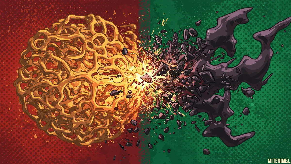
Why rebrand feels wrong and how to fix it: discover the psychology behind resistance and proven strategies to make your rebrand successful.
Why rebrand feels wrong and how to fix it: discover the psychology behind resistance and proven strategies to make your rebrand successful.
A rebrand that makes strategic sense can still feel deeply wrong to the people who encounter it. That gut-level rejection isn't irrational; it's your brain defending a neural pattern it spent years building. I once worked with a B2B software company that redesigned everything, from logo to color palette to typography, in a single launch. The new identity was objectively stronger. But customers hated it. Support tickets spiked with complaints that had nothing to do with the product. The why rebrand feels wrong question haunted the entire leadership team for months.
What happened there wasn't a design failure. It was a neuroscience problem.
The discomfort people feel during a rebrand has a biological basis. Every time someone sees your logo, their brain encodes that visual pattern a little more deeply through a process called memory consolidation branding. Over repeated exposures, the logo stops being something the brain has to "figure out" and becomes something it recognizes instantly, almost reflexively.
Research on the mere exposure effect shows that repeated contact with a stimulus increases preference for it Zajonc, 1968. This isn't about whether the design is good. It's about whether the brain has already done the work of learning it. When you swap out a logo people have seen thousands of times, you're asking their visual cortex to abandon a well-worn neural pathway and build a new one from scratch.
That feels like loss. And humans are famously bad at handling loss.
Here's what's interesting: the strength of this reaction often correlates with how much someone values the brand. Your most loyal customers will push back the hardest, not because they're resistant to change, but because their brains have the deepest encoding of your old identity. Understanding why your logo matters at this neurological level changes how you approach the entire rebrand process.
The practical takeaway? Never interpret rebrand backlash as evidence that the new design is bad. It might just mean the old one was deeply encoded.
Brands that evolve their logos incrementally tend to avoid the worst of the backlash. The reason comes down to how the brain processes visual change. Small modifications allow existing neural patterns to adapt rather than reset entirely.
Think about Apple's logo history. The rainbow apple became the monochrome apple, which became the glossy apple, which became the flat apple. Each step was a modest shift. The silhouette, the bite mark, the proportions: those stayed constant. The brain never had to start over.
Contrast that with Gap's infamous 2010 rebrand. They replaced their classic serif wordmark with Helvetica and a tiny blue gradient square. The change was so abrupt that customers revolted online within days. Gap reverted to the original within a week.
One thing designers overlook: you can change a surprising amount if you preserve what neuroscientists call the "gist" of the image. The gist is the high-level structural information your brain captures in the first 100 milliseconds of viewing Oliva & Torralba, 2006. Keep the gist intact, and you can update colors, textures, and details without triggering that visceral rejection. This is exactly why signs your logo needs a refresh shouldn't automatically mean a complete teardown.
Some logos are built to last through multiple identity updates because their core structure uses clever logo design techniques that anchor recognition at a deep perceptual level.
Negative space branding is one of the most powerful examples. The FedEx arrow, the hidden bear in the Toblerone mountain, the "31" in Baskin-Robbins: these elements create a secondary layer of meaning that the brain locks onto independently of surface-level styling. When you redesign around a negative space logo design, you can refresh the entire visual language while keeping that hidden structural element intact. The brain's recognition pathway stays unbroken.
Consider this: logos built on geometric primitives (circles, triangles, clean symmetry) also tend to survive rebrands more gracefully. Research on logo memorability science suggests that simpler geometric forms are encoded more efficiently by the visual system Pieters, Wedel & Batra, 2010. Target's bullseye, Mastercard's overlapping circles, BMW's quartered roundel. These shapes are so fundamental that surface treatments can change dramatically without disrupting recognition.
If you're planning a rebrand, audit your current logo for these structural anchors before you start sketching. Which elements carry the recognition load? Those are the ones you protect. For a deeper look at how typography plays into this, check out our guide on logo font impact on brand recall and perception.
Here's a pattern I've seen play out dozens of times. The internal team spends three months with the new logo. They've seen it on mockups, presentations, and prototypes. By launch day, the new design feels completely natural to them. Then customers see it for the first time and react with confusion or hostility.
The team is baffled. "How can they not see how much better this is?"
The answer is the exposure gap. The internal team has already gone through their own memory consolidation process with the new design. They've had hundreds of exposures. Customers are at exposure number one.
This mismatch creates a dangerous blind spot. Decision-makers genuinely cannot empathize with the customer's first-impression experience because their own brains have already adapted. It's not arrogance. It's neuroscience.
The fix is surprisingly simple: test the new logo with people who have zero prior exposure, and measure their reactions against the old logo shown to a separate naive group. You're comparing two first impressions, which removes the consolidation bias entirely. A neuroscience-backed analysis can quantify exactly where recognition breaks down and where it holds.
You can't eliminate the adjustment period, but you can compress it. The brain needs roughly 10 to 20 quality exposures to begin forming a stable new memory trace Krugman, 1972. "Quality" matters here: passive background impressions count far less than active, attentional encounters.
So what does this mean for your brand? Front-load high-attention placements in the first two weeks. Put the new logo where people are already paying attention: transactional emails, checkout screens, app launch screens, invoice headers. These are moments of focused engagement, not banner ads people scroll past.
A few more tactics that accelerate acceptance:
Worth noting: if your rebrand decision involves changing the name simultaneously, expect the adjustment period to roughly double. You're asking the brain to rebuild two associations at once.
Not every negative reaction to a rebrand is just mere-exposure bias. Sometimes the new design genuinely has problems, and the discomfort is a legitimate signal.
How do you tell the difference? Time and specificity. Mere-exposure discomfort is vague: "I just don't like it" or "it feels off." It fades with repeated viewing. Genuine design problems produce specific, persistent complaints: "I can't read the text at small sizes," "the icon looks like a different company's logo," "I can't tell what the symbol is supposed to be."
If you're hearing specific, functional critiques three to four weeks after launch, take them seriously. Those aren't nostalgia talking. Those are usability signals.
Running a logo analysis before launch can catch many of these functional issues, from legibility problems to unintended visual associations, before they become public embarrassments. The goal isn't to eliminate all discomfort (that's impossible with any meaningful change) but to ensure the discomfort is only the temporary, exposure-gap kind.
Most research on visual habituation suggests 10 to 20 meaningful exposures are needed to form a new memory trace. For a brand with daily customer touchpoints, that's roughly two to four weeks. Brands with less frequent contact should expect a longer adjustment window, sometimes several months.
Absolutely. But test it with people who haven't seen the old logo recently, so you're comparing genuine first impressions. A/B testing with existing customers will always skew toward the familiar design because of mere-exposure bias, which makes the results misleading.
It's rare but possible, especially when the redesign abandons all structural anchors simultaneously. Tropicana's 2009 packaging rebrand cost the company an estimated $50 million in lost sales within two months. They reverted quickly, but the damage was real. Preserving core geometric elements dramatically reduces this risk.
Gradual rollouts tend to produce less backlash because they allow existing neural pathways to adapt rather than reset. However, a phased approach can also create confusion if customers encounter inconsistent branding across touchpoints. The best strategy depends on how dramatically the new design differs from the old one.
Understanding why rebrand feels wrong is the first step toward making it feel right. If you're planning a visual identity change, or wondering whether your current logo has the structural resilience to survive one, analyze your logo with our neuroscience-backed platform. You'll see exactly which elements your audience's brains are holding onto, and which ones are safe to evolve.
Master font psychology logo design to create powerful brand identities. Learn how typeface choices i...
Discover how logo font impact shapes brand recall and customer perception. Learn proven strategies t...
Discover how international branding psychology shapes logo design across cultures. Learn proven stra...
Get a free scientific analysis with 550+ metrics across perception and design.
Try Free Analysis