
industry applicationsreal
Real Estate Branding Refresh Without Losing Recognition
Refresh your real estate branding strategy while maintaining client recognition. Learn how to modern...
School branding builds trust through consistent, strategic touchpoints. Learn how to create a cohesive identity that resonates with families and strengthens ...
School branding builds trust through consistent, strategic touchpoints. Learn how to create a cohesive identity that resonates with families and strengthens ...
A parent visiting your school's website forms an opinion about your institution in less than half a second. That snap judgment, shaped almost entirely by visual identity, determines whether they keep reading or click away. School branding isn't a marketing luxury reserved for private academies with six-figure budgets. It's the single most controllable factor in how families, staff, and community members perceive your school's competence and values.
I once consulted with a mid-size charter school that had redesigned its curriculum, hired exceptional teachers, and renovated its facilities. Enrollment still declined. The culprit? A logo that looked like it was made in Microsoft Word in 2004, slapped across every touchpoint from the website to the gymnasium wall. The brand was silently undermining everything the school had built.
Most schools treat branding as an afterthought because they see themselves as fundamentally different from businesses. They are. But the cognitive processes parents use to evaluate a school aren't that different from how consumers evaluate any organization. Research on institutional trust shows that visual presentation significantly influences perceived quality, even in educational contexts Melewar & Akel, 2005.
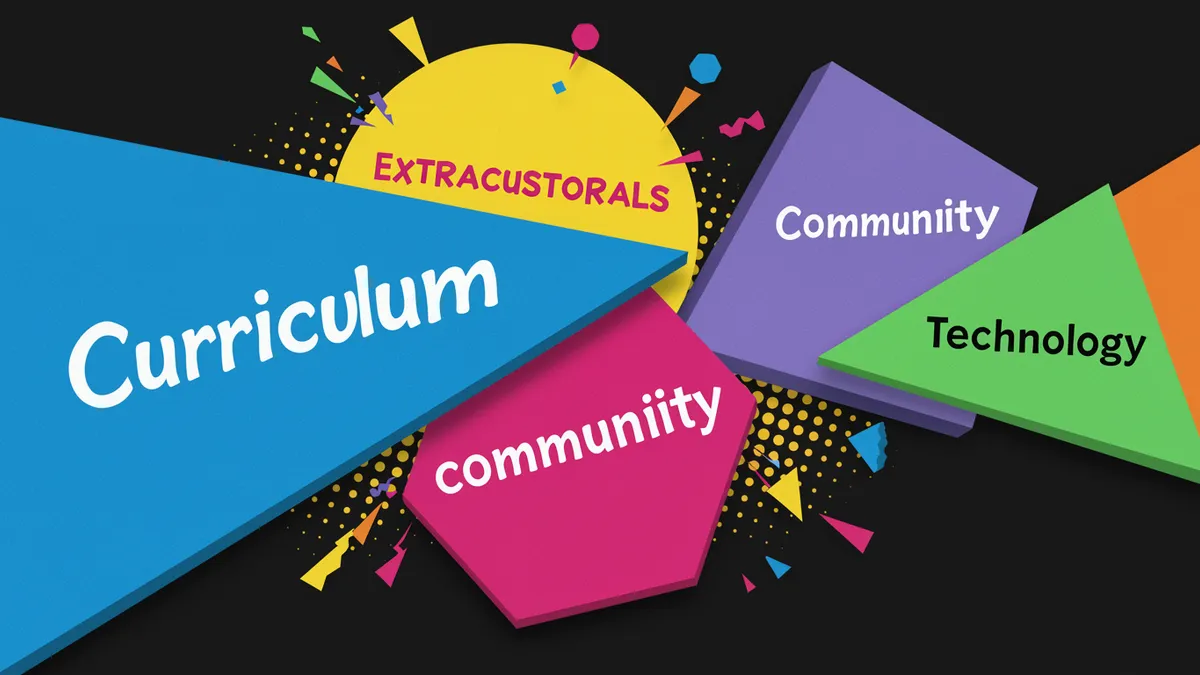
Think about it this way: a family choosing between two schools with similar test scores and programs will lean toward the one that feels more professional. That feeling comes from consistent visual identity across every touchpoint, not just the logo, but signage, letterhead, the enrollment packet, the mobile app, social media headers, and staff email signatures.
Here's what's interesting. Schools in competitive enrollment markets (charter schools, private institutions, magnet programs) often compete with organizations that understand branding instinctively. A nearby pet grooming franchise with polished pet industry branding might actually present a more cohesive visual identity than your school does. That's a problem, because parents notice the gap, even if they can't articulate it.
The fix starts with treating your school's brand as institutional infrastructure, not decoration.
Consistent school branding across touchpoints increases trust because it signals organizational competence. When your website uses one color palette, your gym banners use another, and your social media accounts feature a stretched, pixelated version of your crest, you're sending a message: we don't pay attention to details.
Parents pick up on this. So do prospective teachers.
A 2019 study on brand consistency found that uniform presentation across platforms increased revenue (or in a school's case, engagement and enrollment inquiries) by up to 23% Lucidpress, 2019. The principle applies whether you're running a Fortune 500 company or a K-8 school district.
Consider this: industries that depend on emotional trust have figured this out already. Beauty brand identity in the cosmetics space, for example, obsesses over touchpoint consistency because a single off-brand interaction can erode the premium perception they've built. Schools operate on the same trust currency.
Your action plan should include a brand audit. Collect every piece of visual communication your school produces, from bus wraps to report cards. Lay them out side by side. If they don't look like they come from the same institution, you've found your starting point. A brand audit for teams can make this process systematic rather than guesswork.
Color choices in school branding do more than represent school spirit. They trigger measurable neurological responses that influence how welcomed and safe people feel in your environment. Research in environmental psychology shows that color schemes in educational settings affect student mood, focus, and even behavioral outcomes Barrett et al., 2015.
Most schools inherit their colors from decades-old traditions. That's fine. But the application of those colors matters enormously.
One thing designers overlook: school colors chosen for athletic uniforms don't always work for digital interfaces or printed materials. A deep maroon that looks commanding on a football jersey can feel oppressive on a website background. You need a primary palette for brand identity and a functional palette for communications, both rooted in the same color family but adapted for context.
Typography sends equally strong signals. A school using Comic Sans on official documents communicates something very different from one using a clean serif typeface. The psychology of color and type selection aren't superficial concerns; they're the visual vocabulary your school uses to say "we're serious about education" before a single word is read.
Quick reality check: if your school's visual identity hasn't been professionally evaluated, you're relying on assumptions about how it's perceived. Running a logo analysis can reveal gaps between what you intend to communicate and what your audience actually receives.
Schools aren't the only institutions where trust is the product. And cross-industry lessons are surprisingly applicable.
Animal logo design in the veterinary and pet care space offers a useful parallel. Pet brands must communicate warmth, safety, and expertise simultaneously, exactly the same combination schools need. The best pet brand logo design balances approachability (rounded shapes, warm colors) with professionalism (clean lines, structured layouts). Schools that skew too far toward "fun" with clip-art mascots lose credibility. Those that go too corporate feel cold and institutional.
Cosmetics branding provides another lesson. Beauty brands know that their visual identity must work flawlessly at every scale, from a tiny product label to a billboard. Schools face the same challenge: your logo appears on everything from a favicon to a building facade. If it doesn't hold up at both extremes, it's not doing its job.
The real estate industry has tackled similar trust challenges. Our piece on building trust through visual identity explores how property firms build credibility through design, and the principles translate directly to education.
What should you do with this? Study brands outside education that successfully communicate trust. Borrow their structural principles (not their aesthetics) and apply them to your school's visual system.
Your school's logo is probably one of three things: an overly complex crest nobody can reproduce at small sizes, a cartoonish mascot that undermines your academic credibility, or a wordmark in a default font that says nothing about your institution's character.
None of these serve you well.
Effective school logos need to accomplish several things at once:
I've seen schools spend months debating mascot redesigns while ignoring that their core wordmark is set in a free font that three other districts also use. Prioritize the foundational mark first. The mascot is secondary.
If you're unsure whether your current logo meets these criteria, a neuroscience-backed analysis can give you objective data on legibility, memorability, and emotional response, rather than relying on a committee's subjective opinions.
Enrollment is a lagging indicator. By the time families choose not to apply, your brand has already failed them at multiple touchpoints. Schools need leading indicators of brand health.
Survey incoming families about their first impressions. Ask them what three words come to mind when they see your school's visual materials. If the answers don't align with your strategic priorities, your branding has a communication gap.
You can also run structured perception tests. Show your logo alongside competitors' marks (nearby schools, district alternatives) and ask participants to rank them on traits like trustworthiness, academic rigor, and warmth. The data tells a different story than internal assumptions usually do. A logo comparison tool can formalize this kind of benchmarking.
Worth noting: brand perception research doesn't require a massive budget. Even a simple Google Forms survey sent to 50 prospective families yields actionable data. The point isn't statistical perfection. It's replacing guesswork with evidence.
Schools that measure brand perception annually can track whether design investments are actually shifting how their community sees them, and course-correct before enrollment numbers tell the story too late.
A full rebrand every 10-15 years is typical, but you should refresh visual applications (website, signage templates, digital assets) every 3-5 years. If your logo doesn't work on mobile screens or your colors feel dated, those are signs your logo needs a refresh sooner rather than later.
Absolutely. Start with a style guide that standardizes your existing colors, fonts, and logo usage. Consistency alone, even with modest design assets, dramatically improves perception. Free tools like Canva can enforce templates across staff, and a free logo analysis gives you a professional starting point.
Mascots can work well as secondary brand elements, but they shouldn't be your primary logo. A mascot that's too cartoonish undermines credibility, while one that's too aggressive can feel unwelcoming. Use the mascot for athletics and spirit wear; keep your institutional mark clean and versatile.
Teachers and administrators evaluate schools visually, just like parents do. A polished brand signals organizational health, strong leadership, and attention to detail. Schools with cohesive branding report easier recruitment because candidates perceive them as better-managed institutions.
Your school's brand is talking to families, teachers, and community members every single day, whether you've intentionally shaped that message or not. If you want to know what your current logo is actually communicating, analyze your logo with our neuroscience-backed platform and get objective data on how your school's visual identity performs across trust, clarity, and memorability.
Refresh your real estate branding strategy while maintaining client recognition. Learn how to modern...
Discover common fashion branding mistakes damaging your logo and learn proven strategies to fix them...

Online store branding converts browsers into loyal buyers. Learn proven strategies to build brand id...
Get a free scientific analysis with 550+ metrics across perception and design.
Try Free Analysis