
color psychologypurple
Purple Logo Design to Build Luxury and Authority
Discover how purple logo design conveys luxury and authority for your brand. Learn expert tips to cr...
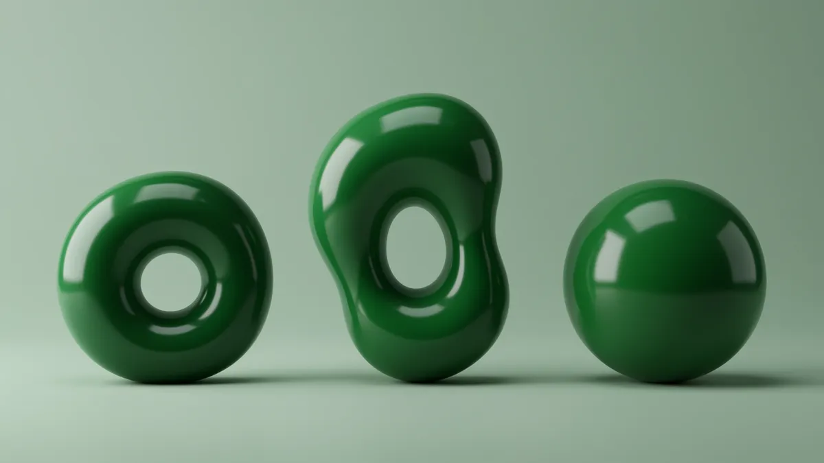
Discover how green logo design builds trust and signals growth for your brand. Learn proven strategies to create memorable logos that resonate with eco-consc...
Discover how green logo design builds trust and signals growth for your brand. Learn proven strategies to create memorable logos that resonate with eco-consc...
A green logo doesn't automatically make your brand feel trustworthy. I've seen organic food startups pick the wrong shade of green and accidentally signal "cheap" instead of "fresh." The difference between a green logo design that builds credibility and one that falls flat often comes down to choices most designers make on instinct rather than evidence.
Green is the most contextually dependent color in branding. Depending on saturation, shade, and what you pair it with, green can communicate wealth, health, environmental responsibility, or even toxicity. That range is exactly what makes it powerful and risky in equal measure.
Green occupies a unique position in human color perception because our eyes have more receptors tuned to green wavelengths than any other color. This biological advantage means we process green faster and with less cognitive effort Elliot & Maier, 2014. Less effort translates to a feeling of ease, and ease feels like trust.
But here's the catch: that trust response depends heavily on shade. Research from the University of British Columbia found that darker greens activate associations with wealth, prestige, and stability, while lighter greens trigger thoughts of nature, freshness, and health Labrecque & Milne, 2012. Bright, saturated greens? Those can feel synthetic or aggressive, which is why you rarely see neon green on a financial services logo.
Think about it this way: Fidelity uses a deep forest green. Whole Foods uses an earthy, mid-tone green. Both succeed because the shade matches the brand promise.
If you're choosing green for your logo, start by asking what kind of trust you need. Financial trust demands darker values. Health and wellness brands benefit from softer, more organic tones. Running a logo analysis on variations of your green can reveal which shade actually resonates with your target audience, rather than leaving it to guesswork.
Not all greens are created equal, and the wrong shade can undermine your brand message entirely. A study published in Color Research & Application demonstrated that consumers associate blue-greens with cleanliness and innovation, yellow-greens with energy and affordability, and pure mid-greens with balance and reliability Schloss et al., 2018.
This matters more than most designers realize. Consider these shade categories and their typical brand associations:
One thing designers overlook: the same green reads differently on screen versus print, and on light versus dark backgrounds. A sage green that feels calming on a white background can look washed out and forgettable on a dark surface. Always test your green across contexts before committing. Our analysis methodology accounts for these contextual variables, measuring how color perception shifts across different viewing conditions.
Sometimes the real question isn't which shade of green, but whether green is the right choice at all. Purple branding tech companies have been gaining ground because purple signals creativity and innovation in ways green simply cannot. The purple color meaning brand managers should understand is this: purple combines the stability of blue with the energy of red, making it a natural fit for brands that want to feel both trustworthy and forward-thinking.
So when should you pick green over purple? And when does purple win?
Green works best when your brand promise centers on growth, health, sustainability, money, or natural products. Purple works best for creative services, luxury tech, beauty, and brands targeting audiences that value originality.
Here's a practical test. Ask five people outside your company: "What does this brand do?" Show them your logo in green, then in purple. If the green version consistently generates answers closer to your actual value proposition, green is your color. If purple gets closer, reconsider. This kind of brand color testing doesn't require expensive research. It just requires honesty about the results.
I've seen tech startups default to green because a founder liked the color personally, only to discover through color psychology in logos research that their audience associated the shade with lawn care companies. Context matters enormously.
Color A/B testing logo variations is one of the highest-ROI activities a brand manager can undertake, yet most teams skip it entirely. They pick a green, build the brand kit, and never question whether a different shade would have performed better.
Effective testing requires isolating the color variable. Change only the green shade between variants. Keep typography, layout, spacing, and all other elements identical. Otherwise you're testing multiple variables at once and your data means nothing.
Here are the metrics worth tracking during a color test:
You need a minimum of 500 impressions per variant to draw meaningful conclusions. Anything less and you're reading noise, not signal.
Worth noting: you can also optimize logo colors by testing green against non-green alternatives entirely. Maybe your assumptions about green are wrong for your category. A side-by-side comparison of your current green logo against alternatives in blue, teal, or even purple can surface insights you'd never find by staring at a mood board. The goal of any test is to let your audience tell you what works, because their perception is the only one that generates revenue.
A green logo rarely exists in isolation. The colors you pair with green dramatically alter its meaning, and getting this combination right is just as important as choosing the green itself.
Green paired with white creates a clean, medical, or minimalist impression. Green with black signals luxury or authority. Green with brown feels artisanal and earthy. Green with blue reads as corporate and dependable.
Research by Palmer and Schloss (2010) on color preference found that people's aesthetic responses to color combinations are strongly predicted by the "ecological valence" of the objects those combinations remind them of. Translation: green and brown together make people think of trees and nature (positive), while green and yellow together can remind people of illness or warning signs (negative).
If you're building trust through visual identity, your color pairing decisions deserve as much attention as the primary green selection. Test your pairings the same way you'd test the green itself. Show people the combinations and ask what industry or product they associate with each one.
For brands exploring multicolor logo design, green serves as an excellent anchor color because of its natural versatility. It plays well with most of the color wheel, as long as you respect the shade relationships.
Sometimes the bravest design decision is walking away from green entirely. Green is so heavily associated with certain industries (finance, health, sustainability) that using it in an unrelated category can create confusion rather than clarity.
If your brand operates in entertainment, fashion, food service (outside health food), or creative agencies, green may actively work against you. It can make a playful brand feel corporate. It can make a luxury brand feel like it's trying too hard to signal responsibility.
I once worked with a SaaS company that had used green for three years. Their product had nothing to do with sustainability or finance. When they tested a deep blue alternative, their conversion rate on the signup page jumped 18%. The green had been sending mixed signals about what the company actually did.
Quick reality check: if you need to explain why your logo is green, it's probably the wrong color. The best color choices feel obvious to your audience without any explanation. If you're questioning whether green still fits your brand, it might be time to refresh your logo.
Dark, desaturated greens in the forest or hunter range perform best for financial brands. These shades activate associations with wealth, stability, and institutional trust. Avoid bright or lime greens, which can feel unserious. Test your specific shade with your target demographic before finalizing.
Yes, but carefully. Green and purple are complementary on the color wheel, so they create high visual contrast. This combination works well for brands wanting to signal both innovation and growth. Keep one color dominant and use the other as an accent to avoid visual competition.
Run a simple preference test with 50+ members of your target audience. Show your logo in green alongside two or three alternative colors. Ask participants to rate trust, relevance, and appeal. Track which version generates the strongest association with your actual product or service category.
Green can work for tech companies focused on sustainability, health tech, fintech, or agricultural technology. For general SaaS, AI, or creative tech, blue or purple typically outperform green in trust and innovation perception. Always validate with audience testing rather than assumptions.
Your green logo might be building trust with every impression, or it might be quietly confusing your audience. The only way to know is to measure it. Use our neuroscience-backed analysis to analyze your logo and discover exactly how your audience perceives your color choices, shade by shade.
Discover how purple logo design conveys luxury and authority for your brand. Learn expert tips to cr...

Discover how gradient logo design elevates brand emotion and creates lasting visual impact. Learn pr...

Discover how blue logo design builds instant brand trust and credibility. Learn proven color psychol...
Get a free scientific analysis with 550+ metrics across perception and design.
Try Free Analysis