
color psychologycolor
Color Trends Logos Should Follow for Stronger Impact
Discover the latest color trends logos should follow to create stronger visual impact. Learn how to ...
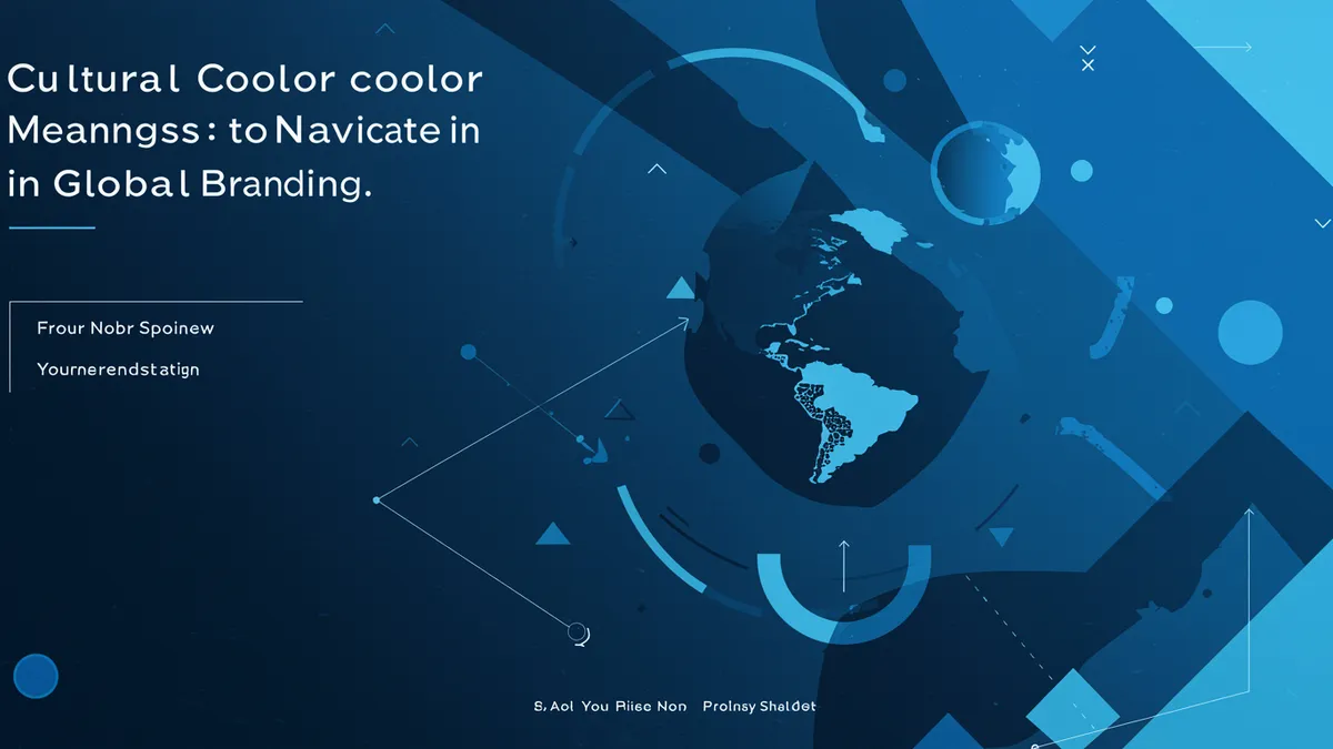
Discover cultural color meanings across global markets and learn how to choose brand colors that resonate worldwide. Avoid costly mistakes today.
Discover cultural color meanings across global markets and learn how to choose brand colors that resonate worldwide. Avoid costly mistakes today.
A few years ago, I worked with a health food brand that wanted to expand into Southeast Asia. Their packaging was drenched in white, which tested beautifully with American focus groups. Clean. Pure. Trustworthy. But in parts of China and Vietnam, white is the color of mourning. The brand's cultural color meanings problem nearly derailed a multi-million dollar launch before anyone on the team thought to question their assumptions.
That story isn't unusual. Color carries meaning that shifts dramatically across borders, and brands that ignore those shifts pay for it in lost trust, lower conversions, and confused customers.
Color associations are learned, not innate. The emotional response you have to a specific hue is shaped by your upbringing, religious traditions, regional customs, and media exposure. Research confirms this: Labrecque and Milne (2012) found that color associations with brand personality are culturally modulated, meaning a color that signals "luxury" in one market might signal something entirely different in another.
Red is the classic example. In the United States, red often communicates urgency, passion, or danger. In China, it represents luck, prosperity, and celebration. Coca-Cola's red works globally, but not for the same psychological reasons everywhere.
Here's what's interesting: even within a single country, subcultures can interpret color differently. A brand targeting Gen Z consumers in urban Brazil won't get the same color response as one targeting rural communities in the same country. Madden, Hewett, and Roth (2000) demonstrated significant cross-cultural variation in color preferences and meanings across eight countries, reinforcing that blanket assumptions about "what blue means" are dangerously simplistic.
So what does this mean for your brand? Before you finalize any global color palette, you need to map your target markets and research local associations. A quick assumption based on your home market is a recipe for expensive mistakes.
Purple color meaning brand associations vary more than most designers realize. In Western markets, purple has long been tied to royalty, luxury, and creativity. That's why brands like Cadbury and Hallmark lean into it. In purple branding tech circles, the color has become shorthand for innovation and premium positioning; think Twitch, Roku, and Nubank.
But travel east, and the picture shifts. In Thailand, purple is associated with mourning, specifically worn by widows. In Brazil, it carries connotations of death and grief. A tech startup choosing purple to signal "premium innovation" could accidentally signal sorrow to a significant portion of its audience.
One thing designers overlook: purple's perception also shifts based on shade and saturation. A deep violet reads differently than a bright lavender. Elliot and Maier (2014) noted that even slight changes in hue and brightness can alter emotional responses to color, a finding that matters enormously when you're fine-tuning a logo for multiple markets.
If you're considering purple for a global brand, test it. Don't rely on Western color psychology guides alone. Run your palette through a logo analysis that accounts for cultural context, and pair it with local market research before committing.
Brand color testing shouldn't be an afterthought. It should happen before your design is finalized, not after you've printed 50,000 units of packaging.
The most reliable approach combines three methods:
Quick reality check: A/B testing alone isn't enough. People in collectivist cultures may give socially desirable answers in surveys rather than honest ones Aaker and Lee, 2001. That's why implicit measures matter so much for color A/B testing logo decisions in international markets.
Start with your highest-priority markets. Test there first. Then expand your color validation to secondary markets before a full global rollout.
Some colors cause problems more frequently than others. White, as I mentioned, reads as purity in the West but mourning in several East Asian cultures. Green is another tricky one. It's sacred in Islam, associated with nature in Europe, and can signal infidelity in China.
Yellow carries its own baggage. In Germany, yellow is associated with envy. In Japan, it represents courage. In parts of Latin America, it's tied to death and mourning.
Consider this: even black, which feels "safe" and "universal" to many Western designers, carries strong funeral associations in many cultures. The assumption that neutral colors are culturally neutral is one of the most common mistakes I see brands make.
Pepsi learned this lesson decades ago when a color change in Southeast Asia reportedly confused consumers who associated the new shade with different cultural signals than intended. The specifics are debated, but the principle holds: multinational brands must treat color decisions with the same rigor they apply to translation and localization.
For a deeper look at how specific color combinations affect trust and perception, check out our guide on color pairing for brands.
You don't necessarily need a different logo for every market. But you do need a strategy that accounts for cultural variation without fragmenting your brand identity.
Some brands solve this with a flexible color system. They maintain a primary brand color that's been validated globally, then adapt secondary and accent colors by region. Mastercard, for example, keeps its red and yellow circles consistent worldwide but adjusts surrounding design elements and color contexts for local campaigns.
Another approach: choose colors with relatively stable positive associations across your target markets. Blue tends to be the safest bet globally. Aslam (2006) found that blue is the most universally preferred color across cultures, which partly explains why so many global brands (Samsung, Facebook, IBM) default to it. But "safe" doesn't mean "effective." If every competitor in your space uses blue, blending in might cost you more than a cultural misstep would.
The smartest move is to optimize logo colors through a combination of cultural research, competitive analysis, and perceptual testing. Our piece on color theory in logo design covers how to balance distinctiveness with psychological effectiveness.
Worth noting: your color strategy should be documented and revisited. Markets evolve. Cultural associations shift over time, especially as younger generations consume more global media. What was true about color perception in a market five years ago may not hold today.
There's a real risk of over-localizing. If you change your brand colors so dramatically for each market that you lose visual consistency, you've created a different problem: brand fragmentation. Customers who travel or interact with your brand online across regions won't recognize you.
The goal is adaptation, not reinvention. McDonald's uses green storefronts in parts of Europe to signal environmental responsibility, while keeping its golden arches and red consistently visible. That's smart localization. It respects local values without abandoning brand recognition.
If you're unsure whether your current logo colors are sending the right signals, a logo analysis can give you a baseline. From there, you can make informed decisions about what to adapt and what to protect.
Not if you do it strategically. Keep your primary brand color consistent and adjust secondary colors or contextual design elements. The key is maintaining recognizable visual anchors while respecting local associations. Think of it as translation, not replacement.
Blue consistently ranks as the most positively received color across cultures Aslam, 2006. But "safest" doesn't always mean "best." If your entire competitive set uses blue, standing out might require a bolder, well-tested alternative.
Combine cultural audits with local consumer testing. Use implicit association tests or neuroscience-backed analysis alongside traditional surveys. Survey responses alone can be unreliable in cultures where social desirability bias is strong.
Purple works well for tech brands in Western markets, where it signals innovation and premium quality. But in Thailand and parts of Latin America, purple carries mourning associations. Always validate with your specific target audience before committing.
Your logo's colors are saying something in every market you enter. The question is whether they're saying what you intend. If you're expanding internationally or simply want to pressure-test your palette, analyze your logo with a tool built to evaluate visual identity through the lens of neuroscience and perception. The insights might surprise you.
Discover the latest color trends logos should follow to create stronger visual impact. Learn how to ...
Learn how color accessible logo design reaches every audience. Discover inclusive design principles ...

Discover how color symbolism cultures shape brand perception. Learn to design logos that resonate gl...
Get a free scientific analysis with 550+ metrics across perception and design.
Try Free Analysis