
color psychologyindustry
Industry Brand Colors Mapped to Customer Psychology
Discover how industry brand colors influence customer psychology and drive purchasing decisions. Lea...
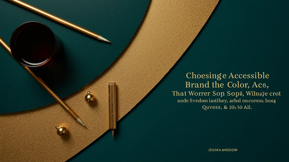
Learn how to choose accessible brand colors that work for everyone. Discover contrast ratios, color blindness considerations, and best practices for inclusiv...
Learn how to choose accessible brand colors that work for everyone. Discover contrast ratios, color blindness considerations, and best practices for inclusiv...
A logo color that looks brilliant on your monitor might be invisible to 300 million people worldwide. That's the population living with color vision deficiency, and most brand designers never test for it. Choosing accessible brand colors isn't charity work or a compliance checkbox. It's a strategic decision that expands your audience, strengthens recognition, and often produces cleaner, more versatile designs in the process.
I once reviewed a fintech startup's logo that used a red-green gradient as its primary mark. Gorgeous on screen. Completely unreadable for roughly 8% of men who walked past their signage. The fix took two hours. The impact on their reach was immediate.
Accessibility in branding directly affects your market size and legal exposure. The Web Content Accessibility Guidelines (WCAG) require a minimum contrast ratio of 4.5:1 for normal text and 3:1 for large text. But these aren't arbitrary numbers. They reflect how the human visual system processes color under real-world conditions: bright sunlight, aging eyes, low-quality screens, and yes, color vision deficiency.
Research from the Colour Blind Awareness organization estimates that 1 in 12 men and 1 in 200 women have some form of color blindness. That's a significant slice of any target market. If your brand relies on color alone to communicate meaning (think red for "error," green for "success"), you're building barriers without realizing it.
Here's what's interesting: brands that prioritize accessible color palettes often end up with stronger visual identities overall. Constraints force clarity. When you can't rely on subtle hue differences, you lean harder on contrast, shape, and typography. The result is a logo that works everywhere, from a billboard to a 16x16 favicon.
Before you start optimizing, run a logo analysis to see where your current colors stand. You might be surprised by what the data reveals.
Your brand colors might pass the "squint test" on a Retina display and still fail basic accessibility standards. Brand color testing requires more than eyeballing it. You need to measure the mathematical relationship between foreground and background luminance.
WCAG defines contrast ratios on a scale from 1:1 (no contrast, identical colors) to 21:1 (black on white). Most brand palettes fall somewhere in the uncomfortable middle, where colors look distinct to designers working on calibrated monitors but collapse for users with low vision or protanopia.
A few practical rules:
One thing designers overlook: contrast isn't just about the logo mark itself. It's about how your brand colors interact with body text, CTAs, and UI elements across every touchpoint. A logo that passes accessibility checks but sits inside an inaccessible color system still creates friction. Understanding our methodology can help you evaluate how your full color system performs, not just the logo in isolation.
Purple has become the signature color of tech brands seeking to signal creativity, premium quality, and innovation. Twitch, Roku, Nubank, and Figma all lean heavily on purple. But purple branding tech companies face a specific accessibility challenge: many purple shades have notoriously low contrast against both white and dark backgrounds.
The psychology of color tells us that purple color meaning brand associations include wisdom, luxury, and imagination Labrecque & Milne, 2012. That's a powerful cocktail for SaaS companies and creative platforms. But the neurological response only works if people can actually perceive the color clearly.
Consider this: a medium purple (#7B2D8E) against white yields a contrast ratio of about 5.8:1. Acceptable. But lighten it to a trendy lavender (#B57EDC) and you drop to around 2.4:1. That fails WCAG AA for any text application.
If you're committed to purple branding, here's what works:
The brands that pull off purple well treat it as an accent within a high-contrast system, not as the entire palette. Check out color trends logos should follow for more on building trend-aware palettes that don't sacrifice readability.
Color A/B testing logo variations is one of the most underused tools in brand development. Most teams pick colors based on preference, mood boards, or competitor analysis. Few actually test whether their chosen palette performs better than alternatives with real audiences.
Here's a framework I've seen work well:
Step 1: Generate accessible variants. Start with your preferred brand color. Create 2-3 variations that maintain the same hue family but adjust saturation and lightness to meet WCAG AA (minimum) or AAA (ideal) contrast ratios.
Step 2: Test recognition speed. Show each variant to test groups for 50 milliseconds. Which version do people identify fastest? Speed of recognition correlates strongly with memorability Pieters & Wedel, 2004.
Step 3: Measure emotional response. Use simple semantic differential scales (modern vs. traditional, trustworthy vs. risky) to see if your accessible variants still carry the intended brand personality.
Step 4: Test in context. A logo doesn't exist in a vacuum. Place each variant on your website header, app icon, social media avatar, and a mock business card. The winner in isolation might not be the winner in practice.
Quick reality check: you don't need a massive budget for this. Even testing with 30-50 people per variant gives you directional data that beats guessing. And eye-tracking research shows that attention patterns shift dramatically based on color contrast alone.
The biggest fear designers have about accessibility is that it will make everything look boring. Beige and black. Safe and sterile. That fear is unfounded.
Accessible doesn't mean bland. It means intentional. Some of the most visually striking brands in the world, Spotify's green-on-black, Mailchimp's yellow-on-dark, IBM's blue system, all exceed WCAG contrast requirements while feeling anything but generic.
The key is to optimize logo colors within a structured system:
Worth noting: seasonal and trend-driven color updates can coexist with accessibility standards. Our guide on seasonal branding colors to refresh your logo year-round shows how to rotate accent colors without breaking your contrast system.
And if you're wondering whether your current palette holds up, a brand analysis tool can score your colors against accessibility benchmarks in seconds.
Sometimes the difference between an inaccessible logo and an accessible one is surprisingly small. A 10% shift in lightness. A slightly deeper saturation. Swapping a thin font weight for a medium one (which changes the effective contrast ratio by altering how much color the eye perceives).
I've seen brands resist accessibility audits because they assume a full rebrand is required. Rarely true. Most fixes fall into three categories:
Darkening or saturating your primary color by one or two steps. This often improves the logo's presence and authority while solving the contrast problem simultaneously.
Adding a background container. If your logo color can't be changed (franchise requirements, legacy equity), place it inside a contrasting shape. Mastercard does this with their overlapping circles on variable backgrounds.
Creating an accessible alternate version. Many brands maintain a "reversed" or "accessible" logo lockup specifically for contexts where contrast is challenging. This is standard practice, not a compromise. It's smart brand management.
Before making changes, look at real-world examples of how other brands have navigated this exact challenge. And if you spot multiple signs your logo needs a refresh, an accessibility overhaul might be the perfect opportunity to modernize your entire visual system.
WCAG AA requires a minimum of 4.5:1 for normal text and 3:1 for large text or graphical elements like logos. AAA (the gold standard) requires 7:1 for normal text. For logos specifically, aim for at least 3:1 against your most common background colors.
Yes, but only for decorative or background purposes. Pastels almost never meet contrast requirements for text or critical visual elements. Pair them with dark text and keep your primary brand identifier in a higher-contrast color.
Use free simulators like Coblis or the Stark plugin for Figma and Sketch. These tools show your logo as it appears to people with protanopia, deuteranopia, and tritanopia. If your logo loses its distinctiveness in any simulation, adjust your palette or add non-color differentiators.
No. Research by Schloss and Palmer (2011) found that color preference is driven largely by contrast and saturation, both of which accessibility guidelines encourage. Accessible palettes often test as more professional and trustworthy than low-contrast alternatives.
Your brand colors shape how millions of people experience your company. Making them accessible isn't a limitation; it's a competitive advantage that most of your competitors are still ignoring. Ready to see how your palette measures up? Analyze your logo with neuroscience-backed scoring and get specific, actionable recommendations for building a color system that works for everyone.
Discover how industry brand colors influence customer psychology and drive purchasing decisions. Lea...

Seasonal brand design transforms your visual identity with color psychology. Learn how strategic col...
Discover seasonal branding colors to refresh your logo year-round. Learn expert tips for adapting yo...
Get a free scientific analysis with 550+ metrics across perception and design.
Try Free Analysis