
color psychologybrand
Brand Color Combinations That Trigger the Right Emotions
Discover powerful brand color combinations that evoke emotions and drive customer action. Learn psyc...
Create a powerful brand color guide using neuroscience principles to influence customer behavior and boost your brand recognition and sales today.
Create a powerful brand color guide using neuroscience principles to influence customer behavior and boost your brand recognition and sales today.
A brand color guide built on gut instinct is basically an expensive guess. I once worked with a SaaS founder who chose his entire palette because he "just liked teal." Six months and a failed rebrand later, he learned that his audience — enterprise CFOs — associated that particular shade with budget airlines. The colors you pick aren't decoration. They're cognitive signals that shape how people feel about your brand before they read a single word.
The good news? Neuroscience gives us a framework for choosing colors that actually work. Not based on trends or personal taste, but on how the human brain processes and responds to chromatic information. Here's how to build a brand color guide that's grounded in science rather than vibes.
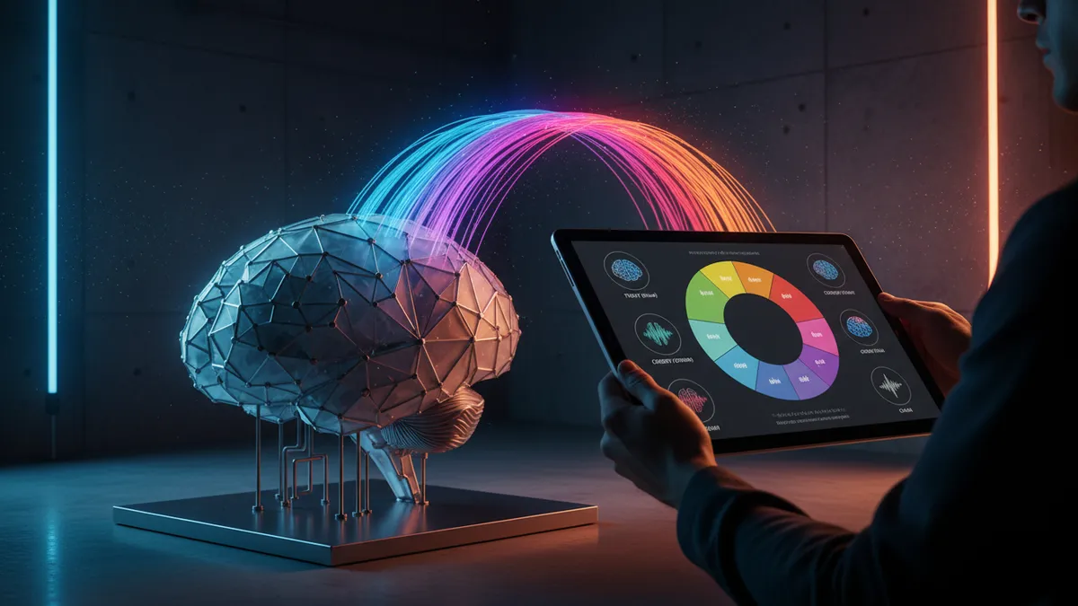
Color reaches the brain's emotional centers faster than language does. Research shows the human visual system can process color information in as little as 13 milliseconds — well before conscious thought kicks in Potter et al., 2014. That means your logo's colors are already shaping perception while the viewer's brain is still decoding your company name.
This has massive implications for your brand color guide. You're not just picking "nice" colors. You're choosing the first emotional signal your audience receives.
Think about it this way: when someone sees a logo, their amygdala fires a rapid emotional response based partly on color associations built over a lifetime. Blue triggers trust associations. Red signals urgency or energy. And these responses happen automatically.
One thing designers overlook: these associations aren't universal. They shift across cultures, age groups, and industries. A neuroscience-backed analysis can reveal whether your chosen palette triggers the emotional response you're actually aiming for — or something entirely different. The psychology of color runs deeper than most brand guidelines acknowledge.
Your first step? Stop treating color selection as an aesthetic decision. Treat it as a strategic one.
Building a science-backed brand color guide requires understanding three layers of color processing in the brain: arousal, association, and preference.
Arousal refers to how stimulating a color is. Warm colors (reds, oranges, yellows) increase physiological arousal — heart rate goes up, attention sharpens. Cool colors (blues, greens) do the opposite, promoting calm and reducing perceived risk Elliot & Maier, 2014. If you're a fintech company trying to signal safety, a high-arousal red palette is working against you.
Association is the learned meaning we attach to colors. These are culturally constructed but remarkably consistent within demographic groups. Green means growth and health in Western markets. Black signals luxury and sophistication. Purple — more on that shortly — carries its own unique baggage.
Preference is personal and contextual. Research by Palmer and Schloss 2010 found that people prefer colors associated with objects they like. If your audience loves nature, greens and earth tones will resonate more strongly.
Here's how to apply this:
This framework turns color selection from a creative free-for-all into a structured, testable process.
Purple color meaning in brand contexts is fascinating because it sits at the intersection of warm and cool. It carries the energy of red and the stability of blue, which is exactly why so many tech companies have gravitated toward it.
Twitch, Roku, Nubank, Figma — purple branding tech is everywhere. And there's a neurological reason. Purple activates both arousal pathways (from its red component) and calming pathways (from its blue component), creating what researchers describe as a state of "engaged calm" Labrecque & Milne, 2012. For tech products that want to feel innovative but trustworthy, that's a sweet spot.
But here's the catch: purple's luxury and creativity associations can backfire in certain contexts. Enterprise B2B software targeting conservative industries? Purple might feel too playful. Budget-friendly consumer products? Purple's premium connotations could create a price expectation mismatch.
Worth noting: the specific shade matters enormously. A deep violet reads as premium and mysterious. A bright magenta-purple feels youthful and disruptive. A muted lavender signals calm and wellness. Same color family, completely different brand signals.
Before committing to purple (or any color), run it through a logo analysis to see whether it's communicating what you think it's communicating. Our case studies include several examples of brands that discovered their purple wasn't landing the way they expected.
Most brand color testing is done wrong. A designer presents three palette options in a meeting, the CEO picks their favorite, and everyone moves on. That's not testing. That's a preference poll with a sample size of one.
Meaningful color A/B testing for logos requires structure:
Quick reality check: you don't need a massive budget for this. Simple A/B tests on landing pages or social media ads can yield statistically significant results within a week. Tools like our brand analysis tool can give you a neurological baseline before you even start testing with real users.
The goal isn't to find the "best" color. It's to find the color that triggers the right emotional response in the right people. Those are very different things.
A complete brand color guide goes beyond picking a primary color. You need a system — one that works across every touchpoint your brand will ever appear on.
Start with your primary brand color. This is your signature. It should directly map to the core emotion you want associated with your brand. Use the arousal-association-preference framework from earlier.
Next, choose secondary colors that complement without competing. A common mistake I've seen countless times: brands pick secondary colors that are equally dominant, creating visual noise. Your secondary palette should support your primary color, not fight it for attention. Aim for 2-3 secondary colors maximum.
Then define your neutral palette — the backgrounds, text colors, and UI elements that make up 60-70% of your visual real estate. Neutrals are the unsung heroes of brand design. Get them wrong and even a brilliant primary color looks off.
Document everything with specific values: HEX, RGB, CMYK, and Pantone codes. Include usage rules. Which color goes where? What are the minimum contrast ratios for accessibility? What combinations are prohibited?
Finally, pressure-test the whole system. Does it work in dark mode? On a billboard? As a tiny favicon? You can compare logos across these contexts to spot weaknesses before they become expensive problems. A strong brand color guide anticipates every scenario, not just the ideal one.
Your brand color guide isn't a document you create once and forget. Markets shift. Audiences evolve. What worked three years ago might be time to refresh your logo territory today.
To optimize logo colors effectively, build a review cycle into your brand operations. Every 12-18 months, revisit your color performance data. Are your conversion rates holding? Has a competitor adopted a similar palette, diluting your distinctiveness? Has your target audience shifted demographically?
The data tells a different story than most brand managers expect. Colors that tested well during a brand launch often lose effectiveness as market conditions change. Mastercard's 2019 color refinement — shifting to brighter, more saturated reds and yellows — wasn't random. It was a response to how their brand needed to perform in digital-first environments where their old palette looked muddy on screens.
You don't need a full rebrand to optimize. Sometimes a 10% saturation increase or a slight hue shift makes a measurable difference in recognition and emotional response. These micro-adjustments are where logo analysis tools become invaluable — they can quantify changes that the human eye might miss but the human brain absolutely registers.
Color optimization is an ongoing practice, not a one-time project.
Most effective brand color guides use 1-2 primary colors, 2-3 secondary colors, and 2-3 neutrals. That gives you enough flexibility for diverse applications without creating visual chaos. Anything beyond 8 total colors becomes nearly impossible to manage consistently across teams and touchpoints.
Yes, and many global brands do exactly this. Color associations vary significantly across cultures — white signals purity in Western markets but mourning in parts of East Asia. If you serve multiple regions, consider cultural color testing for each market rather than assuming one palette fits all.
Run a simple A/B test: swap your primary brand color on a key landing page and measure conversion rates over 2-3 weeks. If you see a statistically significant difference, your colors are part of the equation. A free logo analysis can also flag potential issues with your current palette's emotional impact.
Research suggests color is processed faster and remembered more reliably than shape Bottomley & Doyle, 2006. But they work together. A strong shape with poor color choices underperforms, and vice versa. Think of them as inseparable partners, not competing priorities.
Your brand color guide should be one of the most strategic documents in your brand toolkit. If you're not sure whether your current colors are sending the right signals, analyze your logo with our neuroscience-powered platform. You might discover that the palette you've been defending is quietly undermining everything else you're doing right.
Discover powerful brand color combinations that evoke emotions and drive customer action. Learn psyc...

Discover how industry brand colors influence customer psychology and drive purchasing decisions. Lea...

Learn how to choose accessible brand colors that work for everyone. Discover contrast ratios, color ...
Get a free scientific analysis with 550+ metrics across perception and design.
Try Free Analysis