Logo Score Index · #451 of 487
VMware Logo Analysis
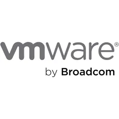
VMware's logo signals strong competence and trust but lacks emotional distinctiveness, risking lower memorability in a competitive market.
Technology · 7 points below the Technology average of 82 (89 logos)
The verdict
The VMware logo projects strong professional credibility and industry appropriateness, effectively communicating reliability and competence in the technology sector. However, its minimalist design, while clear, results in a lower emotional impact and memorability, potentially limiting deeper brand connection. Strategic enhancements to introduce subtle distinctiveness could elevate brand recall without compromising its established trustworthy image.
Score breakdown
How the VMware logo scores across the analysis categories.
- Design89
- Psychology57
- Trust88
- Cognitive74
- Market66
- Typography88
- Color53
- Cultural90
Strengths and weak spots
What works
The logo's primary strengths lie in its strong professional credibility, high industry appropriateness, and excellent scalability. Its minimalist design ensures clear recognition and low cognitive load, making it highly effective for a technology brand. The neutral color palette also contributes to high cultural safety and broad appeal.
Where it could improve
Key areas for improvement include the very low color contrast ratio, which fails WCAG standards, and a relatively low emotional impact. While professional, the monochromatic gray scheme lacks distinctiveness and could benefit from a subtle accent color to enhance memorability and emotional connection without compromising its core identity. The attention spread is also quite diffuse, indicating a lack of a strong focal point.
If this were your logo, we'd suggest
- Improve Color Contrast for Accessibility
- Introduce a Subtle Accent Color
- Refine Typography for Distinctiveness
- Optimize Visual Hierarchy of Brand Elements
What the analysis found
Positioning
The logo's clean, modern sans-serif typography and neutral gray color palette perfectly align with the enterprise technology industry, positioning VMware as a serious, reliable, and sophisticated player. The 'by Broadcom' clearly communicates its new corporate structure, ensuring market clarity and reinforcing its established presence.
Trust
The professional credibility score is high due to the logo's understated elegance and clear, legible typography, which convey competence and stability. The neutral gray tones are universally associated with professionalism, fostering a sense of trust and reliability from the first impression.
Recognition
While highly legible and simple, the logo's monochromatic and text-heavy nature contributes to moderate memorability. Its processing fluency is excellent, allowing for quick recognition, but the lack of a unique visual icon or distinctive color palette means it might not stand out immediately in a crowded visual landscape.
Emotion
The logo's emotional impact is relatively low, as the neutral gray palette and purely textual design evoke professionalism and seriousness rather than strong emotional arousal or connection. While this aligns with a B2B technology brand, it limits the potential for deeper, more resonant storytelling and emotional triggers.
Design
The design excels in harmony and symmetry, with a balanced composition and highly legible typography that ensures scalability across various platforms. The effective use of negative space and strong figure-ground balance contribute to its overall visual clarity and aesthetic coherence, making it a robust design foundation.
Brand personality
The VMware logo strongly embodies 'Competence' (90), reflecting reliability, intelligence, and success through its clean, geometric sans-serif typography and neutral gray color palette. This design choice projects a serious, efficient, and trustworthy image, crucial for an enterprise technology brand. 'Sophistication' (65) is moderately present due to its minimalist elegance, but it lacks the luxurious cues of higher sophistication. 'Sincerity' (45) is low, as the design is more corporate than wholesome or cheerful. 'Excitement' (30) is minimal, as the gray tones and static composition do not convey daring or spiritedness. 'Ruggedness' (20) is almost absent, as there are no earthy tones or heavy, textured elements.
The logo embodies 'The Sage' archetype through its emphasis on knowledge, expertise, and reliability. The minimalist, professional design, coupled with the neutral gray colors, conveys intelligence, wisdom, and a commitment to truth and understanding. It suggests a brand that provides clarity and solutions, rather than flashy innovation, aligning with the core values of a technology leader in complex enterprise solutions.
Color and typography
The gray color palette primarily evokes feelings of professionalism, stability, and seriousness. While these are positive for a technology brand, they do not trigger strong emotional arousal or warmth. The emotional impact is therefore moderate, leaning towards a rational rather than an emotive connection.
The modern sans-serif typeface aligns well with VMware's brand personality as a technology leader. It conveys professionalism, innovation, and clarity, matching the brand's focus on enterprise solutions. The rounded elements add a touch of approachability without compromising its serious intent.
Explore the full VMware scorecard
Every metric behind the 75/100 — attention prediction, color harmony, typography and more, in the interactive report.
More from the index


Independent analysis. Logo Analyzer is not affiliated with or endorsed by VMware; all trademarks and logos belong to their respective owners. Scores and commentary reflect one AI model's assessment of the logo's design and are not an official ranking, endorsement, or measure of brand or commercial success.