Logo Score Index · #315 of 487
Uniqlo Logo Analysis
Uniqlo's logo delivers strong recognition and trust but faces cultural and accessibility hurdles that limit its full global potential.
Fashion · 6 points below the Fashion average of 87 (32 logos)
The verdict
Uniqlo's logo is a powerhouse of recognition and stability, effectively communicating a reliable and accessible brand identity. While it excels in market positioning and design clarity, there's a notable gap in emotional engagement and cultural inclusivity that could limit deeper customer connection and global expansion. Strategic adjustments to color application and subtle design elements could unlock greater emotional resonance without compromising its core strengths.
Score breakdown
How the Uniqlo logo scores across the analysis categories.
- Design93
- Psychology81
- Trust87
- Cognitive91
- Market76
- Typography93
- Color61
- Cultural72
Strengths and weak spots
What works
The logo's primary strengths lie in its exceptional memorability and recognition speed, driven by its bold color contrast and simple, geometric forms. Its high scalability and adaptability ensure consistent brand representation across all mediums. The strong figure-ground balance and processing fluency contribute to an immediate and clear brand message, while its alignment with 'The Everyman' archetype fosters broad appeal and approachability.
Where it could improve
The logo's cultural sensitivity score is low due to potential negative associations of red in certain regions, which could hinder global expansion or acceptance. The WCAG contrast ratio fails, indicating accessibility issues for visually impaired individuals. While bold, the design could benefit from subtle elements that enhance emotional depth beyond basic recognition, and its current aesthetic, while timeless, might be perceived as lacking a unique 'spark' compared to more emotionally evocative brands.
If this were your logo, we'd suggest
- Improve WCAG Contrast Ratio for Accessibility
- Conduct Targeted Cultural Color Research
- Explore Subtle Emotional Enhancements
- Refine Font Spacing for Optimal Readability
What the analysis found
Positioning
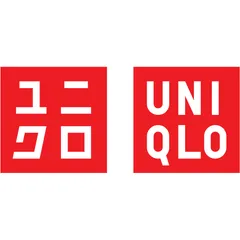
The logo's clean, geometric design and bold red color effectively position Uniqlo as a modern, accessible, and energetic brand. The dual-language approach reinforces its global yet Japanese identity, aligning well with its market strategy of offering quality basics to a broad audience. Its simplicity differentiates it from more trend-driven fashion brands.
Trust
The logo's strong symmetry, clear typography, and stable geometric shapes convey reliability and professionalism, fostering a high level of trust. The straightforward design avoids ambiguity, signaling transparency and honesty, which are crucial for building consumer confidence in a value-driven brand. The high processing fluency further enhances perceived credibility.
Recognition
With its high contrast, bold red squares, and distinctive typography, the logo achieves exceptional recognition speed and memorability. The simple, blocky forms are easy to recall and reproduce mentally, making it highly effective for brand recall. The eye-tracking data confirms immediate attention capture on the core brand elements.
Emotion
The vibrant red evokes energy and excitement, contributing to a positive emotional impact. However, the highly geometric and functional aesthetic, while conveying competence, may limit deeper emotional resonance or storytelling potential. While it triggers attention, it might not foster the same level of warmth or personal connection as brands with more nuanced emotional cues.
Design
The logo demonstrates excellent design quality through its high harmony, symmetry, and scalability. The effective use of negative space and strong figure-ground balance ensures visual clarity and impact across all applications. Its minimalist approach adheres to strong Gestalt principles, making it aesthetically coherent and easy to process.
Brand personality
The Uniqlo logo strongly embodies 'Competence' (85), conveyed through its clean, geometric forms, precise typography, and clear, unambiguous design. It signals reliability, intelligence, and success. 'Excitement' (70) is also present due to the vibrant red color and bold presentation, suggesting an up-to-date and spirited brand. 'Sincerity' (60) is moderately expressed through its straightforwardness and lack of pretension, aligning with an 'Everyman' appeal. 'Sophistication' (40) is lower, as the design prioritizes functionality and mass appeal over luxury or exclusivity. 'Ruggedness' (20) is the lowest, as the aesthetic is far from outdoorsy or tough, focusing instead on urban, modern simplicity.
The Uniqlo logo embodies 'The Everyman' archetype through its universal appeal, simplicity, and lack of pretension. The clean, straightforward design, bold readability, and functional aesthetic resonate with a desire for belonging and accessibility. It doesn't aim for exclusivity or luxury but rather for reliable, high-quality basics for everyone, reflecting the Everyman's values of equality, practicality, and connection. The dual-language approach further emphasizes its global, inclusive nature.
Color and typography
The vibrant, saturated red elicits strong emotional responses, primarily excitement, energy, and urgency. It's an attention-grabbing color that can stimulate passion and a sense of dynamism. The stark contrast with white adds to its boldness and directness, creating a powerful and memorable emotional impression.
The bold, geometric sans-serif font perfectly matches Uniqlo's brand personality of simplicity, functionality, and modernity. It conveys clarity, strength, and approachability, aligning with the 'Everyman' archetype and the brand's focus on essential, well-designed clothing. The font is direct and unpretentious, reinforcing the brand's core values.
Explore the full Uniqlo scorecard
Every metric behind the 81/100 — attention prediction, color harmony, typography and more, in the interactive report.
More from the index


Independent analysis. Logo Analyzer is not affiliated with or endorsed by Uniqlo; all trademarks and logos belong to their respective owners. Scores and commentary reflect one AI model's assessment of the logo's design and are not an official ranking, endorsement, or measure of brand or commercial success.