Logo Score Index · #12 of 487
Hermès Logo Analysis
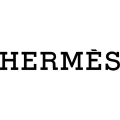
Hermès's logo masterfully conveys timeless luxury and trust, yet its stark simplicity risks limiting emotional depth for future generations.
Fashion · 4 points above the Fashion average of 87 (32 logos)
The verdict
The Hermès logo is a powerful asset, projecting strong professional credibility and a premium perception that underpins brand equity. Its classic, minimalist design ensures high recognition and trust, aligning perfectly with the brand's heritage. However, the monochrome palette and traditional typography, while elegant, offer limited emotional arousal, potentially hindering deeper engagement with younger, emotionally-driven luxury consumers. Strategic exploration of subtle visual enhancements could broaden its appeal without diluting its iconic status.
Score breakdown
How the Hermès logo scores across the analysis categories.
- Design96
- Psychology82
- Trust95
- Cognitive92
- Market89
- Typography95
- Color93
- Cultural94
Strengths and weak spots
What works
The logo's primary strengths lie in its exceptional clarity, timeless elegance, and strong professional credibility. Its minimalist design ensures high memorability and recognition speed, while the monochrome palette and classic typography convey a powerful sense of luxury and heritage. Furthermore, its excellent accessibility for colorblind individuals and high scalability across various applications are significant advantages.
Where it could improve
While highly effective, the logo's stark monochrome palette and formal aesthetic could be perceived as lacking in emotional warmth or dynamic appeal for certain younger demographics. There is a slight risk of appearing overly traditional or conservative in a rapidly evolving luxury market, potentially limiting deeper emotional engagement compared to brands with more vibrant or expressive visual identities.
If this were your logo, we'd suggest
- Refine Typography for Modern Relevance
- Explore Subtle Color Accents
- Develop Dynamic Brand Extensions
- Conduct Global Perception Study
What the analysis found
Positioning
The logo's classic serif typography and monochrome palette firmly position Hermès as a heritage luxury brand, signaling exclusivity and enduring quality. This design choice effectively differentiates it from more contemporary or overtly flashy competitors, reinforcing its established market standing.
Trust
The clean, symmetrical design and professional font instill a high degree of trust and credibility. Its understated elegance avoids any perception of trend-chasing, conveying reliability and a long-standing commitment to excellence, which is crucial for a luxury brand.
Recognition
With its simple wordmark and high contrast, the logo boasts exceptional recognition speed and memorability. The distinct serif typeface, while classic, is unique enough to stand out, ensuring the brand is easily identified and recalled across various touchpoints.
Emotion
While conveying sophistication and aspiration, the logo's strictly monochrome and formal aesthetic results in a moderate emotional impact. It evokes respect and admiration rather than warmth or excitement, which might limit deeper emotional connections for some consumer segments.
Design
The logo exhibits exemplary design quality, characterized by high harmony, symmetry (95% overall), and effective use of negative space. Its simplicity ensures excellent scalability and adaptability across all media, while its Gestalt compliance makes it effortlessly comprehensible.
Brand personality
The Hermès logo strongly embodies Sophistication (95) through its classic serif typography, minimalist black and white palette, and clean, elegant presentation, conveying an upper-class and charming image. Competence (85) is also highly present, signaled by the precise, established font and overall professional appearance, which communicates reliability and success. Excitement (30) is low as the design is not daring or spirited. Sincerity (20) is minimal, as it lacks earthy or wholesome cues. Ruggedness (15) is virtually absent, as the design is far from tough or outdoorsy.
The Hermès logo embodies 'The Ruler' archetype through its classic, authoritative serif typography and minimalist, high-contrast design. It projects an image of established power, control, and unwavering quality, signaling a brand that is a leader in its domain and offers products of superior status and enduring value. The elegance and formality reinforce a sense of exclusivity and aspiration associated with royalty and leadership.
Color and typography
The black and white color scheme primarily evokes feelings of sophistication, elegance, and authority. Black conveys a sense of luxury and power, while white adds clarity and purity. This combination creates a formal and aspirational emotional response, though it may lack the warmth or vibrancy to trigger intense emotional arousal for all audiences.
The classic serif font perfectly matches the brand's personality of heritage, luxury, and sophistication. It conveys a sense of tradition, authority, and timeless elegance, aligning seamlessly with Hermès's established image and values.
Explore the full Hermès scorecard
Every metric behind the 91/100 — attention prediction, color harmony, typography and more, in the interactive report.
More from the index


Independent analysis. Logo Analyzer is not affiliated with or endorsed by Hermès; all trademarks and logos belong to their respective owners. Scores and commentary reflect one AI model's assessment of the logo's design and are not an official ranking, endorsement, or measure of brand or commercial success.