Logo Score Index · #235 of 487
Umbro Logo Analysis
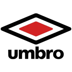
Umbro's iconic logo delivers strong recognition and athletic energy, but its cultural blind spots risk limiting global market penetration.
Fashion · 4 points below the Fashion average of 87 (32 logos)
The verdict
The Umbro logo effectively projects a strong, energetic brand identity, scoring highly in recognition and industry fit, which underpins its market positioning. However, its current cultural sensitivity score indicates potential risks in global expansion, particularly concerning color associations. Addressing these cultural nuances is crucial for unlocking broader market appeal and sustaining long-term brand equity.
Score breakdown
How the Umbro logo scores across the analysis categories.
- Design88
- Psychology79
- Trust85
- Cognitive87
- Market76
- Typography88
- Color89
- Cultural77
Strengths and weak spots
What works
The logo's top strengths include its high memorability due to its distinctive diamond graphic, excellent scalability and adaptability across various platforms, and strong industry fit within sportswear. Its clear figure-ground balance and processing fluency ensure quick recognition, while the bold color palette effectively conveys energy and passion.
Where it could improve
Areas for improvement include enhancing cultural inclusivity beyond Western and Asian markets, potentially diversifying the color palette to broaden emotional appeal, and exploring ways to increase perceived sophistication to attract a wider fashion-conscious demographic without losing its core identity. The current design, while strong, could benefit from subtle refinements to boost its global appeal and address specific cultural sensitivities.
If this were your logo, we'd suggest
- Conduct targeted cultural market research
- Explore secondary color palette options
- Refine typography for enhanced sophistication
- Integrate dynamic visual elements in marketing
What the analysis found
Positioning
The logo's bold, geometric design and high-contrast colors firmly position Umbro as a dynamic and competitive sportswear brand. The diamond graphic is instantly recognizable and aligns well with the athletic industry, suggesting performance and heritage. Its distinctiveness helps differentiate it in a crowded market, though the strong red might be perceived as aggressive in some contexts.
Trust
The clean lines, strong typography, and symmetrical composition contribute to a perception of reliability and professionalism, fostering trust. The established nature of the design, with its timeless quality, signals a brand with a solid foundation and consistent quality. The high processing fluency also aids in building trust by making the brand feel familiar and dependable.
Recognition
The unique double-diamond graphic and the bold 'umbro' wordmark ensure high recognition speed and memorability. The high contrast and clear figure-ground balance make it easily identifiable even at a glance or in various sizes. The strong visual cues effectively capture attention, making the logo stand out and be easily recalled by consumers.
Emotion
The dominant red color evokes strong emotions of passion, energy, and excitement, aligning well with the competitive spirit of sports. The dynamic angles of the diamond also contribute to a sense of movement and action. While effective for its core audience, the emotional range is somewhat narrow, potentially limiting broader appeal to consumers seeking more nuanced or sophisticated emotional connections.
Design
The logo exhibits strong design principles, including excellent harmony and symmetry, and effective use of negative space. Its geometric simplicity ensures high scalability and adaptability across diverse applications. The Gestalt principles are well-applied, leading to a cohesive and easily digestible visual, though the overall complexity is moderate, allowing for visual interest without being overwhelming.
Brand personality
The Umbro logo strongly embodies 'Excitement' (88/100) through its dynamic geometric shapes, high-contrast color palette dominated by energetic red, and bold, modern typography. These elements convey a sense of daring, spiritedness, and being up-to-date, perfectly aligning with the fast-paced, competitive nature of sports. 'Competence' (75/100) is also present, signaled by the clean lines, precision of the diamond graphic, and the overall professional finish, suggesting reliability and success. 'Ruggedness' (60/100) is moderately conveyed by the strong, solid forms and the association with physical activity. 'Sincerity' (40/100) and 'Sophistication' (55/100) are less dominant; while the logo is honest and straightforward, it prioritizes energy and performance over warmth or refined elegance.
The Umbro logo embodies 'The Hero' archetype through its bold, strong, and competitive visual elements. The sharp angles of the diamond, the high-contrast colors (red, black, white), and the robust, sans-serif typography all communicate courage, determination, and a drive for victory. It suggests a brand that helps individuals achieve their best, overcome challenges, and stand out, aligning perfectly with the spirit of sports and athleticism.
Color and typography
The red color in the logo strongly evokes emotions of passion, energy, excitement, and urgency. This is highly effective for a sports brand, stimulating feelings of dynamism and competitive drive. The black adds a layer of power and sophistication, while white provides clarity and a sense of purity, balancing the intensity of the red. The overall impact is stimulating and action-oriented.
The bold, sans-serif typeface perfectly matches the brand's athletic and energetic personality. It conveys strength, modernity, and directness, aligning with the competitive spirit of sportswear. The lowercase letters add a touch of approachability without sacrificing authority, creating a balanced and fitting typographic personality.
Explore the full Umbro scorecard
Every metric behind the 83/100 — attention prediction, color harmony, typography and more, in the interactive report.
More from the index


Independent analysis. Logo Analyzer is not affiliated with or endorsed by Umbro; all trademarks and logos belong to their respective owners. Scores and commentary reflect one AI model's assessment of the logo's design and are not an official ranking, endorsement, or measure of brand or commercial success.