Logo Score Index · #337 of 487
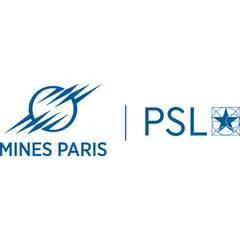
Mines ParisTech Logo Analysis
This logo builds strong trust and recognition but could benefit from enhanced emotional appeal to broaden its market reach.
Education · 1 point below the Education average of 81 (45 logos)
The verdict
This logo effectively projects strong professional credibility and trust, aligning well with the academic sector's need for authority and intellectual rigor. While its design is highly competent and ensures excellent recognition, there's an opportunity to enhance emotional engagement to foster deeper connections with a broader audience. Strategic adjustments could elevate its appeal without compromising its established reputation.
Score breakdown
How the Mines ParisTech logo scores across the analysis categories.
- Design89
- Psychology63
- Trust85
- Cognitive78
- Market77
- Typography88
- Color87
- Cultural83
Strengths and weak spots
What works
The logo's primary strengths lie in its strong professional credibility, high trust score, and excellent harmony and symmetry. Its clean, geometric design and use of blue effectively communicate intelligence, stability, and academic rigor, aligning well with the education industry. The high colorblind accessibility and WCAG compliance ensure broad usability, while its simplicity contributes to good scalability and processing fluency.
Where it could improve
While highly competent, the logo could benefit from increased emotional impact and storytelling potential to foster deeper connection. Its current aesthetic, while professional, leans towards being somewhat conservative, potentially limiting its appeal to younger, more diverse audiences seeking innovation and excitement. The attention spread is diffuse, suggesting opportunities to guide the eye more intentionally to key brand messages.
If this were your logo, we'd suggest
- Enhance Emotional Resonance with Subtle Warmth
- Refine Emblem for Stronger Narrative
- Optimize Visual Hierarchy for Focus
- Explore Dynamic Digital Adaptations
What the analysis found
Positioning
The logo's clean, geometric design and dominant blue color position Mines ParisTech as a serious, intelligent, and modern institution. It aligns well with the education industry's need for credibility and innovation, though its conservative aesthetic might not fully capture a 'cutting-edge' or 'playful' positioning, as indicated by the CLIP attributes.
Trust
The use of a classic blue, combined with clear, legible typography and a highly symmetrical composition, instills a strong sense of trust and reliability. The professional execution and lack of visual clutter contribute to a perception of competence and an established, reputable institution, leading to a high trust score.
Recognition
The distinct abstract emblem, coupled with the clear brand name, contributes to good recognition speed and memorability. While the attention spread is somewhat diffuse, the simplicity and strong figure-ground balance ensure that the key elements are easily perceived and recalled, supporting brand recognition.
Emotion
The logo evokes emotions of stability, intelligence, and professionalism, primarily through its blue color and structured forms. However, its emotional arousal score is moderate, suggesting it doesn't strongly excite or inspire. There's an opportunity to inject more warmth or dynamism to create a deeper emotional connection beyond just competence.
Design
From a design perspective, the logo excels in harmony, symmetry (95% overall), and Gestalt compliance, making it visually pleasing and easy to process. Its vector-based nature ensures high scalability and adaptability across various media. The effective use of negative space further enhances its clean and uncluttered appearance.
Brand personality
The logo's dominant personality is 'Competence' (90), driven by its clean, geometric design, precise lines, and the use of blue, which universally signals intelligence and reliability. The sans-serif typography reinforces a modern, efficient, and successful image. 'Sophistication' (80) is also high, reflecting the prestige of the institution through its elegant simplicity and structured composition. 'Sincerity' (60) is moderate; while trustworthy, it lacks the warmth or earthiness for a higher score. 'Excitement' (50) is average; the dynamic lines add some energy, but the overall academic context keeps it from being truly daring or imaginative. 'Ruggedness' (20) is very low, as the design is polished and refined, not tough or outdoorsy.
The logo strongly aligns with 'The Sage' archetype, embodying wisdom, intelligence, and a pursuit of knowledge. The clean, precise lines, the use of blue (associated with intellect), and the geometric elements in the emblems (especially the star-in-square) convey a sense of academic rigor, expertise, and a commitment to understanding the world. The overall professional and authoritative aesthetic reinforces the idea of a trusted source of information and enlightenment.
Color and typography
The primary blue color evokes feelings of trust, stability, and professionalism. It contributes to a sense of calm and intellectual authority, aligning well with an academic institution. While it effectively conveys competence, it has a moderate emotional arousal, meaning it doesn't strongly excite or inspire passionate feelings, leaning more towards a rational and reliable emotional response.
The bold, uppercase sans-serif font is an excellent match for the brand's personality as a prestigious technical institution. Sans-serif fonts are widely associated with modernity, clarity, and efficiency, aligning perfectly with the 'Competence' and 'Sophistication' archetypes. The uppercase presentation conveys authority and strength, reinforcing the brand's established position in education and research.
Explore the full Mines ParisTech scorecard
Every metric behind the 80/100 — attention prediction, color harmony, typography and more, in the interactive report.
More from the index


Independent analysis. Logo Analyzer is not affiliated with or endorsed by Mines ParisTech; all trademarks and logos belong to their respective owners. Scores and commentary reflect one AI model's assessment of the logo's design and are not an official ranking, endorsement, or measure of brand or commercial success.