Logo Score Index · #61 of 487
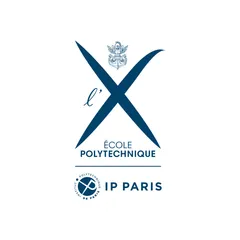
École polytechnique Logo Analysis
The École Polytechnique logo effectively conveys trust and academic authority, ensuring strong recognition and a premium perception in the education market.
Education · 6 points above the Education average of 81 (45 logos)
The verdict
This logo projects strong authority and trust, scoring exceptionally well across credibility metrics, which is vital for an academic institution. Its distinctive 'X' symbol ensures high recognition and memorability, solidifying its market positioning. To further enhance its impact, consider strategies to subtly increase emotional engagement without compromising its established professional foundation.
Score breakdown
How the École polytechnique logo scores across the analysis categories.
- Design91
- Psychology74
- Trust93
- Cognitive89
- Market82
- Typography90
- Color87
- Cultural95
Strengths and weak spots
What works
The logo's primary strengths lie in its strong sense of professional credibility and trust, driven by its classic blue color and clear, authoritative typography. Its high memorability and recognition speed are boosted by the distinctive 'X' symbol and symmetrical composition. The design also demonstrates excellent cultural sensitivity and global appeal, making it suitable for an international academic institution.
Where it could improve
While strong, the logo could enhance its emotional impact and storytelling potential, which are currently moderate. The visual complexity of the crest, while traditional, slightly increases cognitive load compared to the rest of the minimalist design. Additionally, while the overall design is timeless, a slight modernization of the crest's rendering could further boost its contemporary relevance without sacrificing heritage.
If this were your logo, we'd suggest
- Enhance Emotional Connection through Subtle Storytelling
- Streamline Crest Detail for Modern Appeal
- Introduce Dynamic Visual Elements for Excitement
- Optimize 'l'' Script for Readability at Small Scales
What the analysis found
Positioning
The logo's blend of traditional heraldry and modern typography, centered around the iconic 'X', positions École Polytechnique as a prestigious institution with a rich history and a forward-looking vision. Its deep blue color and clear design align perfectly with the values of excellence and innovation expected in the technology and education sectors, as indicated by CLIP analysis.
Trust
High trust scores are driven by the logo's deep blue color, which universally signifies reliability and professionalism, and its clear, authoritative sans-serif typography. The traditional crest further reinforces a sense of established credibility and heritage, fostering confidence in the institution's long-standing reputation and expertise.
Recognition
The highly symmetrical and distinctive 'X' symbol, combined with low cognitive load and high processing fluency, ensures rapid recognition and strong memorability. The clear visual hierarchy and effective use of negative space allow for quick identification, making the logo easily recallable across various contexts.
Emotion
While the logo excels in conveying trust and competence, its emotional impact is more subdued, leaning towards respect and admiration rather than strong emotional connection. The elegant and polished aesthetic, as identified by Kobayashi, evokes a sense of prestige, but there's an opportunity to introduce elements that could foster deeper emotional engagement and inspiration.
Design
The design demonstrates exceptional harmony and symmetry, with a clean, balanced composition that is aesthetically pleasing and easy to process. The monochromatic color scheme and clear figure-ground balance contribute to its visual coherence and scalability, ensuring it performs well across different media and sizes.
Brand personality
The logo's dominant personality is 'Competence', scoring very high due to its deep blue color, precise geometric forms, and clear, authoritative sans-serif typography. These elements convey reliability, intelligence, and success, aligning perfectly with an elite academic institution. 'Sophistication' is also present, reflected in the elegant script 'l'' and the overall polished aesthetic. 'Sincerity' is moderate, as the formality of the design slightly overshadows warmth. 'Excitement' and 'Ruggedness' are the lowest, as the design prioritizes gravitas and tradition over daring or outdoorsy qualities.
The logo strongly embodies 'The Sage' archetype through its emphasis on knowledge, intelligence, and wisdom. The traditional crest, the clear and authoritative typography, and the deep blue color all convey a sense of established expertise and a commitment to truth and understanding. The stylized 'X' can be seen as a symbol of precision and academic rigor, further reinforcing the Sage's pursuit of knowledge.
Color and typography
The deep blue color primarily evokes feelings of trust, stability, and professionalism. It creates a sense of calm and reliability, contributing to a serious and authoritative emotional tone. While strong in conveying competence, it is less likely to trigger high emotional arousal or excitement.
The bold sans-serif font perfectly matches the brand's personality of competence, professionalism, and modernity. It conveys clarity and authority, aligning with an institution of higher learning. The script 'l'' adds a touch of sophistication and tradition, creating a balanced personality that respects heritage while embracing contemporary values.
Explore the full École polytechnique scorecard
Every metric behind the 87/100 — attention prediction, color harmony, typography and more, in the interactive report.
More from the index


Independent analysis. Logo Analyzer is not affiliated with or endorsed by École polytechnique; all trademarks and logos belong to their respective owners. Scores and commentary reflect one AI model's assessment of the logo's design and are not an official ranking, endorsement, or measure of brand or commercial success.