Logo Score Index · #443 of 487
Lidl Logo Analysis
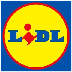
Lidl's logo delivers strong recognition and trust but its dated design and cultural insensitivity risk limiting emotional connection and global market reach.
Retail · 4 points below the Retail average of 79 (12 logos)
The verdict
The Lidl logo effectively projects a strong sense of competence and reliability, ensuring high recognition and trust among its customer base. However, its emotional engagement and cultural sensitivity lag, potentially limiting deeper brand loyalty and global market expansion. Strategic adjustments to color usage and subtle design elements could significantly enhance its appeal without compromising its established brand equity.
Score breakdown
How the Lidl logo scores across the analysis categories.
- Design90
- Psychology72
- Trust81
- Cognitive86
- Market63
- Typography88
- Color68
- Cultural62
Strengths and weak spots
What works
The logo's primary strengths lie in its high memorability due to its distinct color palette and stylized 'i', excellent scalability and adaptability across various media, and strong recognition speed. Its bold, clear design also contributes to a perception of reliability and value, aligning well with its retail context.
Where it could improve
Key areas for improvement include its WCAG contrast ratio, which currently fails accessibility standards, and its cultural sensitivity, as certain color combinations carry negative associations in specific regions. The logo could also enhance its emotional depth to foster stronger brand loyalty beyond functional benefits.
If this were your logo, we'd suggest
- Improve WCAG Color Contrast for Text
- Review Color Palette for Cultural Sensitivity
- Introduce Subtle Emotional Cues
- Optimize Stylized 'i' for Clarity
What the analysis found
Positioning
The logo's bold, primary colors and clear typography effectively position Lidl as an accessible, value-driven retailer. Its distinct visual identity helps it stand out in a crowded market, though the design language leans more towards established rather than modern trends, which could affect appeal to younger demographics.
Trust
The clear, sans-serif font and structured composition contribute to a perception of competence and reliability, fostering trust. However, the failure to meet WCAG contrast standards for text introduces a vulnerability, as it signals a lack of attention to inclusivity, potentially eroding trust among a segment of the audience.
Recognition
With its high contrast and unique stylized 'i', the logo boasts excellent recognition speed and memorability. The distinct color palette ensures it is easily identifiable, and the simple, bold forms reduce cognitive load, making it highly effective for quick brand recall in diverse environments.
Emotion
The vibrant primary colors evoke a sense of energy and optimism, contributing to a moderately positive emotional impact. However, the design's straightforwardness, while conveying value, lacks deeper emotional triggers or storytelling potential, which could limit the development of strong emotional bonds with consumers.
Design
The logo demonstrates strong design principles in terms of harmony, symmetry, and scalability, making it versatile across various applications. Its simple, geometric forms ensure clarity and balance, though the overall aesthetic could benefit from a refresh to align with contemporary design sensibilities while retaining its core identity.
Brand personality
The Lidl logo's dominant personality is 'Competence' (80/100), conveyed through its bold, clear sans-serif typography and structured, geometric composition. These elements signal reliability, efficiency, and success, aligning with a brand that delivers consistent value. 'Sincerity' (75/100) is also strong, stemming from the primary colors and straightforward design, suggesting honesty and approachability. 'Excitement' (65/100) is present due to the vibrant color palette and the dynamic red element in the 'i', adding a touch of energy. 'Sophistication' (20/100) and 'Ruggedness' (15/100) are low, as the design prioritizes mass appeal and value over luxury or outdoor themes.
The logo embodies 'The Everyman' archetype through its use of familiar, primary colors and a straightforward, no-frills design. The bold, legible typography and simple circular shape convey accessibility, reliability, and a sense of belonging, appealing to a broad audience seeking value and practicality without pretense.
Color and typography
The combination of bright yellow, deep blue, and vibrant red creates a strong and energetic emotional impact. Yellow evokes feelings of optimism and value, blue instills trust and reliability, and red adds a sense of urgency and excitement. This palette is designed to be attention-grabbing and memorable, conveying a dynamic yet dependable brand personality.
The bold, blocky sans-serif font is an excellent match for Lidl's brand personality. It conveys strength, reliability, and directness, aligning perfectly with a discount retailer that emphasizes value and efficiency. The clear, no-nonsense typography reinforces the brand's promise of straightforward, honest offerings.
Explore the full Lidl scorecard
Every metric behind the 75/100 — attention prediction, color harmony, typography and more, in the interactive report.
More from the index


Independent analysis. Logo Analyzer is not affiliated with or endorsed by Lidl; all trademarks and logos belong to their respective owners. Scores and commentary reflect one AI model's assessment of the logo's design and are not an official ranking, endorsement, or measure of brand or commercial success.