Logo Score Index · #461 of 487
Jack in the Box Logo Analysis
This logo delivers strong brand recognition and emotional appeal but faces accessibility challenges and could benefit from design modernization.
Food & Beverage · 6 points below the Food & Beverage average of 80 (25 logos)
The verdict
The Jack in the Box logo effectively leverages strong recognition mechanics and emotional appeal to connect with its target audience, scoring well in brand recall. However, its current design presents a notable risk in accessibility and could benefit from strategic refinements to elevate its premium perception and ensure long-term relevance in a competitive market. Addressing these design gaps will strengthen brand equity and broaden its appeal without compromising its playful core.
Score breakdown
How the Jack in the Box logo scores across the analysis categories.
- Design79
- Psychology69
- Trust76
- Cognitive81
- Market67
- Typography80
- Color75
- Cultural71
Strengths and weak spots
What works
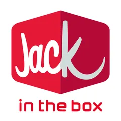
The logo's primary strength lies in its strong brand recognition and direct association with the brand name through the 'box' motif. The playful script and vibrant red colors create an energetic and memorable impression, aligning well with the fast-food industry's need for quick appeal. Its high overall symmetry and color harmony contribute to a visually pleasing and balanced design.
Where it could improve
Areas for improvement include the color contrast ratio, which fails WCAG AA standards, potentially impacting accessibility for some users. The visual complexity is moderate, which could be simplified for better scalability across very small applications. While the design is distinctive, its timelessness could be enhanced by refining some of the more trend-specific elements, and the premium perception is somewhat low.
If this were your logo, we'd suggest
- Improve Color Contrast for Accessibility
- Refine 'in the box' Typography
- Explore Simplified Box Geometry
- Boost Premium Perception with Subtle Refinements
What the analysis found
Positioning
The logo's playful script and literal 'box' imagery clearly position Jack in the Box as a fun, approachable, and slightly quirky fast-food option. The vibrant red aligns with the industry's energetic and appetite-stimulating conventions, ensuring it stands out in a crowded market. Its distinct visual elements help differentiate it from more generic competitors.
Trust
The logo conveys a moderate level of trust. The established brand name and familiar imagery contribute to a sense of reliability. However, the playful script, while engaging, might not project the highest level of corporate professionalism or premium quality, which could subtly impact trust for consumers seeking more sophisticated dining experiences.
Recognition
Recognition is a strong suit for this logo, driven by its unique 'box' shape and the distinctive 'Jack' script. The high saliency on the brand name ensures quick identification. The consistent use of vibrant red further aids in rapid brand recall, making it easily identifiable across various touchpoints.
Emotion
The logo successfully evokes emotions of excitement, fun, and perhaps a touch of nostalgia, aligning with 'The Jester' archetype. The warm red colors stimulate appetite and energy, while the playful typography and 'box' concept suggest a delightful surprise. This emotional resonance is key for a brand aiming to provide a cheerful and enjoyable experience.
Design
From a design perspective, the logo exhibits good harmony and symmetry, creating a balanced and aesthetically pleasing composition. The use of a 3D box adds depth and visual interest. However, the color contrast issues, particularly between the red shades and the light gray, represent a significant design flaw that impacts accessibility and overall visual clarity.
Brand personality
The Jack in the Box logo strongly aligns with the 'Excitement' personality dimension, scoring 80. This is driven by its vibrant red colors, dynamic 3D box shape, and the playful, spirited handwritten script for 'Jack'. These elements convey a sense of daring, imagination, and being up-to-date, characteristic of an exciting brand. 'Sincerity' scores 70, reflecting the approachable, friendly nature of the script and the wholesome 'box' concept. 'Competence' is moderate at 60, as the playful elements slightly overshadow a sense of strict reliability or success, though the clean sans-serif for 'in the box' adds a touch of clarity. 'Sophistication' is low at 30, as the design prioritizes fun over elegance. 'Ruggedness' is also low at 20, as there are no visual cues suggesting toughness or outdoorsiness.
The logo embodies 'The Jester' archetype through its playful, handwritten script for 'Jack' and the literal 'box' imagery, which evokes surprise and fun. The vibrant red colors contribute to a sense of energy and excitement, aligning with the Jester's desire to bring joy and lighten the mood. The slightly quirky and unconventional design suggests a brand that doesn't take itself too seriously, aiming to entertain and provide a good time, much like a Jester.
Color and typography
The vibrant red colors are highly effective in stimulating emotional responses, primarily excitement, energy, and appetite, which are crucial for a fast-food brand. Red is known to increase heart rate and create a sense of urgency. The lighter gray provides a neutral, clean backdrop that prevents the red from becoming overwhelming, allowing the energetic emotions to be perceived positively rather than aggressively.
The custom script font for 'Jack' perfectly matches the brand's playful and slightly quirky personality, aligning with 'The Jester' archetype. It conveys a friendly, personal, and energetic vibe. The clean sans-serif for 'in the box' provides a grounding, legible contrast that adds a touch of modern simplicity without detracting from the main playful element. This combination effectively balances fun with clarity.
Explore the full Jack in the Box scorecard
Every metric behind the 74/100 — attention prediction, color harmony, typography and more, in the interactive report.
More from the index


Independent analysis. Logo Analyzer is not affiliated with or endorsed by Jack in the Box; all trademarks and logos belong to their respective owners. Scores and commentary reflect one AI model's assessment of the logo's design and are not an official ranking, endorsement, or measure of brand or commercial success.