Logo Score Index · #458 of 487
GAZ Logo Analysis
This logo powerfully conveys heritage and competence but its dated aesthetic and accessibility flaws risk alienating modern audiences and limiting global reach.
Automotive · 9 points below the Automotive average of 83 (76 logos)
The verdict
Your current logo is a robust emblem of heritage and competence, scoring highly on professional credibility and industry fit, which are critical for an automotive brand. However, its high visual complexity and dated execution, coupled with significant WCAG contrast issues, create barriers to modern appeal and broad accessibility. To maintain market relevance and expand global reach, a strategic refresh is necessary to balance tradition with contemporary design principles.
Score breakdown
How the GAZ logo scores across the analysis categories.
- Design77
- Psychology60
- Trust75
- Market68
- Color88
- Cultural81
Strengths and weak spots
What works
The logo boasts a strong sense of heritage and authority, effectively conveying competence and ruggedness. Its distinctive imagery and classic emblem format contribute to high memorability and recognition speed. Furthermore, it demonstrates excellent colorblind accessibility, ensuring broad visual comprehension.
Where it could improve
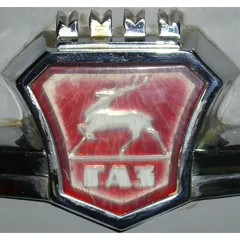
The logo suffers from poor WCAG color contrast in certain areas, limiting overall accessibility. Its high visual complexity and somewhat dated aesthetic could hinder appeal to modern, innovation-seeking demographics. The current weathered appearance, while adding character, might detract from a perception of pristine quality or cutting-edge technology.
If this were your logo, we'd suggest
- Improve Color Contrast for Accessibility
- Modernize Visual Execution
- Optimize for Small-Scale Applications
- Refine Color Palette for Global Markets
What the analysis found
Positioning
The logo's heraldic design, featuring a deer and crown within a shield, strongly positions GAZ as a brand with deep heritage, authority, and robust quality, aligning well with the automotive industry's emphasis on durability and established presence.
Trust
The formal, metallic emblem and classic motifs project a high degree of professional credibility and reliability, fostering trust through a perception of long-standing tradition and proven competence.
Recognition
The distinctive combination of a deer, shield, and crown, along with the unique Cyrillic text, ensures high memorability and recognition speed, making the brand easily identifiable in its market.
Emotion
The red color and majestic imagery evoke a sense of power, energy, and prestige, aiming to connect with consumers on an emotional level through feelings of pride and established quality.
Design
The logo exhibits strong perceptual harmony and high symmetry, creating a visually balanced and cohesive design. However, its high complexity and detailed textures pose challenges for scalability and modern aesthetic appeal.
Brand personality
The logo strongly embodies "The Ruler" archetype through its use of a crown, a heraldic shield, and a majestic animal (deer). These elements convey authority, prestige, control, and a sense of established quality and heritage. The metallic, robust design further reinforces a feeling of power and leadership, suggesting a brand that is dominant, responsible, and sets high standards.
Explore the full GAZ scorecard
Every metric behind the 74/100 — attention prediction, color harmony, typography and more, in the interactive report.
More from the index


Independent analysis. Logo Analyzer is not affiliated with or endorsed by GAZ; all trademarks and logos belong to their respective owners. Scores and commentary reflect one AI model's assessment of the logo's design and are not an official ranking, endorsement, or measure of brand or commercial success.