Logo Score Index · #162 of 487
FedEx Logo Analysis
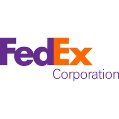
Iconic FedEx logo drives recognition and trust but risks alienating global markets with accessibility and cultural insensitivity.
Travel · 3 points above the Travel average of 81 (46 logos)
The verdict
The FedEx logo projects strong competence and trust, effectively communicating reliability and efficiency crucial for a global logistics leader. While its iconic design ensures high recognition and memorability, the brand faces a strategic challenge in cultural inclusivity and accessibility due to its color palette. Addressing these gaps is vital to sustain global market leadership and ensure universal brand acceptance.
Score breakdown
How the FedEx logo scores across the analysis categories.
- Design92
- Psychology83
- Trust92
- Cognitive95
- Market86
- Typography95
- Color59
- Cultural73
Strengths and weak spots
What works
The logo's primary strength lies in its iconic hidden arrow, which brilliantly communicates speed and efficiency, enhancing memorability and recognition. Its clean, professional aesthetic and strong typography instill trust and credibility, making it highly appropriate for the logistics industry. The design is also highly scalable and adaptable across various media, maintaining its impact from small icons to large vehicle branding.
Where it could improve
The logo's color contrast fails WCAG AA standards, posing accessibility challenges for users with visual impairments. The use of purple carries significant negative cultural associations in several regions, including mourning and death, which could limit global appeal and cultural inclusivity. While professional, the overall color palette and design could benefit from a slight refresh to enhance emotional warmth and excitement, aligning more with modern design trends without losing its core identity.
If this were your logo, we'd suggest
- Improve Color Contrast for Accessibility
- Conduct Targeted Cultural Research
- Explore Subtle Color Palette Refresh
- Refine 'Corporation' Typography
What the analysis found
Positioning
The logo's hidden arrow and clean, professional aesthetic perfectly position FedEx as a leader in efficient and reliable logistics. It clearly communicates speed and precision, aligning well with industry expectations and differentiating it through clever design rather than overt imagery.
Trust
The bold, geometric sans-serif typography and the established, professional color scheme of purple and orange contribute significantly to a high trust score. The logo conveys competence and reliability, essential for a brand handling critical deliveries, fostering confidence in its services from the first impression.
Recognition
The FedEx logo excels in recognition, largely due to its distinctive color block and the famous hidden arrow, which creates a memorable 'aha!' moment. This clever use of negative space, combined with high processing fluency, ensures rapid and lasting brand recall across diverse audiences.
Emotion
The logo evokes a sense of efficiency and reliability, with the orange adding a touch of energy and dynamism. However, the emotional impact is more on the side of competence and trust rather than warmth or excitement, which could be enhanced to foster deeper emotional connections with consumers.
Design
From a design perspective, the logo is a masterpiece of simplicity, harmony, and Gestalt principles. Its clean lines, balanced composition, and the ingenious hidden arrow demonstrate exceptional design quality, ensuring scalability and visual coherence across all brand touchpoints.
Brand personality
The FedEx logo's dominant personality is 'Competence' (95/100). This is driven by its clean, geometric sans-serif typography, which conveys reliability, intelligence, and success. The professional purple reinforces a sense of quality and trustworthiness, while the hidden arrow subtly communicates efficiency and precision. 'Excitement' (65/100) is also present, primarily due to the vibrant orange and the dynamic, forward-moving arrow, suggesting a spirited and up-to-date service. 'Sophistication' (50/100) is moderately present through the purple and minimalist design. 'Sincerity' (30/100) and 'Ruggedness' (20/100) are less prominent, as the logo prioritizes efficiency and professionalism over warmth or toughness.
The FedEx logo aligns strongly with 'The Sage' archetype, embodying wisdom, intelligence, and a commitment to understanding the world. The hidden arrow, a clever and insightful design element, speaks to problem-solving and finding efficient paths, reflecting the Sage's pursuit of knowledge and truth. The clean, professional aesthetic and emphasis on reliability further support this archetype, suggesting a brand that is dependable and provides clarity in complex logistics.
Color and typography
The combination of deep purple and vibrant orange creates a balanced emotional impact. The purple evokes feelings of reliability, quality, and a touch of sophistication, while the orange injects energy, enthusiasm, and a sense of urgency or dynamism. This blend aims to convey a service that is both trustworthy and efficient, though it leans more towards professional competence than overt warmth.
The bold, geometric sans-serif font perfectly matches FedEx's brand personality of efficiency, reliability, and modernity. It conveys professionalism and strength, aligning with a company that handles global logistics. The clean lines and clear legibility reinforce trust and competence, making it an ideal typographic choice for the brand.
Explore the full FedEx scorecard
Every metric behind the 84/100 — attention prediction, color harmony, typography and more, in the interactive report.
More from the index


Independent analysis. Logo Analyzer is not affiliated with or endorsed by FedEx; all trademarks and logos belong to their respective owners. Scores and commentary reflect one AI model's assessment of the logo's design and are not an official ranking, endorsement, or measure of brand or commercial success.