Logo Score Index · #67 of 487
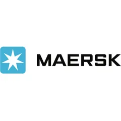
Maersk Logo Analysis
Maersk's logo commands trust and recognition but needs emotional depth to fully capture market loyalty and future relevance.
Travel · 6 points above the Travel average of 81 (46 logos)
The verdict
The Maersk logo projects exceptional authority and trust, scoring highly across credibility and recognition metrics, which is vital for a global logistics leader. However, its functional design, while efficient, could benefit from enhanced emotional engagement to deepen brand loyalty and storytelling. Strategic refinements could further solidify its market positioning and ensure long-term relevance.
Score breakdown
How the Maersk logo scores across the analysis categories.
- Design94
- Psychology76
- Trust93
- Cognitive85
- Market80
- Typography93
- Color87
- Cultural95
Strengths and weak spots
What works
The logo's primary strengths lie in its exceptional trust-building capacity, high memorability, and strong professional credibility. Its minimalist design ensures excellent scalability and adaptability across various platforms, while the clear visual language contributes to low cognitive load and high recognition speed. The cultural sensitivity of the blue color further enhances its global appeal.
Where it could improve
While strong in many areas, the logo could enhance its emotional impact and storytelling potential to foster deeper connections. The current design, while highly competent, leans towards being purely functional, potentially missing opportunities for more evocative brand narratives. Differentiation, while good, could be further strengthened to stand out in an increasingly competitive global market.
If this were your logo, we'd suggest
- Explore subtle dynamic elements for emotional engagement
- Conduct market research on differentiation perception
- Refine brand narrative to highlight human element
- Evaluate potential for secondary color accents
What the analysis found
Positioning
The logo's strong, geometric forms and blue color firmly position Maersk as a reliable and authoritative leader in global logistics. Its clean, minimalist aesthetic aligns with modern corporate trends, signaling efficiency and forward-thinking operations. The distinct star symbol aids in differentiating the brand within a competitive industry, reinforcing its global reach and guidance.
Trust
The deep blue color, universally associated with trust and stability, combined with the robust, sans-serif typography, instills high confidence. The symmetrical and balanced composition further contributes to a perception of reliability and professionalism, making a strong first impression of competence and dependability. This visual integrity is crucial for a brand handling complex and high-value global operations.
Recognition
The simple, distinct icon and bold wordmark ensure high recognition speed and memorability. The unique seven-pointed star within a rounded square creates a strong visual anchor that is easily recalled. The low cognitive load associated with its clean design allows for effortless processing, making the logo instantly identifiable across various touchpoints and cultures.
Emotion
While the logo evokes feelings of calm and security through its blue color and stable forms, its emotional impact is primarily functional rather than deeply resonant. It communicates competence and reliability effectively but has less capacity for inspiring awe or strong personal connection. This functional emotional response is appropriate for the industry but could be enhanced to foster greater brand affinity.
Design
The logo exhibits exceptional design quality, characterized by high harmony, symmetry, and scalability. Its minimalist approach ensures versatility across all media, from digital to physical assets. The effective use of negative space and strong figure-ground balance contributes to its visual clarity and aesthetic appeal, making it a robust and well-executed design.
Brand personality
The Maersk logo strongly embodies 'Competence' (90/100) through its clean, geometric design, bold sans-serif typography, and the universally trusted blue color. These elements convey reliability, intelligence, and success, crucial for a global logistics leader. 'Sincerity' (60/100) is present due to its straightforwardness and lack of pretense, but it's not the dominant trait. 'Excitement' (50/100) is moderate; while modern, it prioritizes stability over daring or imaginative flair. 'Sophistication' (40/100) is low, as the design is more about functional strength than luxury or charm. 'Ruggedness' (30/100) is also low, as its precision and cleanliness contrast with an outdoorsy or tough image. The logo's visual cues consistently reinforce a highly capable and dependable brand.
The Maersk logo embodies 'The Ruler' archetype through its strong, authoritative, and stable visual language. The bold, geometric shapes, clear typography, and consistent blue color convey control, leadership, and reliability. The star symbol, while also suggesting guidance, can be interpreted as a mark of distinction and authority, reinforcing Maersk's position as a dominant force in global logistics. It projects an image of a well-established, responsible, and powerful entity that brings order to complex global operations.
Color and typography
The blue color primarily evokes feelings of calm, trust, and security. It has a soothing effect, reducing perceived risk and fostering a sense of reliability. While it doesn't trigger intense emotional arousal, its consistent positive associations contribute to a stable and reassuring emotional experience for the viewer.
The bold, sans-serif font perfectly matches Maersk's brand personality, conveying strength, reliability, and modernity. It aligns with the 'Competence' archetype, projecting an image of a serious, capable, and trustworthy organization. The clean lines and clear legibility reinforce the brand's commitment to efficiency and straightforwardness.
Explore the full Maersk scorecard
Every metric behind the 87/100 — attention prediction, color harmony, typography and more, in the interactive report.
More from the index


Independent analysis. Logo Analyzer is not affiliated with or endorsed by Maersk; all trademarks and logos belong to their respective owners. Scores and commentary reflect one AI model's assessment of the logo's design and are not an official ranking, endorsement, or measure of brand or commercial success.