Logo Score Index · #467 of 487
ELBO Logo Analysis
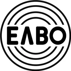
ELBO's logo signals robust competence and trust but lacks emotional vibrancy, risking market differentiation and deeper customer connection.
Automotive · 10 points below the Automotive average of 83 (76 logos)
The verdict
The ELBO logo projects strong authority and trust, scoring exceptionally well across credibility and design metrics, which is vital for the automotive sector. However, its emotional engagement and differentiation lag behind expectations, potentially limiting brand recall and loyalty in a competitive market. A strategic introduction of subtle color or dynamic elements could bridge this gap without compromising its professional foundation.
Score breakdown
How the ELBO logo scores across the analysis categories.
- Design88
- Psychology59
- Trust87
- Cognitive76
- Market64
- Typography88
- Color53
- Cultural76
Strengths and weak spots
What works
The logo's primary strengths lie in its strong sense of professionalism, trust, and scalability. Its highly symmetrical and geometric design conveys reliability and competence, making it suitable for a serious industry like automotive. The monochrome palette ensures excellent adaptability across various media, and its simplicity contributes to good memorability and recognition speed.
Where it could improve
Key areas for improvement include its low emotional impact and lack of differentiation, which could hinder brand loyalty and market appeal. The extremely low color contrast ratio between the two shades of black also presents a significant accessibility issue. Furthermore, the monochrome nature, while conveying seriousness, limits its ability to evoke excitement or warmth, potentially impacting broader demographic appeal.
If this were your logo, we'd suggest
- Improve Color Contrast for Accessibility
- Introduce a Secondary Accent Color
- Refine Typography for Modernity
- Develop a Dynamic Brand System
What the analysis found
Positioning
The logo's bold, geometric design and monochrome palette position ELBO as a serious, reliable, and authoritative player in the automotive industry. It aligns well with the sector's emphasis on engineering and performance, but its lack of unique color or dynamic elements means it struggles to differentiate itself from competitors who might use more expressive branding.
Trust
With its high symmetry, clear typography, and stable composition, the logo instills a strong sense of trust and professional credibility. The black color reinforces seriousness and authority, contributing to a very positive first impression regarding the brand's reliability and competence. This solid foundation of trust is a significant asset for ELBO.
Recognition
The logo's simplicity, strong figure-ground balance, and clear wordmark contribute to good recognition speed and memorability. The concentric circles provide a distinctive visual anchor. However, the diffuse attention pattern and lack of strong emotional triggers mean that while it's easily recognized, it might not be as deeply ingrained or emotionally resonant as more vibrant or unique designs.
Emotion
The monochrome palette and geometric shapes primarily evoke feelings of seriousness, strength, and professionalism, aligning with 'The Ruler' archetype. However, it scores low on emotional impact and arousal, as it lacks the warmth, excitement, or dynamism typically associated with strong emotional connections. This limits its storytelling potential and ability to create passionate brand advocates.
Design
The logo exhibits high design quality in terms of harmony, symmetry, and scalability. Its geometric precision and clear lines ensure it looks good at any size and across various applications. The effective use of negative space and strong Gestalt principles contribute to its visual coherence, making it a well-constructed and adaptable design.
Brand personality
The ELBO logo strongly aligns with the 'Competence' personality dimension, scoring 90. This is evident in its geometric precision, bold sans-serif typography, and monochrome palette, all of which convey reliability, intelligence, and success. The structured concentric circles reinforce a sense of order and efficiency. 'Sophistication' (70) is also present due to the minimalist black design. 'Sincerity' (40) and 'Excitement' (30) are low, as the design lacks warmth, playfulness, or vibrant energy. 'Ruggedness' (50) is moderate, as the bold, strong forms suggest durability, but it lacks the earthy or raw elements typically associated with this dimension.
The logo embodies 'The Ruler' archetype through its strong, authoritative, and stable visual language. The bold, uppercase typography and the structured concentric circles convey a sense of control, leadership, and established power. It suggests a brand that is dominant, responsible, and seeks to create order and stability, aligning with the Ruler's desire for control and excellence. The monochrome palette further reinforces this serious and commanding presence.
Color and typography
The monochrome black palette primarily evokes feelings of seriousness, authority, and sophistication. While it conveys strength and professionalism, it lacks the vibrancy or warmth to trigger strong positive emotional arousal like excitement, joy, or comfort. Its emotional impact is more about gravitas and reliability than passion or dynamism.
The bold, geometric sans-serif font perfectly matches the brand's implied personality of strength, reliability, and modernity. It conveys a no-nonsense, competent, and authoritative image, aligning well with the automotive industry's need for trust and precision. The stylized 'Λ' adds a subtle touch of uniqueness without compromising legibility or professionalism.
Explore the full ELBO scorecard
Every metric behind the 73/100 — attention prediction, color harmony, typography and more, in the interactive report.
More from the index


Independent analysis. Logo Analyzer is not affiliated with or endorsed by ELBO; all trademarks and logos belong to their respective owners. Scores and commentary reflect one AI model's assessment of the logo's design and are not an official ranking, endorsement, or measure of brand or commercial success.