neuroscience brandingbrain
Brain Science Branding Applied to Your Logo Design
Discover how brain science branding transforms your logo design to captivate audiences and drive mem...
Discover memory encoding branding tactics that make your logos unforgettable. Learn proven strategies to boost brand recall and customer loyalty today.
Discover memory encoding branding tactics that make your logos unforgettable. Learn proven strategies to boost brand recall and customer loyalty today.
A logo seen once and remembered forever sounds like a designer's fantasy. But some marks genuinely pull it off. The FedEx arrow, the Amazon smile, the Toblerone bear: these aren't accidents. They work because they align with how your brain actually encodes and stores visual information. Memory encoding branding is the practice of designing logos that exploit these cognitive processes, and it's far more systematic than most designers realize.
The human brain processes a logo through three stages: sensory registration, short-term encoding, and long-term consolidation. Most logos never make it past stage one. They register as visual noise, get briefly held in working memory, and vanish within seconds.
Here's what's interesting: research on visual memory shows that people can recognize thousands of images with remarkable accuracy, but only when those images contain distinctive, meaningful features Brady et al., 2008. A generic swoosh or abstract globe doesn't qualify. Your brain treats it like wallpaper.
For a logo to reach long-term storage, it needs what neuroscientists call elaborative encoding, the process of connecting new information to existing knowledge structures. A logo that looks like a letter and an object simultaneously (think the Spartan Golf Club logo, where a golfer's swing forms a Spartan helmet profile) forces the brain to process it on multiple levels. That dual processing creates stronger memory traces.
The practical takeaway? Stop designing logos that require a brand guidelines PDF to explain. If the mark doesn't trigger a "wait, I see it" moment on its own, you're relying on repetition alone to build recall. Repetition works, but it's expensive. Clever encoding is free.
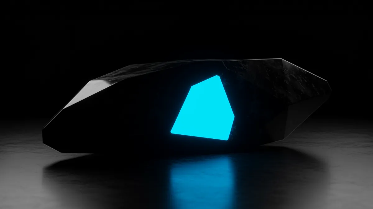
Negative space logo design is one of the most powerful clever logo design techniques precisely because of how the brain handles ambiguity. When you spot the hidden arrow in the FedEx logo, your brain releases a small hit of dopamine, the same neurotransmitter involved in reward and memory formation Kang et al., 2009. You solved a puzzle. That feels good. And your brain tags that experience as worth remembering.
Negative space branding works because it creates what psychologists call a "generation effect." Information you actively generate or discover yourself is remembered better than information passively received Slamecka & Graf, 1978. When a viewer discovers the hidden bear in the Toblerone mountain, they didn't just see it. They found it. That distinction matters enormously for logo memorability science.
But here's the catch: the hidden element can't be too hidden. If nobody notices the arrow without being told, you've designed a clever illustration, not an effective logo. The sweet spot is a discovery that happens within 2-3 seconds of focused attention. Quick enough to feel rewarding, subtle enough to feel earned.
Some practical guidelines for negative space execution:
Encoding gets a logo into short-term memory. Memory consolidation branding is what moves it into permanent storage. This process happens primarily during sleep, when the hippocampus replays recent experiences and transfers them to the neocortex for long-term retention Stickgold, 2005. You can't control when your audience sleeps, obviously. But you can control what their brain has to work with during consolidation.
The key factor is consistency across touchpoints. Every time someone encounters your logo in a slightly different form (different colors, altered proportions, inconsistent spacing), the brain treats it as a partially new stimulus. That fragmentation weakens consolidation. Research on perceptual learning confirms that consistent repetition of identical stimuli strengthens neural representations far more effectively than varied exposure to similar-but-different stimuli Karni & Sagi, 1993.
Think about it this way: if your logo appears one way on your website, slightly cropped on social media, and recolored on merchandise, you're not building one strong memory trace. You're building three weak ones. This is why eye-tracking research consistently shows that brands with strict visual standards outperform those with loose ones on recall tests.
One thing designers overlook: consolidation also depends on emotional context. A logo encountered during a positive brand experience (great customer service, a satisfying unboxing, a funny ad) gets tagged with positive emotional markers that boost retrieval later. Your logo isn't just a visual asset. It's a memory anchor.
Dual coding theory Paivio, 1986 argues that the brain stores verbal and visual information in separate but interconnected systems. Logos that activate both systems simultaneously get encoded twice, creating redundant memory pathways that dramatically improve recall.
This is why some of the most memorable logos in history are visual-verbal hybrids. The Baskin-Robbins logo hides "31" (their flavor count) inside the B and R. The Goodwill logo uses a stylized "g" that doubles as a smiling face. These marks give the brain two retrieval routes: you can recall the image, the word, or both.
Pure abstract marks (think the Chase Bank octagon or the Airbnb Bélo) can absolutely become memorable, but they require vastly more exposure to reach the same level of recall. They're encoding through only one channel. For startups and smaller brands without massive media budgets, dual-coded logos offer a significant efficiency advantage.
Worth noting: dual coding doesn't mean cramming text into an icon. It means designing a single element that functions as both image and language simultaneously. The letterform is the picture. When you compare logos that achieve this versus those that don't, the recall difference is striking.
Your brain is a prediction machine. It constantly anticipates what comes next based on stored patterns, or schemas. When a prediction is violated, attention spikes and encoding deepens Greve et al., 2017. This is why unexpected logos stick.
Consider the Beats by Dre logo. It's a lowercase "b" inside a circle. Simple enough. But the circle reads as a human head wearing headphones, with the "b" forming the ear cup. The moment you see it, your schema for "letter" collides with your schema for "person wearing headphones." That collision generates surprise, and surprise is rocket fuel for memory.
Schema disruption doesn't require complexity. Sometimes the simplest deviation works best. A logo for a yoga studio that uses sharp, angular typography disrupts your expectation of soft, rounded forms. A children's brand using a sophisticated serif wordmark breaks the pattern of playful, bubbly fonts. These small violations make the brain pay attention.
The risk, of course, is going too far. If the disruption feels random or confusing rather than clever, it backfires. The best schema violations feel inevitable in hindsight, like a joke with a perfect punchline. You didn't see it coming, but once you do, it makes complete sense.
For brands considering whether their current mark hits this threshold, a neuroscience-backed analysis can quantify how much cognitive surprise your logo actually generates.
All of these encoding principles are useless if you don't test them with real people. I've seen designers fall in love with a hidden-element concept that nobody outside the studio ever notices. Testing doesn't have to be elaborate.
A simple protocol that works:
These tests don't require a neuroscience lab. You can run them with a dozen colleagues, friends, or target customers. The data you get, even from small samples, will be more valuable than any design committee's subjective opinion.
If you want a more rigorous evaluation, our logo analysis platform applies cognitive science metrics to score memorability, distinctiveness, and encoding potential.
A single meaningful exposure can create a memory trace, but reliable long-term encoding typically requires 5-7 exposures over separate sessions. Logos designed with dual coding or negative space techniques need fewer exposures because each encounter generates deeper processing. Sleep between exposures is essential for consolidation.
Yes. Sometimes small refinements, like adjusting negative space to create a subtle hidden element, or modifying a letterform to suggest a secondary image, significantly boost encoding. Before committing to changes, run a logo evaluation to identify specific weaknesses in your current mark's memorability profile.
Absolutely. Color adds an additional encoding dimension, which is why full-color logos are generally recalled faster than monochrome versions. But the psychology of color matters too: unexpected color choices (a green financial brand, a pink construction company) create schema disruption that deepens encoding.
Not always. The relationship is curvilinear. Extremely simple logos (a plain circle) lack distinctive features for encoding. Extremely complex logos overwhelm working memory. The sweet spot is moderate complexity: simple enough to process in under two seconds, complex enough to contain a distinctive or surprising feature.
Your logo is either working with the brain's memory systems or against them. There's no neutral ground. If you're curious where your current mark falls on the encoding spectrum, analyze your logo with our neuroscience-driven platform and get a detailed memorability score in minutes.
Discover how brain science branding transforms your logo design to captivate audiences and drive mem...
Discover powerful subliminal branding techniques to embed into your logo design. Learn how hidden me...
Discover emotional branding techniques that transform your logo into a powerful brand asset. Learn h...
Get a free scientific analysis with 550+ metrics across perception and design.
Try Free Analysis