
neuroscience brandinglogo
Logo Recognition Peripheral Vision and How to Design for It
Learn how logo recognition peripheral vision works and discover design strategies that make your bra...
Discover how familiar logo shapes communicate brand identity effectively. Learn proven design principles to create memorable logos that resonate with your au...
Discover how familiar logo shapes communicate brand identity effectively. Learn proven design principles to create memorable logos that resonate with your au...
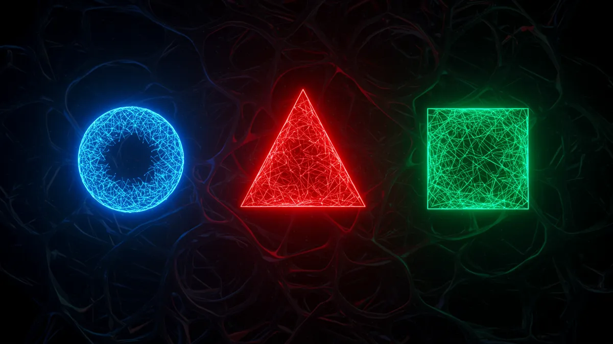
A circle, a triangle, a simple square. These are the shapes your brain processed before you could read, speak, or tie your shoes. And that early wiring is exactly why familiar logo shapes hold so much power in brand design. Designers often chase novelty, but the most memorable logos tend to lean on geometric forms your visual cortex already knows how to handle. The trick isn't choosing between familiar and original. It's knowing how to make the familiar feel fresh.
The human visual system is biased toward recognition. When you encounter a shape you've seen thousands of times before, your brain skips the costly process of decoding it from scratch and jumps straight to categorization. Neuroscientists call this processing fluency, and it directly affects how much you trust and like what you're looking at Reber, Schwarz & Winkielman, 2004.
Here's what's interesting: this preference isn't just aesthetic. Shapes processed fluently trigger a mild positive emotional response. Your brain essentially rewards itself for recognizing something quickly. That tiny neurochemical pat on the back? It gets associated with whatever brand is attached to the shape.
Think about the logos you remember most easily. Apple's circle-adjacent silhouette. Target's concentric rings. Microsoft's four squares. None of these shapes are complex. They work because your brain doesn't have to labor over them.
This matters for designers making strategic choices. A logo analysis can reveal whether your mark's geometry aligns with high-fluency shapes or forces viewers into unnecessary cognitive work. The goal isn't to be simple for simplicity's sake. It's to be simple in a way that feels inevitable.
Not all shapes are remembered equally. Research on logo memorability science shows that logos built on primary geometric forms (circles, squares, triangles) are recalled more accurately after brief exposure than logos with irregular or abstract contours Machado et al., 2015.
Why? It comes down to how memory works. During memory consolidation branding researchers study closely, the hippocampus encodes new visual information by connecting it to existing mental templates. Familiar shapes provide ready-made scaffolding. Your brain doesn't need to build a new category; it files the logo into one that already exists.
But there's a catch. Pure geometry, without any distinguishing feature, becomes generic. A plain circle is forgettable precisely because it matches too many existing memories. The sweet spot sits between recognition and distinction.
Consider Mastercard. Two overlapping circles. The geometry is elementary, yet the overlap creates something specific enough to own. Or look at how Airbnb's logo uses a rounded, organic form that echoes a heart, a location pin, and the letter "A" simultaneously. The base shape is familiar. The interpretation is layered. That layering is what makes it stick. For a deeper look at how the brain processes these visual structures, explore pattern recognition branding applied to your logo strategy.
Negative space logo design is one of the most effective clever logo design techniques because it exploits your brain's compulsion to complete incomplete information. Gestalt psychology calls this "closure," and it turns passive viewers into active participants.
The FedEx arrow is the textbook example. You don't consciously notice the arrow between the "E" and "x" on first glance. But your subconscious registers it, and that hidden discovery creates a small dopamine hit. The logo becomes more memorable because your brain did work to find it.
Negative space branding works especially well with familiar shapes because the viewer needs a recognizable form to "complete." If the implied shape is too abstract, the closure effect fails. People just see a gap, not a hidden message.
Some practical guidelines:
I've seen designers spend weeks engineering a negative space concept that nobody notices without a red circle drawn around it. That's not clever. That's self-indulgent. The best negative space designs feel like an "aha" moment, not a puzzle that needs solving. To understand what viewers actually notice first, eye-tracking research offers some surprising answers.
Relying too heavily on familiar logo shapes creates a real risk: blending in. Scroll through the logos of any single industry, say fintech or health tech, and you'll see the same circles, shields, and swooshes repeated endlessly. Familiarity becomes camouflage.
Research on "typicality" in branding confirms this tension. Logos that look too typical for their category score high on trust but low on distinctiveness Loken & Ward, 1990. Logos that break category norms score high on attention but can feel untrustworthy. Neither extreme serves a brand well.
So what should you actually do? Start with a familiar base shape, then introduce one element of surprise. That surprise could be:
The logo symmetry psychology applied to your next redesign guide covers how controlled asymmetry can make a balanced mark feel more dynamic without sacrificing trust.
Quick reality check: if your logo could be swapped with a competitor's and nobody would notice, familiarity has stopped working for you. That's one of the clearest signs your logo needs a refresh.
A circle doesn't mean the same thing everywhere. In Western markets, circles tend to communicate community, unity, and warmth. In some East Asian design traditions, circular forms carry connotations of cyclicality and harmony that run even deeper.
Triangles pointing upward suggest ambition and growth in many cultures, but inverted triangles can signal instability or, in certain contexts, femininity. Squares read as stability and reliability almost universally, which explains their dominance in financial and enterprise branding.
These associations aren't random. They're learned through decades of cultural exposure, which means they're both powerful and potentially misleading if you're designing for a global audience.
One thing designers overlook: the meaning of a shape shifts depending on what surrounds it. A triangle inside a circle feels protective and contained. A triangle standing alone feels aggressive. Context modifies everything. Before committing to a shape language for a global brand, running a neuroscience-backed analysis can help you identify how different audiences might interpret your geometry.
The most durable logos aren't the trendiest ones. They're the ones built on shapes that transcend any particular design era. Think about how the Nike swoosh, essentially a modified checkmark, has survived decades without a redesign. The shape is familiar enough to process instantly and distinctive enough to own.
Your shape strategy should answer three questions:
I've worked with brands that overthink this process, layering meaning upon meaning into a single mark until it collapses under its own weight. The strongest logos carry one clear geometric idea executed with precision. Everything else is ornamentation.
Understanding symmetrical logos and how they wire brand memory can give you a scientific foundation for making these structural decisions with confidence rather than gut instinct.
Circles, squares, and triangles dominate logo design because they're processed fastest by the human visual system. Circles suggest community and inclusiveness, squares communicate stability, and triangles imply direction or growth. Most iconic logos use one of these as a foundation, then add a unique element to stand apart.
Yes. When a logo relies on a basic shape without any distinguishing characteristic, it becomes generic and legally difficult to trademark. The goal is familiar geometry plus one memorable twist, whether that's a color choice, negative space element, or unexpected proportion.
Negative space engages your brain's pattern-completion instinct, turning you from a passive viewer into an active participant. That cognitive engagement creates stronger memory encoding. The key is keeping the hidden element simple enough that viewers discover it naturally without needing it explained.
Not necessarily, but build your core mark on timeless geometry. Trendy elements like gradients or dimensional effects can be applied as stylistic layers that evolve over time, while the underlying shape remains constant. This gives you flexibility without requiring a full redesign every few years.
Your logo's shape is doing more cognitive work than any color, font, or tagline ever will. If you're unsure whether your current mark is hitting the right balance between familiar and distinctive, analyze your logo with our neuroscience-backed platform. You might discover that a small geometric adjustment could dramatically improve how your brand is processed, remembered, and trusted.
Learn how logo recognition peripheral vision works and discover design strategies that make your bra...

Master font psychology logo design to create powerful brand identities. Learn how typeface choices i...
Discover how logo font impact shapes brand recall and customer perception. Learn proven strategies t...
Get a free scientific analysis with 550+ metrics across perception and design.
Try Free Analysis