neuroscience brandingcross-cultural
Cross-Cultural Logo Design That Resonates Globally
Learn how cross-cultural logo design creates global brand impact. Discover strategies to design logo...
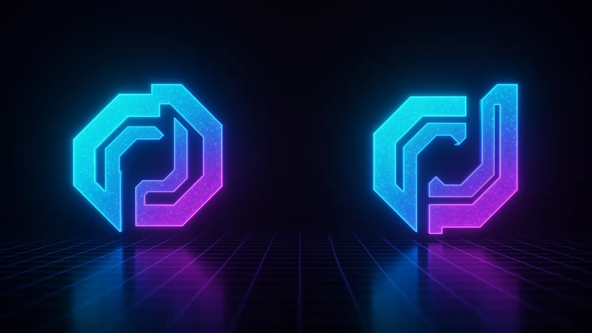
Discover how symmetry in logo design creates memorable brands that stick with customers. Learn proven techniques to boost recognition and impact today.
Discover how symmetry in logo design creates memorable brands that stick with customers. Learn proven techniques to boost recognition and impact today.
A perfectly balanced logo feels right before you can explain why. That gut reaction isn't random; it's your brain recognizing a pattern it has evolved to prefer over millions of years. Symmetry in logo design taps into one of the deepest visual processing shortcuts humans possess, and brands that understand this create marks that stick in memory with remarkable efficiency.
But here's the catch: symmetry isn't just about making both sides match. The neuroscience behind it reveals something far more nuanced, and far more useful for designers willing to think beyond the mirror line.
The human visual system processes symmetric shapes roughly 20% faster than asymmetric ones Wagemans, 1997. This speed advantage exists because your brain can encode a symmetric object by storing only half the information, then reconstructing the rest. Less cognitive effort means faster recognition, which means stronger recall.
Think about it this way: when you see the Target bullseye or the Volkswagen emblem, your brain doesn't need to work hard. It grabs half the shape, mirrors it internally, and moves on. That processing fluency creates a subtle feeling of pleasure. Psychologists call this the fluency heuristic, and it directly influences how much people trust and prefer a brand Reber, Schwarz & Winkielman, 2004.
This matters enormously for logo memorability science. A logo that's easy to process gets encoded more deeply during memory consolidation branding research shows happens during sleep and rest periods. The simpler the initial encoding, the more stable the long-term memory trace.
One thing designers overlook: this doesn't mean every logo must be perfectly bilateral. The preference for symmetry operates on a spectrum. Even approximate symmetry, where the overall structure feels balanced without being a perfect mirror, triggers faster processing than chaotic arrangements. Your goal isn't geometric perfection. It's perceptual ease.
Not all symmetry is created equal, and choosing the right type is one of the most underrated clever logo design techniques available to designers.
Reflective (bilateral) symmetry is the most common. Draw a vertical line down the center, and both sides match. Think Chanel, McDonald's, or Airbnb. This type feels stable and authoritative. It signals establishment and reliability, which is why financial institutions and luxury brands gravitate toward it.
Rotational symmetry creates energy. The shape looks the same after being rotated by a certain angle. The Mercedes-Benz star, the recycling symbol, and the Isle of Man triskelion all use this. Rotational symmetry suggests movement and dynamism without sacrificing balance.
Translational symmetry involves repeating elements along an axis. It's less common in logos but shows up in patterns and wordmarks where letterforms create rhythm.
Here's what's interesting: eye-tracking research shows that viewers fixate on the center of reflective logos almost immediately, while rotational logos generate a brief circular scanning pattern before the brain "clicks" the pattern into place. Both resolve quickly, but they create subtly different first impressions. A logo analysis can help you determine which type best serves your brand's personality.
I've seen designers treat symmetry as an absolute rule. That's a mistake. Some of the most memorable logos in history succeed precisely because they introduce controlled asymmetry into an otherwise balanced structure.
The Nike Swoosh is entirely asymmetric. So is the Apple logo with its missing bite. And Twitter's old bird (now X) leaned slightly forward. These marks work because they create visual tension, a small surprise that forces your brain to pay extra attention.
Research on the Von Restorff effect (also called the isolation effect) explains why: items that deviate from a pattern are remembered better than items that conform Hunt, 1995. So a logo that is mostly symmetric but contains one deliberate break can actually outperform a perfectly balanced design in recall tests.
The key word is "deliberate." Random asymmetry reads as sloppy. Strategic asymmetry, like a single element that breaks the mirror line, reads as intentional and confident. This tension between expectation and surprise is where negative space logo design often shines. The FedEx arrow, hidden in the asymmetric gap between the E and x, works because it rewards closer inspection within a mostly balanced wordmark.
Quick reality check: if you're considering breaking symmetry, make sure the overall composition still feels visually weighted. Balance and symmetry aren't the same thing. You can have one without the other.
Negative space branding becomes exponentially more effective when paired with symmetric structures. The reason is cognitive: symmetry tells your brain "this is a pattern, pay attention to the whole shape," which makes you more likely to notice hidden forms within the negative space.
Consider the World Wildlife Fund panda. The mark uses approximate bilateral symmetry in the panda's face, which draws your eye to the center and helps you read the black-and-white interplay as a unified animal rather than abstract blobs. Without that symmetric scaffolding, the negative space trick would be much harder to parse.
Designers working with negative space should use symmetry as the container that guides perception. A symmetric outer form creates the expectation of completeness, and the negative space element then delivers the "aha" moment. This combination produces what neuroscientists call a reward prediction error, a small dopamine hit that occurs when reality pleasantly surprises you Schultz, 2016.
That dopamine response? It directly strengthens memory encoding. So logos that combine symmetric structure with negative space surprises don't just look clever. They're neurologically optimized for recall. You can explore our methodology to see how we measure these perceptual dynamics.
Knowing the science is one thing. Applying it under deadline pressure with a client breathing down your neck is another. Here are principles I keep coming back to.
Start symmetric, then subtract. Build your initial concept on a symmetric grid. Once the foundation feels solid, look for one element you can shift, remove, or hide. This gives you the best of both worlds: processing fluency plus memorability through surprise.
Test at small sizes first. Symmetry's processing advantage matters most at small scales, favicons, app icons, social avatars, where the brain has limited information to work with. If your symmetric logo still reads clearly at 16x16 pixels, you've built something resilient.
Match symmetry type to brand personality:
Don't forget the wordmark. Symmetry in the icon means little if the accompanying typography creates visual chaos. Aim for consistent letter spacing and x-height alignment so the full lockup feels cohesive. This is where building trust through visual identity starts, in the details most people never consciously notice but always feel.
And if you're unsure whether your current mark hits the right balance, a logo analysis can quantify what your eyes might miss.
The real payoff of symmetric logo design doesn't show up in the first impression. It shows up six months later, when a consumer spots your mark on a shelf and feels instant recognition without knowing why.
Research on memory consolidation branding professionals should understand reveals that simpler visual encodings are more resistant to decay over time Wixted, 2004. Because symmetric logos require less information to store, they maintain their fidelity in long-term memory better than complex, asymmetric alternatives.
This is where it gets tricky. Many brands chase distinctiveness by adding complexity: gradients, intricate illustrations, multiple interlocking shapes. But complexity and distinctiveness aren't synonyms. A simple symmetric mark with one surprising element (a hidden arrow, an unexpected color break, a subtle negative space figure) can be both easy to remember and impossible to confuse with competitors.
Starbucks understood this when they simplified their logo in 2011, stripping away the outer ring and text to leave just the symmetric siren. The mark became easier to encode, easier to recall, and more versatile across digital touchpoints. Sometimes the most powerful design move is removal.
No. Asymmetric logos like the Nike Swoosh prove that distinctiveness and emotional resonance can override symmetry's processing advantage. But symmetric logos do have a measurable head start in speed of recognition and ease of encoding, especially at small sizes.
Rotational symmetry tends to work well for tech brands because it implies movement and innovation. Think of how Google Chrome's icon uses rotational balance. But the right choice depends on your brand values, not just your industry.
Absolutely. Perfect bilateral symmetry without any distinguishing feature can feel generic and forgettable. The most effective approach combines a symmetric foundation with one element of controlled surprise, whether through negative space, color, or a subtle structural break.
Show your logo to people for three seconds, then ask them to draw it from memory. Symmetric logos with clear structure get reproduced more accurately. You can also try the demo for a neuroscience-backed assessment of your mark's visual balance.
Your logo's symmetry isn't just an aesthetic choice. It's a cognitive strategy that shapes how quickly people recognize your brand, how deeply they encode it, and how accurately they recall it months later. Want to know how your current mark measures up? Analyze your logo with our neuroscience-backed platform and get a detailed breakdown of its visual balance, memorability potential, and perceptual strengths.
Learn how cross-cultural logo design creates global brand impact. Discover strategies to design logo...
Learn how logo design attention strategies rooted in brain science capture viewers instantly. Discov...
Discover how logo symmetry psychology influences brand perception. Learn proven design principles to...
Get a free scientific analysis with 550+ metrics across perception and design.
Try Free Analysis