Logo Score Index · #376 of 487
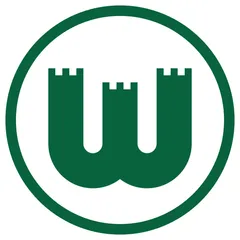
VfL Wolfsburg Logo Analysis
VfL Wolfsburg's logo projects unwavering strength and heritage, yet its conservative design may limit broader emotional appeal.
Sports · 3 points below the Sports average of 82 (3 logos)
The verdict
The VfL Wolfsburg logo effectively communicates a strong, reliable, and heritage-rich brand identity, scoring highly in trust and recognition. However, its somewhat conservative aesthetic and limited emotional range could hinder deeper engagement with diverse fan bases and modern market trends. Strategic updates could enhance emotional connection without compromising its established credibility.
Score breakdown
How the VfL Wolfsburg logo scores across the analysis categories.
- Design90
- Psychology73
- Trust87
- Cognitive84
- Market73
- Typography85
- Color58
- Cultural81
Strengths and weak spots
What works
The logo's primary strengths lie in its strong brand-context alignment, leveraging the city's heritage with the castle-like 'W'. Its high memorability and recognition speed are driven by a simple, symmetrical, and distinctive design. The deep green color and solid shapes instill a high degree of trust and professionalism, contributing to a strong sense of reliability and tradition.
Where it could improve
Areas for improvement include enhancing emotional impact beyond stability, as the current design leans towards seriousness rather than excitement. The conservative aesthetic could limit broader appeal to younger demographics and in international markets. Additionally, while colorblind accessible, the internal color contrast is poor, and the overall design could benefit from subtle dynamic elements to convey more energy.
If this were your logo, we'd suggest
- Introduce dynamic visual elements to enhance emotional appeal
- Explore a secondary color palette for versatility
- Optimize internal color contrast for enhanced accessibility
- Refine the 'W' to subtly convey movement or speed
What the analysis found
Positioning
The logo clearly positions VfL Wolfsburg as a strong, traditional club rooted in its city's identity, leveraging the castle motif. Its classic design, however, might not convey the dynamism often associated with top-tier sports, potentially limiting its appeal to younger, more trend-conscious demographics.
Trust
The solid, symmetrical design and deep green color instill a high degree of trust and professionalism. The clear, unambiguous symbolism of a fortress conveys reliability and an established presence, reinforcing the club's credibility and long-standing reputation.
Recognition
The simple, bold 'W' within a circle, combined with a distinctive green, ensures high recognition speed and memorability. Its strong figure-ground balance and clear visual hierarchy make it easily identifiable across various applications, contributing to strong brand recall.
Emotion
While conveying strength and stability, the logo's emotional impact is somewhat muted, leaning towards seriousness rather than excitement or passion. The deep green evokes calm and nature, but the rigid castle structure limits the expression of dynamic energy or joy often associated with sports.
Design
The design exhibits excellent harmony and symmetry, with a simple, scalable vector graphic. The effective use of negative space and strong Gestalt principles contribute to its visual coherence and adaptability across different media, making it a robust design foundation.
Brand personality
The logo's dominant personality is 'Competence' (85), driven by its solid, symmetrical structure, clear symbolism of a fortress, and the deep, stable green color. These elements convey reliability, success, and intelligence. 'Sincerity' (35) and 'Excitement' (30) are low, as the design is not particularly cheerful, imaginative, or daring. 'Sophistication' (55) is moderate due to its clean lines and classic feel, but it lacks overt luxury. 'Ruggedness' (60) is also moderate, as the castle implies strength and resilience, but not a raw, outdoorsy toughness.
The logo strongly embodies 'The Ruler' archetype through its castle/fortress imagery, which symbolizes power, control, and established authority. The solid, symmetrical design and deep green color reinforce a sense of stability, tradition, and leadership. It projects an image of a well-established, dominant entity that values order and heritage, aligning perfectly with a sports club aiming for consistent success and a strong presence.
Color and typography
The deep green color primarily evokes feelings of stability, tradition, and reliability. It has a calming effect, associated with nature and growth, which can foster a sense of trust and security. However, its intensity and the lack of complementary vibrant colors mean it has a moderate emotional arousal, leaning more towards seriousness than excitement or passion.
While not a traditional font, the blocky, architectural style of the 'W' logomark aligns well with the brand's personality. It conveys strength, solidity, and a no-nonsense attitude, matching the 'Ruler' archetype and the competence expected of a professional sports organization. The robust form suggests reliability and an established presence.
Explore the full VfL Wolfsburg scorecard
Every metric behind the 79/100 — attention prediction, color harmony, typography and more, in the interactive report.
More from the index


Independent analysis. Logo Analyzer is not affiliated with or endorsed by VfL Wolfsburg; all trademarks and logos belong to their respective owners. Scores and commentary reflect one AI model's assessment of the logo's design and are not an official ranking, endorsement, or measure of brand or commercial success.