Logo Score Index · #317 of 487
Vauxhall Logo Analysis
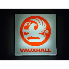
Vauxhall's iconic griffin logo commands recognition and trust but its overall color scheme risks cultural missteps and accessibility failures.
Automotive · 2 points below the Automotive average of 83 (76 logos)
The verdict
The Vauxhall logo effectively projects a strong image of competence and reliability, securing high trust and recognition in the automotive market. However, its overall color scheme, particularly in the broader image context, presents cultural sensitivities and accessibility challenges that could limit global expansion and user inclusivity. Strategic adjustments to the color palette are recommended to maintain its core strengths while broadening its appeal and compliance.
Score breakdown
How the Vauxhall logo scores across the analysis categories.
- Design84
- Psychology79
- Trust86
- Cognitive88
- Market80
- Typography90
- Color67
- Cultural77
Strengths and weak spots
What works
The logo's primary strengths lie in its strong brand recognition through the unique griffin emblem, its clear communication of competence and reliability, and its excellent readability. It also demonstrates high colorblind accessibility and strong figure-ground balance, ensuring broad visual clarity.
Where it could improve
The overall image's color contrast fails WCAG standards, potentially impacting accessibility for some users. The color palette, when considering the full image context, has some negative cultural associations in specific regions. While strong in competence, the logo could enhance emotional warmth or excitement to broaden appeal.
If this were your logo, we'd suggest
- Improve Overall Color Contrast for WCAG Compliance
- Evaluate Cultural Color Impact in Target Markets
- Introduce Warmer Tones for Emotional Engagement
- Refine Brand Messaging to Leverage Storytelling Potential
What the analysis found
Positioning
The logo's unique griffin emblem and clear, bold typography position Vauxhall as a strong, reliable, and distinctive player in the automotive industry. Its classic yet powerful aesthetic helps it stand out from more generic designs, reinforcing its established presence and heritage.
Trust
The heraldic nature of the griffin and the robust, legible sans-serif font instill a high degree of trust and professional credibility. This visual language suggests a brand that is dependable, competent, and has a strong foundation, which is critical for consumer confidence in the automotive sector.
Recognition
With its highly distinctive griffin symbol and clear brand name, the logo achieves excellent recognition speed and memorability. The high contrast and central focus points, as indicated by eye-tracking, ensure that the key brand identifiers are quickly processed and retained by the viewer.
Emotion
The powerful griffin evokes emotions of strength, protection, and energy, aligning with the Hero archetype. While the bright orange adds excitement, the overall image's darker tones contribute to a more stern and authoritative emotional impact, which might limit broader emotional warmth or approachability.
Design
The logo exhibits strong design quality with high harmony, symmetry, and effective figure-ground balance. The iconic griffin is scalable and adaptable, maintaining its impact across various applications. However, the overall image's color contrast falls short of WCAG accessibility standards.
Brand personality
The Vauxhall logo's dominant personality is Competence (85), driven by its clear, strong design, heraldic griffin emblem, and bold, legible typography, all of which convey reliability, success, and intelligence. Ruggedness (75) is also prominent, with the powerful griffin symbolizing durability and toughness, fitting for an automotive brand. Excitement (65) is present due to the bright orange and dynamic griffin, suggesting energy, but it's tempered by the classic design. Sophistication (60) is moderate, stemming from the established, clean aesthetic. Sincerity (40) is the lowest, as the logo prioritizes strength and capability over warmth or cheerfulness.
The Vauxhall logo, with its powerful griffin emblem, strongly aligns with 'The Hero' archetype. This archetype is characterized by courage, strength, and a desire to prove oneself through difficult actions. The griffin, a creature of myth, symbolizes vigilance, protection, and mastery, conveying a sense of reliability and performance crucial for an automotive brand.
Color and typography
The bright orange of the griffin and text within the logo itself generates feelings of energy, enthusiasm, and boldness. However, when considering the full image context, the dominant dark background colors contribute to a more authoritative, somber, and stern emotional impact, as indicated by the Kobayashi analysis.
The robust, uppercase sans-serif typeface strongly complements the powerful and reliable imagery of the griffin, creating a cohesive brand personality that speaks to strength and dependability, highly suitable for an automotive brand.
Explore the full Vauxhall scorecard
Every metric behind the 81/100 — attention prediction, color harmony, typography and more, in the interactive report.
More from the index


Independent analysis. Logo Analyzer is not affiliated with or endorsed by Vauxhall; all trademarks and logos belong to their respective owners. Scores and commentary reflect one AI model's assessment of the logo's design and are not an official ranking, endorsement, or measure of brand or commercial success.