Logo Score Index · #393 of 487
Pontiac Logo Analysis
This logo powerfully signals automotive heritage and recognition, yet its color choices subtly limit global emotional resonance and market expansion.
Automotive · 5 points below the Automotive average of 83 (76 logos)
The verdict
The Pontiac logo effectively communicates power and recognition, establishing a strong presence in the automotive market. While its classic design ensures high memorability and trust, there's a missed opportunity to enhance emotional connection and global appeal due to color palette limitations. Strategic refinement of color usage could unlock broader market penetration without compromising its iconic identity.
Score breakdown
How the Pontiac logo scores across the analysis categories.
- Design88
- Psychology82
- Trust75
- Market70
- Color80
- Cultural74
Strengths and weak spots
What works
The logo's primary strengths lie in its strong recognition, high memorability, and clear communication of power and dynamism, perfectly fitting the automotive industry. Its excellent scalability and adaptability ensure consistent brand representation across all platforms. The high degree of symmetry and clear figure-ground balance contribute to its visual harmony and ease of processing.
Where it could improve
The logo's color palette, while impactful, has below-average cross-cultural preference and a high-sensitivity negative association in South Africa, potentially limiting global appeal. The design, while classic, could be perceived as less modern or innovative compared to some contemporary automotive brands. The overall quality score is moderate, suggesting room for refinement in visual execution.
If this were your logo, we'd suggest
- Evaluate color palette for broader cultural appeal
- Introduce subtle modern design elements
- Refine visual execution for higher quality perception
- Explore secondary color options for versatility
What the analysis found
Positioning
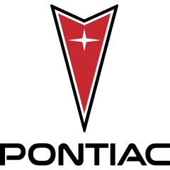
The logo's dynamic arrowhead and star effectively position Pontiac as a brand associated with speed, performance, and aspiration, aligning well with the automotive industry's core values. Its classic, bold aesthetic reinforces a heritage of power and reliability.
Trust
The symmetrical, stable design and bold, clear typography instill a sense of professional credibility and reliability, fostering trust among consumers. The strong figure-ground balance contributes to an impression of clarity and honesty.
Recognition
With its distinctive arrowhead and star emblem, the logo boasts high memorability and rapid recognition. The low cognitive load and clear visual hierarchy ensure it is easily processed and recalled, making it highly effective for brand identification.
Emotion
The dominant red color evokes strong emotions of passion, excitement, and power, creating an energetic and impactful brand experience. However, the limited color diversity and specific cultural color associations might restrict its universal emotional appeal.
Design
The logo exhibits strong design principles with high harmony and symmetry, ensuring visual balance and aesthetic coherence. Its geometric simplicity allows for excellent scalability, maintaining integrity across various applications.
Brand personality
The Pontiac logo embodies 'The Hero' archetype through its bold, shield-like emblem and prominent star, symbolizing achievement, courage, and a drive for excellence. The sharp, upward-pointing arrowhead suggests forward momentum and overcoming challenges, resonating with a desire for mastery and impact.
Explore the full Pontiac scorecard
Every metric behind the 78/100 — attention prediction, color harmony, typography and more, in the interactive report.
More from the index


Independent analysis. Logo Analyzer is not affiliated with or endorsed by Pontiac; all trademarks and logos belong to their respective owners. Scores and commentary reflect one AI model's assessment of the logo's design and are not an official ranking, endorsement, or measure of brand or commercial success.